| Image |
Comment |
| 05/13/2003 02:43:31 PM |
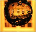
Solar Nocturnalby kiwinessComment: My only 10 this week. Great job! Nice clarity and contrast. You might clone out that one white spot in the upper right after the challenge. |
 Photographer found comment helpful. Photographer found comment helpful. |
| 05/07/2003 12:40:40 AM |
|
| Photographer found comment helpful. |
| 05/07/2003 12:13:24 AM |
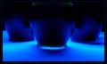
Blues in the Nightby crabappl3Comment: Dunno if you could desaturate a certain channel to get rid of that green in the middle, but it bugs me a little. I love the lighting along the bottom. Great clarity for such low light. Beautiful. |
| Photographer found comment helpful. |
| 05/05/2003 11:07:02 PM |
|
| Photographer found comment helpful. |
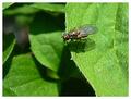
| 05/05/2003 10:39:10 PM |
Small World, Big Gap #1by KINGComment: 53rd? I would expect higher. This is a good shot and a nice score. I think it might have hurt that it is of an insect rather than a more traditional animal. It's a great macro.
I really like how you used dof to isolate the fly from the lower leaves and suggest distance.
The lighting is bright, but you did a good job with exposure. Nice detail and focus on the subject. Maybe you could crop some off the right side so that the fly isn't so centered. The color is nice. Maybe another frame would be nice - some burgundy and black? |
| Photographer found comment helpful. |
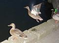
| 05/05/2003 10:30:38 PM |
One day I'll fly awayby pesinnComment: Hey! Lots of Icelandic folks around here lately.
I think the biggest problem with this shot is the flash burn. It's really obvious that you used a flash, and it just looks very unprofessional and too much like a snapshot. The duck also has red-eye.
Taking night shots of moving subjects is pretty near impossible unless you have some real lights set up to make it look more natural. Some cameras will allow you to adjust the flash output so that it isn't as strong and doesn't "burn" the subject. They just look too washed out in this shot. Other than the overexposure of the ducks, the water should also be darker which can be adjusted with levels in post processing.
Next time I'd suggest showing your shot to a few ppl to get some feedback before posting. Just be sure to do it early enough so that you'll have time to reshoot. The subjects and composition aren't that bad if you had taken it in the evening with better light. |
| Photographer found comment helpful. |
| 05/01/2003 02:35:47 PM |
|
| Photographer found comment helpful. |
| 05/01/2003 02:26:43 PM |
Stickerby lumbardhComment: competitions :) I like how you included photos in yours.. maybe the color photo should be on the left to even out the blue ribbon on the right |
| Photographer found comment helpful. |
| 05/01/2003 01:49:10 PM |
Use With Cautionby mcmurmaComment: love the caution line. The angle reminds me of the opening text in Star Wars, and is a little harder to read. |
| Photographer found comment helpful. |
| 05/01/2003 01:48:00 PM |
create. submit.by helgihelgiComment: I thought the rules said that it should be the other direction ("5 inches wide by 3 inches tall "), but I like this layout. Effective and simple. The web addy is too small though. |
| Photographer found comment helpful. |
Home -
Challenges -
Community -
League -
Photos -
Cameras -
Lenses -
Learn -
Help -
Terms of Use -
Privacy -
Top ^
DPChallenge, and website content and design, Copyright © 2001-2025 Challenging Technologies, LLC.
All digital photo copyrights belong to the photographers and may not be used without permission.
Current Server Time: 04/11/2025 07:08:37 AM EDT.