| Image |
Comment |
| 02/05/2003 03:23:40 AM |
Just Another Sunsetby lisaeComment: The foreground isn't all that interesting to me and it's really hard to make out. I think it should either be all black and a true silhouette or be lighter so that we can see what it is. Nice warm colors in the sky though. 7 |
 Photographer found comment helpful. Photographer found comment helpful. |
| 02/05/2003 03:20:44 AM |
Bahsworth & Brodamireby GotchaComment: Very cute. I could see someone hiring a photographer to take a pet photo like this. Not crazy about the chair, but I do like that the smaller dog is higher than the other. Good lighting on them. 7 |
| Photographer found comment helpful. |
| 02/05/2003 03:19:38 AM |
|
| Photographer found comment helpful. |
| 02/05/2003 03:18:12 AM |
NYC sunsetby BeeGeeComment: I like the bird! The statue is a little too close to the bottom of the shot. I'd prefer a little more water. Might also try changing the black point to make a stronger silhouette. 7 |
| Photographer found comment helpful. |
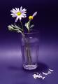
| 02/05/2003 03:16:37 AM |
she loves me, she loves me not.by MajorChaosComment: woohoo. I like the indigo-ish color of this. Lighting is a bit harsh for those white petals. Also not the best choice of vases. It's still a strong, simple image for me. 7 |
| Photographer found comment helpful. |
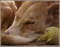
| 02/05/2003 03:15:16 AM |
Let Sleeping Dogs Lieby mcraelComment: Cute puppy! That nose reminds me of my greyhound. Nice composition though I'd rather see all of his nose and no tail. I think I'd also like a little more focus since the dog is really the subject and his focus is softer than that of the ball. 7 |
| Photographer found comment helpful. |
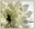
| 02/05/2003 03:13:54 AM |
Cliclowerby redfigComment: I like the composition. Very tough subject to expose properly. Decent job on the focus. The center is focused and the back petals are, but I'd like to see those center petals a little better. 7 |
| Photographer found comment helpful. |
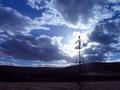
| 02/05/2003 03:10:18 AM |
Brokenby PtmanComment: Cool sky. It's a little overexposed and I think I'd like to see the tower a little further away from the bottom of the frame w/ more land and a little less sky. 6 |
| Photographer found comment helpful. |
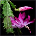
| 02/05/2003 03:03:56 AM |
house plantby jjbeguinComment: I like the black bg. Good lighting. A little too much water IMO. Somehow the composition isn't quite right. I think it's the two flowers competing for attention since they are stacked on top of eachother. Might be nice without the top bud. 7 |
| Photographer found comment helpful. |
| 02/05/2003 03:02:15 AM |
Decaying Beautyby stephanComment: Interesting take on the traditional flower shot. I like the black bg and the composition. Would like a little more light on the flower and a tighter crop. 8 |
| Photographer found comment helpful. |
Home -
Challenges -
Community -
League -
Photos -
Cameras -
Lenses -
Learn -
Help -
Terms of Use -
Privacy -
Top ^
DPChallenge, and website content and design, Copyright © 2001-2025 Challenging Technologies, LLC.
All digital photo copyrights belong to the photographers and may not be used without permission.
Current Server Time: 04/19/2025 08:30:07 AM EDT.