| Image |
Comment |
| 02/03/2003 04:06:15 AM |
Cute as a Bugs Earby SonifoComment: My favorite shot of the challenge. This is just the cutest photo. Excellent job! It's so clear and the b&w works perfectly. Nice lighting. I'm not sure about the slobber though :-P 10 for sure |
 Photographer found comment helpful. Photographer found comment helpful. |
| 02/03/2003 03:48:08 AM |
Waiting for Romanceby Harz_JoergComment: This is such a cute idea and setup. Adorable dog. The quality is just lacking. He's out of focus. The lighting is good but I wouldn't crop so close to his chin on the bottom. I also don't think you need the frame. |
| Photographer found comment helpful. |
| 01/31/2003 02:48:24 AM |
Just Humansby MonaComment: Decent score. The comments obviously liked this shot so I'll try to be more critical.
I like the colors in this shot. Outside of the challenge, I'm just not sure I'd find this photo very appealing on its own. The signs are cute. What is the diagonal black line along the bottom? It looks like a bad crop. There are some very strong vertical lines w/ the posts, fence, and tree and some strong horizontals along the water. Then you have some diagonals with the walk and a few shadows. It all seems a bit busy and too geometric for an outdoor shot. Maybe giving the lines a bit more room would've helped. They just don't intersect or lead anywhere. The main subject sign seems crammed up in that corner almost - very close to the edge of the frame on two sides. Of course, I don't know what the surroundings were like so suggesting better compositions is hard.
What I really like about this shot are the dog sign on the right, the fence beside it, the lighting on the fence, and the green grass. Perhaps you could have composed the shot to focus more on those elements and not even try to include that other small sign. There's just so much going on as it is - too many places to look.
I think it might be cute to have a dog on a leash tied to the dog sign (esp if they'd just lie down and look sad) and just get rid of most of the rest of the photo.
Tough lighting situation to expose for. I think you did a good job with it. |
| Photographer found comment helpful. |
| 01/29/2003 02:36:27 AM |
Drink Milk?by rj324Comment: I don't guess that I have to mention the background :) Picky, picky people, huh? Seriously, it would make the girls stand out much better. You don't necessarily have to have a solid sheet. I sort of like the candid nature of this rather than a studio feel. It would just be a lot stronger without the competing prints (and that line down the middle).
It fits the challenge and doesn't have any glaring technical problems. Focus is great, lighting is good (a few shadows but nothing too harsh). Something about the crop is a little off to me. Maybe I don't like having their arms amputated. I actually like cute kid shots but the fact that they both look like they are about to be sick sort of dampens my warm, fuzzy feeling.
Actually, I'm wondering if you couldn't do this with just one girl. Photos usually work better w/ an odd number of subjects. They aren't really interacting or playing off of eachother. I wonder how you would have done with a shot showing just one daughter. |
| Photographer found comment helpful. |
| 01/29/2003 12:47:18 AM |
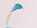
Yoghourtby lionelmComment: HEY! I think that most comments suggest that your white level is a little off. Was the background actually pink? because it looks like it may have been white originally. I'd rather not see it on white either though as I think another color works better. Perhaps a dark color would help. The reflective surface already makes the lighting seem very harsh. Was it diffused? Because of the type of surface and lighting, it's hard to tell for sure how good the focus is. The edges on the bottom part seem to be rather soft and not as distinct as they could be. As an abstract, this isn't as critical of course.
I do like the shape, but if I had been voting in "milk" then I'm not sure I would have really gotten the connection between this photo and the topic (without the title which I try not to rely on). Including atleast the top part of the container might have helped anchor it in dairy more.
It's a very abstract shot which probably didn't help the score any either. Of course there is always a trade-off in pleasing the crowds and pleasing yourself. I actually like abstract shots and wish they did better here. There's also a lot of blank space which IMO isn't really adding much to the image. I really like the blue and wonder if you couldn't have shown a bit more of it along the bottom.
Overall, nice abstract that could be tweaked - fits the challenge but just barely. |
| Photographer found comment helpful. |
| 01/26/2003 12:29:38 AM |
Happy babyby CreativeFlyPhotoComment: Very cute shot, but maybe not the best fit for the challenge. Seems more happy than humor to me. I'm bettin that's why it scored so low. No better reason really. The focus might be a tad soft and the lighting isn't even ... but the composition is good. Not sure I like that her fingers are cut off but that's minor. Great expression capture. I like how you filled the frame. Do use the full 150kb! |
| Photographer found comment helpful. |
| 01/25/2003 11:18:25 PM |
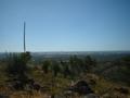
Overlooking God's creationby Delta_6Comment: I think that this photo needs a center of interest or a focal point. Ppl are drawn to that tall plant which isn't all that interesting. The foreground is a little too dark (probably due to the harsh shadows created by the bright sunlight) and the bg is too hazy. You might also be careful about centering the horizon in the frame. You could try shooting in the same spot if you place some of the plants (perhaps the group of 3 from the center) in the foreground so that they are taking up more of the frame and attracting attention. Then shoot at a different time of day. Early morning and late evening have the best lighting and would probably have a more interesting sky. |
| Photographer found comment helpful. |
| 01/21/2003 04:53:09 PM |
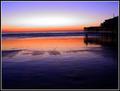
Sands of Timeby RoninComment: YAY! I got assigned a shot that I really like! :o)
This was one of my 10s for the challenge so I'm not sure how constructive I can really be. I just think that the colors are awesome. The reflection of the sky on the wet sand is beautiful. I would maybe like to see even more of the building silhouette, but I wouldn't want any cropped off the left side b/c of that great white oval of light in the sky. Maybe you could have moved to the right to achieve that.
I really like that the horizon isn't centered - that bugs me to no end. The sand seems to have more color gradation than the sky so I think it was a good choice to put the extra room there instead of above. I'm sorry that I can't offer more suggestions, but I just think it's gorgeous as is. |
| Photographer found comment helpful. |
| 01/21/2003 04:39:09 PM |
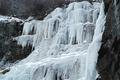
Wall of Winterby YomiComment: HEY! I'm from Utah originally. That looks really cold.
The ice formation is really cool, but I agree that the perspective isn't the best. I suppose there is probably some sort of pool or something that prevents you from getting really good angles though. I'd also like to see more of the surroundings just for comparison. I like that you've filled up the frame, but it's often hard to judge how good the crop is without knowing what the photographer was dealing with. It feels like the bottom has been cut off a little too much.
Ice and snow can be an exposure nightmare, and you've done a fairly good job with it. There are a few "hot" spots on the ice, but not bad. This photo is still color, right? It looks almost B&W except for that one patch of grass. Since the color isn't adding much anyway, you might try changing it to B&W and then doing some quadtones to see what other looks you come up with. The B&W just feels a little dead to me and doesn't add to the coldness IMO. Maybe a blue cast or something would work. You did a great job of finding an interesting subject and, without being there, it's really hard to judge whether or not you could have taken a better shot of it. It would be really cool to have something in this photo for size comparison to actually see how big the fall is. Maybe a person looking up at it? Again, not sure what's possible since I haven't been there. Overall, nice shot with very few problems. |
| Photographer found comment helpful. |
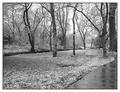
| 01/20/2003 02:47:41 PM |
Winter Serenityby crabappl3Comment: Well... That's quite a snow for Texas! This photo doesn't really have any glaring problems, but it isn't as strong as many of the other submissions. It IS rather understated and serene which doesn't help it stand out from the crowd. I really like the sidewalk, but it just isn't very obvious in B&W. I actually think that you could move a little, showing more of the sidewalk, and make it a stronger element in the image. I'm still not sure that I like this in black and white. Did you take it in color and then convert it? B&W can often add drama to a landscape, but IMO it makes this photo seem a little too lifeless and blah. Since you obviously have ready access to this site, I would suggest going back in spring, summer (maybe even during a rain shower), and fall to take the same shot from the same spot. Putting them side by side and showing how much it changes would be very interesting. |
| Photographer found comment helpful. |
Home -
Challenges -
Community -
League -
Photos -
Cameras -
Lenses -
Learn -
Help -
Terms of Use -
Privacy -
Top ^
DPChallenge, and website content and design, Copyright © 2001-2025 Challenging Technologies, LLC.
All digital photo copyrights belong to the photographers and may not be used without permission.
Current Server Time: 04/21/2025 10:33:58 PM EDT.