| Image |
Comment |
| 01/13/2003 09:50:05 PM |
Lunada Bayby daysezComment: Seems to need a little more saturation maybe. Nice composition. 10 |
 Photographer found comment helpful. Photographer found comment helpful. |
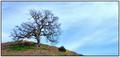
| 01/13/2003 09:49:05 PM |
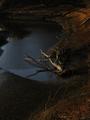
Oak Treeby GotchaComment: Awesome colors. Lovely composition. Very interesting tree. 10 |
| Photographer found comment helpful. |
| 01/13/2003 09:48:28 PM |
Mississippi Riverscapeby RiderGalComment: Beautiful scene. Just enough light. Tree is a little too centered but the receding perspective helps it not be too obvious. Would try not to cut off the bottom of the lamp maybe. 10 |
| Photographer found comment helpful. |
| 01/13/2003 09:46:18 PM |
|
| Photographer found comment helpful. |
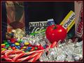
| 01/13/2003 04:15:20 AM |
Stranger in Candy Landby karmatComment: I like the idea but do think that you tried to show too much. Taking the shot closer or from above and limiting the candy to those not in boxes might have helped. The tomato just doesn't stand out well enough. One tomato in a sea of kisses would stand out more (although that foil is tough to avoid reflections/glare on). Using something to contrast with the red color would help it pop out. Putting it in a more natural setting so that it isn't so "set up" would help too - like putting it on the shelf at the store between the snickers and kit kats or something. Tough lighting - do you try to diffuse it with some cloth? |
| Photographer found comment helpful. |
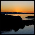
| 01/13/2003 01:28:19 AM |
Olympic Peninsulaby jimmythefishComment: Top half of this is beautiful. I would personally crop off in the middle of the large black mass. I don't think the bottom water adds much - it just detracts from the drama of the top where the colors and silhouettes are so strong. |
| Photographer found comment helpful. |
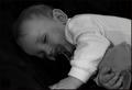
| 01/13/2003 01:15:11 AM |
Brahm's Lullabyby karmatComment: Why the long exposure? I love the song and really like the photo (gave it a 7), but it did have a few things that bother me. Mainly, the focus seems soft which I don't like for some reason. Not sure why because it is a soft, sleepy photo. Maybe it's the black and white making me want crisper lines.
I also think that both hands should be in the shot - maybe he would have let you move it a little closer to her face even. Otherwise, the composition is great. I'd like to compare this to the color and know why you chose black and white. The white clothing seems to draw too much attention. Maybe try something not quite so bright and use a little more lighting on him. It's a beautiful shot of such a sweet little boy - worth perfecting. I think people just didn't know what to say about it b/c there aren't any glaring problems. It's just a sweet photo. Even if you had ended up in last place, you'll probably appreciate this shot more than all your higher scoring shots in a few years. |
| Photographer found comment helpful. |
| 12/21/2002 02:10:33 PM |
Merry Kissmas!by karmatComment: This is cute, but daaaaaaaaaang if that isn't a whole lotta white! It feels sort of like the kiss is just pushed down in the corner. I think you basically already got a lot of good feedback. I don't agree that it needs more saturation. I think the lighting is a little too harsh for that reflective foil though. Did you try diffusing it? It also bugs me that the white tag blends into the background.
I was wondering if you couldn't do some sort of photo using more than one kiss that would really USE the negative space. Perhaps with a cute title. Sort of like a greeting card, with two kisses that want to kiss but there's a lot of space between them? I dunno ... |
| Photographer found comment helpful. |
| 12/21/2002 02:02:02 PM |
light's ebbby aelithComment: The difference is subtle, but I do like it better. I think you could even crop more off the bottom if you wanted - maybe a square crop so that the tree isn't so close to the center of the shot. |
| Photographer found comment helpful. |
| 12/16/2002 11:27:50 PM |
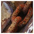
Linksby jjbeguinComment: Wow. The member challenge certainly got a lot more feedback than the open challenge, but here's some more for ya...
You obviously have a very nice photo here. Competition was stiff in this challenge.
Composition is great. I am so glad that we have the new cropping rules because this is an excellent example of where a rectangular shot just wouldn't be as strong. The diagonal and placement of the open link are great. Part of what makes this image so strong is how close you got to the subject. Exposure is good. You've made an interesting photo out of a mundane object which is quite an accomplishment.
Minor gripes: The lack of focus in the bottom right corner is distracting - especially because it is one of the few light colored spots and, therefore, draws the eye. Overall, I wonder if the focus couldn't be even sharper. Texture shots don't often work well with post-processing sharpening, but maybe you could have tried something different during shooting. It is helpful if you include the aperture, shutter, and iso in the photo details.
I agree with the frame comments. I'm not sure that such a bright color is the best choice - especially since it further accentuates that lower corner. |
| Photographer found comment helpful. |
Home -
Challenges -
Community -
League -
Photos -
Cameras -
Lenses -
Learn -
Help -
Terms of Use -
Privacy -
Top ^
DPChallenge, and website content and design, Copyright © 2001-2025 Challenging Technologies, LLC.
All digital photo copyrights belong to the photographers and may not be used without permission.
Current Server Time: 04/22/2025 03:10:40 PM EDT.