| Author | Thread |
|
|
12/22/2002 11:43:00 AM |
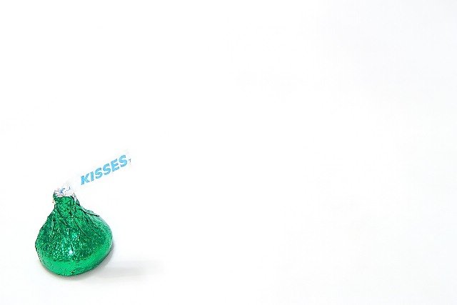
Hi Karmat!!!
ahem.. Okay..
Initial: cute idea.
Composition: Excellent. Use of Negative Space works in that the "kisses" tag leads my eye into the white space, and the white space pushes my eye back to the green wrapping.
Technical: I like the use of lighting... no harsh shadows, although I do wish I could better see the outline of the tag.. Sometimes wishes cannot come true - I realize this - but with the background so white, I wonder if any other lighting position would boost the less white outline of the tag. (does this make sense?). I even wonder if you could have 'cheated' by lighting touching the edge of the tag all the way around with a green or light blue marker. (Okay. I'll let it go.. now I sound obsessed).
The use of the slight shadow grounds the subject - so that it doesn't look like it is floating.
Overall good. Limited in keeping my interest, but cute.
|
|
 Photographer found comment helpful. Photographer found comment helpful. |
|
|
12/21/2002 02:10:33 PM |
This is cute, but daaaaaaaaaang if that isn't a whole lotta white! It feels sort of like the kiss is just pushed down in the corner. I think you basically already got a lot of good feedback. I don't agree that it needs more saturation. I think the lighting is a little too harsh for that reflective foil though. Did you try diffusing it? It also bugs me that the white tag blends into the background.
I was wondering if you couldn't do some sort of photo using more than one kiss that would really USE the negative space. Perhaps with a cute title. Sort of like a greeting card, with two kisses that want to kiss but there's a lot of space between them? I dunno ... |
|
| Photographer found comment helpful. |
|
|
12/16/2002 01:00:10 AM |
| I am surprised this didn't do better. I like it. One of my favorites. |
|
Comments Made During the Challenge  |
|
|
12/15/2002 11:22:38 PM |
| Great use of negative space. The kisses points my eyes to move through the photo. Good job. |
|
| Photographer found comment helpful. |
|
|
12/14/2002 08:42:41 AM |
| This is a cute idea. I like the placement of the kiss. I also like that the label clearly reads "Kisses". You have a perfectly white background, which makes it stand out. I would have bumped the saturation up a touch to make the green really pop! |
|
| Photographer found comment helpful. |
|
|
12/13/2002 12:48:15 AM |
| A bold experiment, but the object just isn't interesting enough, thematically or aesthetically, to make any use of all that space. The fact that the white of the "KISSES" tag blends with the background makes it confusing as well. |
|
| Photographer found comment helpful. |
|
|
12/12/2002 11:46:04 PM |
| LOVE the negative space entries. This one was particularly hard, I bet, cause of how easy it would be to overexpose the foil. Good job! |
|
| Photographer found comment helpful. |
|
|
12/12/2002 09:01:36 PM |
And Merry Kissmas to you, too. The white IS just a little loud here, as far as the brightness. Maybe a little darker gray would have helped, but you know how that is.
|
|
| Photographer found comment helpful. |
|
|
12/12/2002 02:35:42 PM |
| Wheee, fun shot, but almost too much negative space. The background color and the tag are just too close (IMO). Maybe you wanted them blended. 8 Swash |
|
| Photographer found comment helpful. |
|
|
12/11/2002 08:58:59 PM |
| Very cute! Think a red kiss would have been better, more contrast, but green is unexpected. |
|
| Photographer found comment helpful. |
|
|
12/11/2002 02:50:50 PM |
| Is it possible the background here is too white? It actually hurts me eyes to look at it a long time lol. I think this is a nice shot - the detail on the foil is very good. Cute idea = 7 |
|
| Photographer found comment helpful. |
|
|
12/11/2002 01:15:41 PM |
| looks like an ad. i expect to see ad copy in the white space : ) |
|
|
|
12/11/2002 11:21:18 AM |
| So simple. So good. I love that even the kiss itself is slightly blown out. 10. |
|
| Photographer found comment helpful. |
|
|
12/11/2002 09:40:25 AM |
| Excellent shot... I love the effective use of negative space here... this wold make a great christmas card photo :) great shot... - setzler |
|
| Photographer found comment helpful. |
|
|
12/11/2002 07:55:25 AM |
| Very good use of negative space. |
|
| Photographer found comment helpful. |
|
|
12/11/2002 07:18:07 AM |
| Interesting idea, and good use of negative space. The white background, presumably brightened using levels, unfortunately makes the label merge into it (intentional?), making the label seem separate from the main subject, which in my opinion detracts from the overall image. |
|
| Photographer found comment helpful. |
|
|
12/11/2002 05:06:51 AM |
| Very great use of negative space. Good detail on the KISS. |
|
| Photographer found comment helpful. |
|
|
12/11/2002 01:28:34 AM |
| A great idea, excelent use of negative space. Color is good. My only nitpick is that the lighting seems to be washing out the white tag. The edges aren't very distinct at all. I think that the lighting on the foil is good though, but just too bright for the white tag. Love the placement within the photo. bottom left is a great choice for this, with the tag leading toward the center of the shot. Your focus and clarity are really nice as well. Good luck in the challenge. |
|
| Photographer found comment helpful. |
|
|
12/11/2002 01:03:11 AM |
| Good use of negative space, seems just a bit over exposed. DPz |
|
| Photographer found comment helpful. |
|
|
12/10/2002 10:56:21 PM |
| good use of negative space, but a tighter crop so there is not so much negative space would be better for me |
|
| Photographer found comment helpful. |
|
|
12/10/2002 09:32:30 PM |
| I think this is a very well composed image, although a bit over exposed for my taste. |
|
| Photographer found comment helpful. |
|
|
12/10/2002 09:26:14 PM |
| Classic shot. May need just a tad bid of contrast between the 'KISSES' tag and background. Not easy to accomplish. Good job. |
|
| Photographer found comment helpful. |
|
|
12/10/2002 09:08:29 PM |
| I like it! Your choice of placement is reall appealing, and the snowy white background is a great contrast for the vivid green. Cool! |
|
| Photographer found comment helpful. |
|
|
12/10/2002 06:36:02 PM |
|
|
|
12/10/2002 01:48:54 AM |
| I really like simple, graphic shots...but this one is a bit too simple for my tastes. Maybe the green could have been pumped up a bit? 6 |
|
| Photographer found comment helpful. |
|
|
12/09/2002 11:18:31 PM |
| I love the white background and it seems to be popular. It sure makes the subject stand out. Very clear and nice focus. Great use of negative space. And green is one of my favorite color. :) |
|
| Photographer found comment helpful. |
|
|
12/09/2002 10:35:52 PM |
| Absolutely fantastic. I love this. Getting those stark white backgrounds is hard and this is done well. The wrapper of the Kiss doesn't blend completely into the background (like my boardwalk and parkplace cards did) Overall well done. Great picture. |
|
| Photographer found comment helpful. |
|
|
12/09/2002 09:19:18 PM |
| nice technique, a little more saturation even with shadows might improve the picture. |
|
| Photographer found comment helpful. |
|
|
12/09/2002 05:41:42 PM |
| Just a little bright..over exposed.....but--- I really like this. Great composition, color a little washed out, and good focus. Nice job. Like this. |
|
| Photographer found comment helpful. |
|
|
12/09/2002 03:00:32 PM |
| I enjoy the framing and the high contrast feel -- but this might even be too high-contrasty. And that's saying something for me. |
|
| Photographer found comment helpful. |
|
|
12/09/2002 01:52:20 PM |
| zen but suprisingly fills that frame rather well |
|
|
|
12/09/2002 01:37:24 PM |
| Merry Kissmas to you too! |
|
|
|
12/09/2002 11:17:30 AM |
Sweet.
Seems very bright/ white. Overexposed? |
|
| Photographer found comment helpful. |
|
|
12/09/2002 11:06:48 AM |
|
|
|
12/22/2002 11:43:00 AM |
| A bit empty. Would do good as the backside of a Christmass card, plenty of room to write something on the right. |
|
| Photographer found comment helpful. |
Home -
Challenges -
Community -
League -
Photos -
Cameras -
Lenses -
Learn -
Help -
Terms of Use -
Privacy -
Top ^
DPChallenge, and website content and design, Copyright © 2001-2025 Challenging Technologies, LLC.
All digital photo copyrights belong to the photographers and may not be used without permission.
Current Server Time: 03/13/2025 01:26:52 AM EDT.