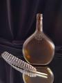
DPChallenge: A Digital Photography Contest You are not logged in. (log in or register
 
Browse Settings
Currently viewing:
Registered Userindigo997

Show comments:

Per page:

Order:

Comments:


Comments Made by indigo997
Pages:   ... ...
Showing 321 - 330 of ~448
Image Comment
Turkey Feather Still Life
12/16/2002 11:27:37 PM
Turkey Feather Still Life
by Kaz

Comment:
HEY!
Please include iso, shutter, and aperture in your photo info. I think it can help everyone learn.
You have a lot of comments already, but I'll throw in my two cents.
First, I too am wondering a little about the combination. This isn't actually a wild turkey bottle is it? That's really the only connection I could guess.
Usually it's a good idea to use odd numbers in still lifes. The reflection of the bottle almost creates a third subject or else this would really seem a bit weird. For that reason, I really like the inclusion of the mirror.
I do like the draping of the background material, but there does seem to be quite a bit of noise in the darker areas of the shot. Some cameras can't handle low light well, but it would help to know the iso and shutter speed.
I like the angle of the feather and don't even mind the position of the bottle, but the composition is a little off.
I hate to jump on the "rule of thirds" bandwagon, but I think that it might help here. The primary focal point seems to be where the bottle and feather meet which is very centered. I also think that a different perspective and crop could help. The upper empty area isn't really adding a lot to the shot. Maybe poining the camera down more so that there is less space above the bottle and even more reflection showing would help.
I took this into photoshop and ran auto levels. It moved the black point (darkening the shadows) some which added more drama to the shot. I also like a little more saturation to bring out the nice color of the bottle.
Photographer found comment helpful.
Rehearsal
12/13/2002 06:18:04 PM
Rehearsal
by Alecia

Comment:
I think this is a really good snapshot and definitely fits the topic. It just isn't "pretty enough" for the average voter. My complaint is the noise and that shadow obstructing my view of the hot guy.
Photographer found comment helpful.
Blue Streak
12/11/2002 12:49:38 AM
Blue Streak
by inspzil

Comment:
This is great, but if you could somehow create the motion blur just in the bg and have him in focus then it would be awesome. Sort of like the look you get when you sit in the center of a merry go round and take a pic of someone on the edge of it while it spins. Not sure that's at all possible of course. ;oP I just wanna see this kid!
Photographer found comment helpful.
Music Box Ballerina
12/09/2002 12:56:56 AM
Music Box Ballerina
by Squiffyeitherjag

Comment:
I think this was a good idea tho I don't really understand the blur being all over the place. I thought these girls usually just go around in circles. I'd like to see her more clearly. Did you try to use a flash to stop her motion and then leave the shutter open to catch the motion trail?
Photographer found comment helpful.
Royal Blue
11/26/2002 01:12:06 PM
Royal Blue
by Marklane

Comment:
Unlike a lot of ppl, I tend to like technical shots more than emotional ones. This is very nice. I like the idea and the execution. It's grown on me since the first time I viewed it.
Photographer found comment helpful.
Blue Sky, Blue Spruce, White Snow
12/01/2002 09:20:51 PM
Blue Sky, Blue Spruce, White Snow
by alanfreed

Comment:
The snow looks overexposed which gives the illusion that the photo just has a white border along the bottom. I think a foreground subject would help - something just left of the middle maybe. A snowman, footprints, a sled....I dunno.
Photographer found comment helpful.
Bubbles
12/01/2002 09:23:17 AM
Bubbles
by JamieWillmott

Comment:
This reminds me of my macro shot. I love the color. It seems too dark tho, and doesn't really have a "subject" so my eye keeps searching around with nowhere to land.
Photographer found comment helpful.
Outstanding
12/01/2002 02:40:13 PM
Outstanding
by crabappl3

Comment:
This is cute. I'm not sure that I agree with your decision not to make this a landscape. I do like the layers created by the 3 vertical areas, but I think that you could show it just as well without so much empty space. It's also a tad off center with more space on the right. If you're going to make a symmetrical shot then you probably want to watch that.
Photographer found comment helpful.
Blue on Blue
11/30/2002 07:10:04 AM
Blue on Blue
by Kaz

Comment:
Nice composition. Interesting lines. Lighting on the white is a tad bright.
Photographer found comment helpful.
INK
11/28/2002 11:01:08 AM
INK3rd Place
by marbo

Comment:
Ewe! Reminds me of fingerpaints. Definitely a color/texture photo. Seems a tad dark maybe, but I like the little light reflections.
Photographer found comment helpful.
Pages:   ... ...
Showing 321 - 330 of ~448


Home - Challenges - Community - League - Photos - Cameras - Lenses - Learn - Help - Terms of Use - Privacy - Top ^
DPChallenge, and website content and design, Copyright © 2001-2025 Challenging Technologies, LLC.
All digital photo copyrights belong to the photographers and may not be used without permission.
Current Server Time: 04/22/2025 03:04:42 PM EDT.