| Image |
Comment |
| 01/31/2006 05:46:05 PM |
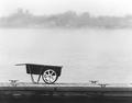
Wheelbarrowby TranquilComment: I'd like to see more definition in the bokeh skyline and more contrast in the wheelbarrow/fg, but overall its a nice find, and a good b+w study |
 Photographer found comment helpful. Photographer found comment helpful. |
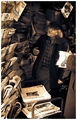
| 01/31/2006 05:18:41 PM |
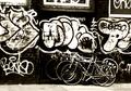
Bikes and Graffitiby TranquilComment: Good contrast, suiting the b+w well. I like how the graffiti really overshadows the bikes. I guess it wasnt setup, so you can't help it, but the back bike is raised and appears to be hovering, which kinda breaks up the composition somewhat.
The tones are good, kind of natural browns |
| Photographer found comment helpful. |
| 01/31/2006 05:02:44 PM |
Sleeping Rooby TranquilComment: Awwwwwwww.
The textures, the sofness of the fur.. have been brought out really well. The oof hay behind the head works well to bring focus to the face, but the stray strand near his (her?) left elbow is a distraction. The composition really suits the posture of the kangaroo and the shapes inherent in that. |
| Photographer found comment helpful. |
| 01/31/2006 04:44:57 PM |
Noncomformistby TranquilComment: I love this sensitive B+W study. The dof, the tones, the composition...all spot on imo. Hrrmmm, I'm supposed to be critiquing, not simply offering praise *runs off to find another photo* |
| Photographer found comment helpful. |
| 01/31/2006 04:40:33 PM |
reviwesx.jpgby TranquilComment: very surreal colours, very painterly. The composition and leading lines work really well, and the purple hues in the sky add to the painterly feel. |
| Photographer found comment helpful. |
| 01/26/2006 12:30:49 PM |
|
| Photographer found comment helpful. |
| 01/04/2006 12:35:15 PM |
New York Times by JPRComment: not voting atm but this really caught my eye. its captures city life more than most. I expect it do do very well |
| Photographer found comment helpful. |
| 01/01/2006 03:09:45 PM |
Back Off - This One's Mine!by SJCarterComment: from thread:
another of my favourites, great expression, dreamy homely atmosphere, toy fits well... My one criticism would be the big difference on sharpness between the head and body.. I'd maybe try and sharpen the body a tiny bit to reduce that difference. |
| Photographer found comment helpful. |
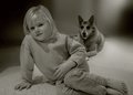
| 01/01/2006 03:06:17 PM |
Olivia & Shastaby SJCarterComment: from thread:
This was the first thumbnail to grab my attention, nice dynamics between the two characters. As i've already mentioned, imho the backdrop could be cleaned up a little. It does seem like the focus isnt as spoton as in the other photos, but this may just be lack of sharpening. The black and white works well, but it doesnt seem as though you've got full use of the tonal range. this may be just cause i spend most of my time with real b+w film :-p But yeah, reallly nice. |
| Photographer found comment helpful. |
| 01/01/2006 03:05:39 PM |
I'm Ready for My Close-Up Mr. DeMille!by SJCarterComment: from thread:
wonderful expression, nice warmth to it. personally i'm not a fan of the title, the photo seems too nice for a candid quote. There seeems to be some haloing of some description round the head (using the term loosely) which could definitely be dealt with. Also, I'm not sure if the background could be smoothed in the middle left where there's that stray white bit going into the grey stripe. But this probably isnt really necessary, i'm just trying to find fault cos its an awfully nice photo. One finally thing you dont notice til staring at it for ages, is the background above her (his?) left (from my pov) canine. Possibly been missed out in postprocessing. |
| Photographer found comment helpful. |
Home -
Challenges -
Community -
League -
Photos -
Cameras -
Lenses -
Learn -
Help -
Terms of Use -
Privacy -
Top ^
DPChallenge, and website content and design, Copyright © 2001-2025 Challenging Technologies, LLC.
All digital photo copyrights belong to the photographers and may not be used without permission.
Current Server Time: 04/18/2025 09:57:23 PM EDT.