| Image |
Comment |
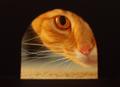
| 05/28/2004 11:54:26 AM |
The Prey's Perspecitve by JoelHSmithComment: Ow, awesome! It's razor sharp, composition with only one eye showing (and right in the middle) creates real tension, and lighting is perfect. Makes me feel like a scared mouse :-)) Only thing I wonder is whether less black on the left and right sides would improve even more. |
 Photographer found comment helpful. Photographer found comment helpful. |
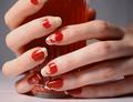
| 05/26/2004 11:38:11 AM |
"Can't Leave Well Enough Alone" or "Baby Needs a New Paint Job"by JesuispeureComment: * Greetings from the Critique Club! *
My impression is that this is a very nice image. Some detailed comments:
- the composition is good, with the glass slightly off center, and both middle fingers off center.
- the color match of the nail polish and the content of the glass create a sense of balance.
- lighting is excellent, no harsh shadows and everything properly lit.
- cropping could be better: it bothers me slightly that the top of the glass is not visible. The partly cropped index fingers creates tension, suggesting there's more outside the frame which makes it interesting to look at, but the top of the glass is not quite right for me, don't know exactly why.
Hope this helps, congrats on a nice image! |
| Photographer found comment helpful. |
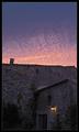
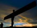
| 05/26/2004 10:41:28 AM |
David & Goliath (ll)by jjbeguinComment: Subtle, the two light sources! I like the colors in the sky very much. Pity it's a bit tilted to the right. |
| Photographer found comment helpful. |
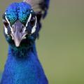
| 05/25/2004 09:53:24 AM |
Birds eye viewby mattrixComment: The idea is nice, but there is not enough of the bird in focus to keep my attention. I do like the negative space and the colors. |
| Photographer found comment helpful. |
| 05/22/2004 08:07:45 AM |
|
| Photographer found comment helpful. |
| 05/21/2004 07:32:12 AM |
|
| Photographer found comment helpful. |
| 05/21/2004 07:22:01 AM |
Looking for foodby ingvarComment: Nice colors, nice composition. Don't like the DOF though: the background should be either sharp or more out of focus, as it is now it draws my attention away from the bird. 6 |
| Photographer found comment helpful. |
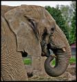
| 05/20/2004 01:15:40 PM |
Up Close & Personalby browntComment: * From the Critique Club *
I like this image a lot. You captured the texture of his skin extremely well, it's all sharp. Framing is good, I like the way his head and trunk fill the frame. The only thing that's bothering me a little bit is that the background almost blends in with his chin, that part of his head does not really stand out against the background. More blurring of the background might have improved that (but I realize you're already at the largest opening of this lens), or choosing a different standpoint. I'm not too fond of such a wide border as you have used here, but that's a personal thing.
Congrats on a nice image! |
| Photographer found comment helpful. |
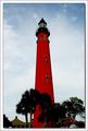
| 05/20/2004 12:39:16 PM |
Ponce de Leon Inlet Lighthouseby GallatinComment: Nice color! I would have liked to see either more cropping at the bottom (removing the houses) or more of the base of the tower and houses. As it is now they appear floating. |
| Photographer found comment helpful. |
| 05/20/2004 12:26:53 PM |
|
| Photographer found comment helpful. |