| Image |
Comment |
| 05/20/2004 12:25:28 PM |
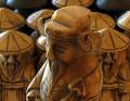
Sharing Wisdomby soccerdadComment: Lighting is very nice. The two dark figures in the back are a bit distracting, my eyes keep wandering to them instead of the center figure. |
 Photographer found comment helpful. Photographer found comment helpful. |
| 05/19/2004 06:17:31 PM |
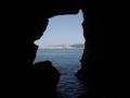
Sunny Jim Caveby theSajComment: Nice view, would have liked it better with more of the dark left and right parts cropped off. |
| Photographer found comment helpful. |
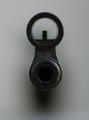
| 05/19/2004 06:08:53 PM |
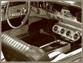
A "Shift" Back to the Pastby tfarrell23Comment: Composition is very good, and I like the 'slick' atmosphere of this image a lot! The link to the challenge seems a bit weak though, I guess the knob of the stick-shift is centered intentionally... |
| Photographer found comment helpful. |
| 05/19/2004 05:43:21 PM |
|
| Photographer found comment helpful. |
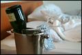
| 05/19/2004 01:22:45 PM |
Cold - Hotby tyrkinnComment: * Critique Club *
My first impression is that this a pleasant image to look at. Some details:
- the border could have been a little smaller. It's not too distracting, but it could be just a bit less heavy.
- I like the suggestive band and the unmade bed in the background. It bothers me a bit that the foreground is not completely in focus: I would have liked to see the band and the glasses as sharp as the bottle.
- DOF is perfect: the bed slightly out of focus but not completely blurred makes it quite suggestive to me.
- Composition is very good, the bottle nicely balances the stems of the glasses.
- The color of the band gives a good balance to the color of the bottle and the bed, without too harsh contrasts. |
| Photographer found comment helpful. |
| 05/19/2004 06:37:09 AM |
|
| Photographer found comment helpful. |
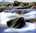
| 05/19/2004 06:34:56 AM |
Standing Stillby oskarComment: Nice image, I like the smooth impression of the water. Don't like the border though. Background seems a little bit out of focus, would have been better either sharp or much more blurred. |
| Photographer found comment helpful. |
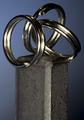
| 05/18/2004 05:50:46 AM |
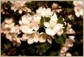
Opposites Attractby gajmajComment: Lighting on this is very nice. Personally, I would have cropped more off the bottom, it seems a bit top-heavy now. |
| Photographer found comment helpful. |
| 05/17/2004 06:24:27 PM |
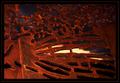
Through and Throughby LENWOODBLUZComment: * Critique Club *
The colors in this image are very powerful! The blueish grey sky makes a nice complement with the orange of the rust. A pity the image as a whole is a bit dark, especially the right and top portions, but it works well nonetheless. The border is too heavy for my taste. The image itself is already quite dark, the border makes it appear even darker. Focus is good, lighting could be more even, although I realize that might be difficult for an outdoor shot. Composition and cropping is perfect, with a good balance in straight and curved lines.
Congrats on an interesting shot! |
| Photographer found comment helpful. |
| 05/17/2004 05:34:59 PM |
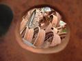
Past Their Prime (Unedited)by trnqltyComment: * Critique Club *
My first impression is that this is an attractive shot, the combination of the rusted hole with the texture of the wheels is really nice. Framing the image with the hole in the middle seems appropriate here, although the dark area to the left is a bit distracting. Tighter cropping probably would work better. The shallow depth of focus works well for me, having the hole out of focus leads the eye into the picture. Colors and lighting are very nice, the small spot of grass adds just the right amount of 'non-rust' color.
Creative take of a nice find for the challenge! |
| Photographer found comment helpful. |
Home -
Challenges -
Community -
League -
Photos -
Cameras -
Lenses -
Learn -
Help -
Terms of Use -
Privacy -
Top ^
DPChallenge, and website content and design, Copyright © 2001-2025 Challenging Technologies, LLC.
All digital photo copyrights belong to the photographers and may not be used without permission.
Current Server Time: 04/11/2025 07:13:25 AM EDT.