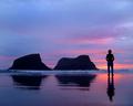
Silhouetteby
ZoomdakComment: Greetings From the Critique Club!!
Initial impact: ooh those are nice and different colors.
Does it meet the challege? Perfectly. No questions there. I feel that this was a good choice for the faceless challenge.
Focus: The Focus looks good However after looking closely at the shot, It looks as if you have croped to much or lost some detail while downsizing for the challenge. If you look closely at the shoulders and the top of the rocks it looks blocky.
Colors. While i'm sure the unatural looking colors might have hurt your score a little. I love them. They are not colors that cross my screen often. I personaly enjoy somthing different. It also looks to be slightly oversaturated in the brighter area of the sky causing more of a blocky look to your clouds. This to could also have happened while down sizing.
Contrast: I feel that you managed to nail the contrast dead on the sunset and the silhoutte mix perfectly.
Composition and layout: For the most part I feel that your composition works well. I tend to agree with mpalitang the pose the person is in does not seem to flow well with the rest of the shot. But To be honest I can't realy think of what pose would work better. Looking at the sunset seems to be the only one that makes since... ohh well my mind and eyes don't always agree.
Overall: This is a very nice shot. I would probably have scored it fairly high if I had voted in this challenge. I hope it didn't sound like I wash bashing you shot. But hey you placed 6th and that alone should tell you that this isn't a bad shot. I just felt with such a high score I had to realy look to find what might have caused this to miss it's ribbon. (and I realy had to look to find any flaws).
Keep up the wonderfull work and I hope to see more great shots like this one in challenges to come. Good luck
Tristalisk
Message edited by author 2005-02-16 07:29:04.