|
|
|
Showing 311 - 320 of ~403 |
| Image |
Comment |
| 06/03/2003 11:07:36 PM | Home Bellby russiComment: Clock is tilted in the frame... but I like the placement of the candles. |  Photographer found comment helpful. Photographer found comment helpful. |
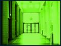
| 06/03/2003 08:49:59 PM | The Portalby bil99Comment: *Critique Club*
FIRST IMPRESSION: Green. Very, very green. Quite bright, and I knew before I even saw the challenge title that this is for "The Matrix" challenge.
CHALLENGE: Given that, it meets the challenge quite well. I can envision the scene from the movie that this shot may be based upon.
COMPOSITION: Framed OK, maybe a little high at the top. The door position within the frame works well, as does the tunnelling effect of looking down the hallway.
TECHNICAL: Seems a good bit blown out on the right side, and through the doors. Because of this overexposure, the floor is washed out, and the contrast between light and dark on the two sides of the photograph is too pronounced.
CONCLUSION: A good interpretation of the challenge, with some technical issues that detracted from the shot. The color adjustments you did to make it green may have been a bit better with a slightly darker color, given the overly bright side of the photo.
Thanks for sharing and good luck in future challenges! | | Photographer found comment helpful. |
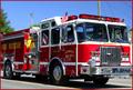
| 06/03/2003 12:17:35 AM | EMERGENCY!!by RuchartComment: I can hear it, and I think that's the best comment I can give for a "sound" competition entry like this one. Well framed and well executed shot. Would be a 9 if I was voting. | | Photographer found comment helpful. |
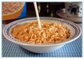
| 06/03/2003 12:15:35 AM | Snap, Crackle and Popby mariomelComment: European Rice Krispies? This photograph captures both the sound of S,K,+P, along with the milk that you're pouring as it splashes on the cereal. Good lighting, staging, and even cropping (the frame works well on this). Probably an 8-9 if voting. | | Photographer found comment helpful. |
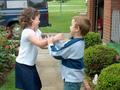
| 06/03/2003 12:10:44 AM | Not so loudby Crafty SueComment: First thought, sign language hush request. If that's the point, the challenge is met. It seems a bit snapshotty, I'm unsure if the blur (motion?) of the hands adds or detracts. Would rate at 6 if I was voting. | | Photographer found comment helpful. |
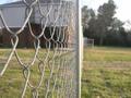
| 05/28/2003 11:19:23 PM | A Walk Until the Endby DavidLevinComment: *Critique Club*
FIRST IMPRESSION: The fence is a very prominent feature here, and the grass needs watering. The background is 'reached' by the fence, which does a good job of leading the eye.
CHALLENGE: On a color wheel, you would determine complimentary colors by looking at the opposite side from the primary color you use - or may be determined by figuring which two colors are not involved with the color you've picked, i.e. Green= yellow + blue, so red is not involved. Given how pale the colors are in this photo, and that the gray fence is the focal point to me, the challenge is not met especially well.
COMPOSITION: Again, the fence is the focal point - the photo has good focus, and the fence leads the eye to the trees in the background. The Dormitory is difficult to see for the fence.
TECHNICAL: Depth of field is good - the focus difference between the foreground and background is quite distinct.
CONCLUSION: An attempt worth taking, unfortunately not executed as well as it could have been. My suggestion for a shot like this would be, if the colors of the grass and the dorm are to contrast each other, this shot might have been better received had you stood on the other side of the fence, as in the same side as the dorm.
Thanks for sharing and good luck in future challenges! Message edited by author 2003-05-28 23:27:46. | | Photographer found comment helpful. |
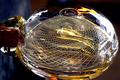
| 05/19/2003 12:08:44 PM | Blowing Glassby ToddhComment: *Critique Club*
FIRST IMPRESSION: I like that checkerboard pattern visible inside the bubble.
CHALLENGE: If not for the comment, it might have taken me a few minutes to tell that this was glass being blown, although that's just because I haven't seen glass being blown in quite some time. Definitely meets the challenge.
COMPOSITION: Colors are good, clarity is good. I like the darkness behind the glass, although the reflections on the foreground may be a bit strong.
TECHNICAL: Technically a very nice shot of something not seen very often. I like the level of detail visible, and how everything is properly focused.
CONCLUSION: This is a very nice photograph of a trade that has faded from view in recent years. The level of detail and clarity, along with the array of colors show some of the complexity of this art. Aside from the harsh reflections I mentioned earlier, this photograph is quite good.
Thanks for sharing and good luck in future challenges! | | Photographer found comment helpful. |
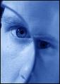
| 05/19/2003 11:12:05 AM | Magnifying Picassoby kosmikkreeperComment: *Critique Club*
FIRST IMPRESSION: This photograph is downright creepy. It is an appropriate reprsentation of Picasso's work, modified to fit a challenge requiring the use of glass.
CHALLENGE: Definitely meets the challenge - there is glass present, and it is an integral part of the photo.
COMPOSITION: The colors remind me of The Matrix or Metropolis (a very old movie about class separation). I like the contrast of focus points in and around the magnifying glass, as it makes the presence of that glass stand out.
TECHNICAL: There's the tiniest shadow above the magnified eye, probably from the frame of the glass. Otherwise, this is quite well done.
CONCLUSION: An interesting rendition of a very well-known Picasso painting. The focus issue you mention in your comments is well handled, and as one of the other commenters said, it adds contrast between the magnified and unmagnified sides of the face.
Thanks for sharing and good luck in future challenges! | | Photographer found comment helpful. |
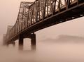
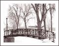
| 03/16/2003 12:46:21 AM | Into The Mystic by sherComment: Neat effect - i like the mist here. The sepia treatment works well too. | | Photographer found comment helpful. |
| 03/16/2003 12:45:01 AM | A Cold Peaceful Winter Afternoonby nathaliedooComment: I like this scene, but I guess the snow just washes out the sky a bit. One or two 'compression quality' points might have bumped the size of the file closer to 150k, which I have seen makes a difference in detail and in what looks washed out. | | Photographer found comment helpful. |
|
Showing 311 - 320 of ~403 |
Home -
Challenges -
Community -
League -
Photos -
Cameras -
Lenses -
Learn -
Help -
Terms of Use -
Privacy -
Top ^
DPChallenge, and website content and design, Copyright © 2001-2025 Challenging Technologies, LLC.
All digital photo copyrights belong to the photographers and may not be used without permission.
Current Server Time: 03/14/2025 12:46:58 PM EDT.
|