| Image |
Comment |
| 02/14/2005 10:25:07 AM |
|
 Photographer found comment helpful. Photographer found comment helpful. |
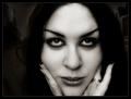
| 02/14/2005 10:23:33 AM |
I see you . . .by mocabelaComment: Very unique toning on this image... Kind of a vampire-esque look to it... I like that your background has things in it, but they are very well managed so as not to be a distraction. Interesting when such a dominant foreground subject isn't necessarily 100% of the shot, the background really feel like a significant part of the feel of this shot. Nice work. |
| Photographer found comment helpful. |
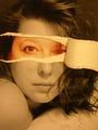
| 02/14/2005 10:21:32 AM |
Meby L2Comment: Wow! This is extremely creative. It feels a bit out of focus in the "exposed" area, or perhaps slightly overexposed, Also, excellent use of the frame - no dead space; It's all put to good use and very well balanced. I'd like to see a bit more contrast, but have to give you two thumbs up for a GREAT idea which was executed wonderfully! |
| Photographer found comment helpful. |
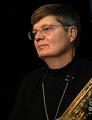
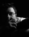
| 02/14/2005 10:17:37 AM |
My Other Hobby....by DrakeComment: There is a detached quality to this image, which I believe creates a barrier to the subject's essence. You have captured yourself with good technical detail, but there is an element of personality / emotion which fell short. I think it might be improved with more eye contact, or at a minimum getting the leftmost eye unobstraucted by nose & glasses frame. |
| Photographer found comment helpful. |
| 02/14/2005 10:14:59 AM |
Not Rockwellby graphicfunkComment: I like the expression very much, and the painter theme works well for me. Unfortunately, the high key background is so brilliant that I feel it distracts from the subject. An uncluttered natural backdrop would feel more at harmony in this image to me. |
| Photographer found comment helpful. |
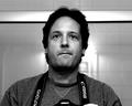
| 02/14/2005 10:13:39 AM |
Me, myself and Iby kevrobertsonComment: I like the natural feel to this exporession; It doesn't have an artifical feel to it. Also like your choice of lighting. Nicely done. |
| Photographer found comment helpful. |
| 02/14/2005 10:13:30 AM |
Gangsta'by postoakinversionComment: Great lighting and post processing - not too overdone, but has a very professional feel to it. |
| Photographer found comment helpful. |
| 02/14/2005 10:13:21 AM |
Self-Portrait of NGEby ngefComment: The background trim piece's intersection with the subject's head is distracting. I'm also not comfortable with the way the camera is cut off, and a partial finger is showing. I think a different perspective and some cropping would go a long way. |
| Photographer found comment helpful. |
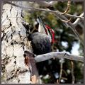
| 02/12/2005 09:24:25 PM |
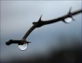
Woodpecker.jpgby artvetComment: This is a Pileated Woodpecker... Not an easy bird to get a clean shot at, so just havig it outweighs the technical flaws in this shot (branch obstructions, etc.). I haven't been able to get one yet, but have been trying. Nice job! |
| Photographer found comment helpful. |
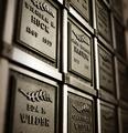
| 01/31/2005 02:55:56 PM |
Time Chambersby KylieComment: I've been struggling with a cemetary project lately, and must say that I think this is a successful image. Your use of depth of field suggests to me an expanse of these plaques while retaining a macro perspective. It's a touch soft in the foreground, which I think is the only real distraction. The detail within DOF is excellent, as is the lighting. On its own, I'm not sure this shot will reach its potential. However, I believe it couls be the foundation for an outstanding photo essay, tritych, or portfolio. I encourage you to keep its momentum... |
| Photographer found comment helpful. |
Home -
Challenges -
Community -
League -
Photos -
Cameras -
Lenses -
Learn -
Help -
Terms of Use -
Privacy -
Top ^
DPChallenge, and website content and design, Copyright © 2001-2025 Challenging Technologies, LLC.
All digital photo copyrights belong to the photographers and may not be used without permission.
Current Server Time: 04/11/2025 12:58:26 AM EDT.