| Image |
Comment |
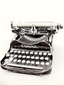
| 12/01/2004 02:39:21 PM |
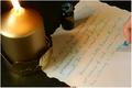
Word Processorby ChiquiComment: I don't think Jane Austen used quite that color ink! I like the idea, but I'm not sure I like the composition. There's something weird about the candle, too. |
 Photographer found comment helpful. Photographer found comment helpful. |
| 11/30/2004 01:25:57 PM |
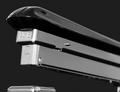
AceLiner Model No. 502by Keith ManiacComment: Good choice as a black and white. I like the crop for just the, uh, thingy ... but it looks like something is missing down there. Still, a sharp shot here. |
| Photographer found comment helpful. |
| 11/30/2004 01:21:21 PM |
|
| Photographer found comment helpful. |
| 11/30/2004 01:20:16 PM |
|
| Photographer found comment helpful. |
| 11/30/2004 01:09:15 PM |
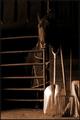
Simple Lifeby NeuferlandComment: This is cool. I almost didn't see the horse. How would this look with either A) the horse's head more center (horizontally, not vertically), or B) lots more space on the left side so the main subjects are way off-center? I like the duotone look here. |
| Photographer found comment helpful. |
| 11/30/2004 01:06:29 PM |
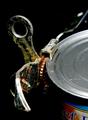
Can Openerby kyeboshComment: What a great subject - who knew a can opener could have personality? The only change I'd make is to get rid of the label on the can. |
| Photographer found comment helpful. |
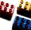
| 11/30/2004 01:00:53 PM |
Lego of my egoby Travis99Comment: I'm terrible with lighting, but seems too harsh to me. Maybe a bounce would help? Not so much to soften the shadows but to show more of the darker sides. |
| Photographer found comment helpful. |
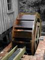
| 11/30/2004 12:58:35 PM |
The 1855MH Super Power Drive (Batteries not invented)by gruvinComment: Well, the selective desaturation helps make the wheel pop, but it also makes the scene feel contrived (especially since the block attaching the wheel to the bricks looks b&w). Would a more blurred background be more effective? |
| Photographer found comment helpful. |
| 11/30/2004 12:52:55 PM |
High Keysby TuckersmomComment: I usually like the high key effect, but for some reason it doesn't work for me here. Sorry I can't be specific as to why. I'd also leave more space on the sides. It's a cool experiment, though. |
| Photographer found comment helpful. |
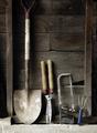
| 11/30/2004 12:46:58 PM |
Just the Basicsby Judith PolakoffComment: Two small comments on an otherwise good photo: I'd like to see the rest of the shovel's handle, and the blue plastic handle is distracting and out of place compared to the rest of the photo. |
| Photographer found comment helpful. |
Home -
Challenges -
Community -
League -
Photos -
Cameras -
Lenses -
Learn -
Help -
Terms of Use -
Privacy -
Top ^
DPChallenge, and website content and design, Copyright © 2001-2025 Challenging Technologies, LLC.
All digital photo copyrights belong to the photographers and may not be used without permission.
Current Server Time: 04/18/2025 05:31:12 AM EDT.