| Image |
Comment |
| 07/16/2004 04:19:18 PM |
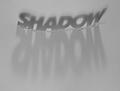
Shadow's shadowby paha_lComment: Would work better with harder light, so the shadows were darker and sharper. Nice image, though. |
 Photographer found comment helpful. Photographer found comment helpful. |
| 07/16/2004 04:15:15 PM |
Two Minute Hateby bledfordComment: Not sure where I'm supposed to focus here. The words on the bottom right are cut off, and the top left words are very far from center. Not sure what you are getting at with this image. |
| Photographer found comment helpful. |
| 07/16/2004 04:13:39 PM |
bibliyaby potogComment: Needs a bit more focus and light, nice old-fashioned look though. |
| Photographer found comment helpful. |
| 07/16/2004 04:10:36 PM |
Bird Seedsby dinotechComment: I like your idea here, the image is sharp and appealing, my only complaint is that the white is too bright, it hurts my eyes, and makes it hard to read. Tone down the white a bit and this will be a nice image. |
| Photographer found comment helpful. |
| 07/16/2004 11:17:42 AM |
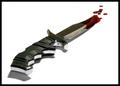
a Killing Toolby NazgulComment: Nice, I don't see how you could have gotten 1's. I'd give it an 8 at least. The handle does seem a bit oof, though. |
| Photographer found comment helpful. |
| 07/16/2004 11:06:02 AM |
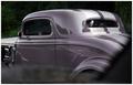
'34 Fordby jmleliiComment: Aloha from the Critque Club!
Congratualations on making a spur-of-the-moment shot look like a studio set print!
The color here is very nice, just purple enought to make you aware of the color, but not glaring. The shine on the vehicle is also very nice, and gives it a showroom look. Despite the hasty nature, the composition is nicely arranged and the lines are sharp. DOF is almost perfect for the subject.
I do have a few issues about the focus here, mainly the letters on the left edge of the image, which aren't in focus (which I know you couldn't affect in that situation) and distract alot from the sleek image of the car. Since I am also distracted by the dark patch along the right edge, meybe a solution would be to halo the left and right edges both with dark.
The burn marks along the bottom are a little too visible, try a softer burn, so the edges aren't so obvious. The cloud in the rear window and the two fingers on the steering wheel are also a little distracting, since they stand out in the dark windows.
Overall, this is an excellent capture that could be print-ready with a few minor edits. |
| Photographer found comment helpful. |
| 07/16/2004 10:51:35 AM |
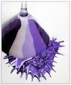
Deep Purple Somethingby mffnqueenComment: Aloha from the Critique Club!
This is a great example of how to create a photograph, rather than trying to find one. You put thought and effort into your composition, and it shows. I like the subtle use of thirds in the placement of the glass, and the shot angle give the image a sense of abstractness.
The focus is mostly very good, but think your depth of field needs to be a little deeper, it would bring the martini glass into full focus, and help sharpen the lines.
Obviously this picture meets the challenge, and as far as the composition of the subject, my only suggestions might be to use one color of purple, and dump the paint from higher up, so the splatter pattern would look more natural. Right now it is more contrived looking.
I like the solid background, though pure white might be better than the textured white. The lightings is unobtrusive and flattering to the subject. I don't care for the frame you chose, it might look better with a solid black bar or no frame at all.
Good job with this entry, keep at it! |
| Photographer found comment helpful. |
| 07/14/2004 10:12:31 PM |
- Miracle! -by ImagineerComment: A little grainy, but a very neat image. Can't wait to see your explanation :) |
| Photographer found comment helpful. |
| 07/14/2004 10:07:25 PM |
Here's Your Signby freakyreefComment: Love to know how you got this shot (assuming it was within the rules of engagement). Excellent entry. |
| Photographer found comment helpful. |
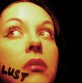
| 07/14/2004 10:06:13 PM |
Pulpby Herblacklist12Comment: Nice image, but she doesn't look lustful, she looks aprehansive. I had used the word lust for one of my possible shots, but I decided the photo was too risque. Nice entry. |
| Photographer found comment helpful. |
Home -
Challenges -
Community -
League -
Photos -
Cameras -
Lenses -
Learn -
Help -
Terms of Use -
Privacy -
Top ^
DPChallenge, and website content and design, Copyright © 2001-2025 Challenging Technologies, LLC.
All digital photo copyrights belong to the photographers and may not be used without permission.
Current Server Time: 04/18/2025 04:49:34 PM EDT.