| Image |
Comment |
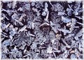
| 01/01/2006 10:17:33 AM |
Natural Patterns In Frostby woodseyComment: The detail and patterns are superb. But I really don't like the faded edges, sorry. Still a 6, should have been much higher. |
 Photographer found comment helpful. Photographer found comment helpful. |
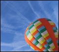
| 01/01/2006 09:58:38 AM |
Up, Up and Away!by kteachComment: Fabulous colours. I would have scored this a lot higher, but sorry, i am one of the "tilt-haters" ;) |
| Photographer found comment helpful. |
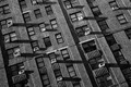
| 01/01/2006 09:56:08 AM |
6th Avenue Facadeby Car54Comment: Great patterns, the shadows are fantastic. But, I am one of those people who hates tilted cameras ;) |
| Photographer found comment helpful. |
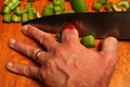
| 12/29/2005 08:26:48 AM |
eeoooowwwwww!!!by EclecticComment: Don't you just hate doing that?
Very nicely done. Composition, colours, sharpness are all there. Hope there weren't too many out takes! 8 |
| Photographer found comment helpful. |
| 12/29/2005 08:23:37 AM |
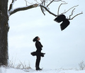
Angel Flew Too Close To The Ground by ColeyComment: There's something strange going on here ;)
If not for the tree I would have put this down to one of the loony Icelanders ... so instead I'll just have to settle for giving it a 9. Great composition, enough of a sense of mystery to make me keep coming back to look at it. |
| Photographer found comment helpful. |
| 12/29/2005 08:21:15 AM |
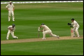
Dropped Catch !!by millsaComment: With fielding like that ... looks like the Test series in England in the summer! Great action picture. 9 |
| Photographer found comment helpful. |
| 12/29/2005 08:18:56 AM |
Oops!! Busted!by MajankaComment: That expression is superb! The empties picture in the challenge and one of the top two. The composition really works, just enough detail in the chair/cushion and that keyline really sets off the picture. 9. Bumped up to 10 on the next pass. |
| Photographer found comment helpful. |
| 12/19/2005 08:36:37 AM |
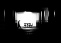
insomniaby crayonComment: Creepy and mysterious. The "soot and whitewash" treatment is great, the grain/noise just enough and the movement of the stooping person makes the viewer ask questions. Bumping up to a 9. |
| Photographer found comment helpful. |
| 12/19/2005 08:34:26 AM |
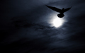
Moonlight Serenade by patrinusComment: Looks like this belongs on the cover of a vampire novel! Very effective. My personal opinion is that the left side of the picture isn't contributing anything and that the picture works well as a vertical. 8 |
| Photographer found comment helpful. |
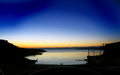
| 12/19/2005 08:21:59 AM |
Harbour At Dawnby CoralComment: I really want to know where this is, it is the sort of place I could stand for hours, especially on a morning like that. I gave this an 8, maybe a little more detail or a different crop would have squeezed an extra point or two from me, but it's your picture, not mine ;) |
| Photographer found comment helpful. |
Home -
Challenges -
Community -
League -
Photos -
Cameras -
Lenses -
Learn -
Help -
Terms of Use -
Privacy -
Top ^
DPChallenge, and website content and design, Copyright © 2001-2025 Challenging Technologies, LLC.
All digital photo copyrights belong to the photographers and may not be used without permission.
Current Server Time: 04/11/2025 06:02:23 PM EDT.