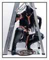
Wearing the face that she keeps in a jar by the doorby
Breeee123Comment: Hello from The Critique Club! :)
This is a very clever concept for a shot, which you pulled off pretty well!
Compositionally, its well done, with the important elements clearly placed within the frame of the photo. I feel that perhaps the two lipsticks in the foreground, whilst adding interest and added context and depth, could be better positioned. The way they are right up against the corner of the photo seems awkward to me, and I feel there should be some empty space surrounding them rather than them touching the edge, more like you've done towards the left of the jar.
I like the way you have the face in the jar, it looks very effective! I think having used a polarizer filter would have improved it however, since this would have reduced the bright and distracting reflections off of the glass. It may have also gone some way to reducing the glare from the window.
The overexposure in the background I find quite distracting. Perhaps waiting for a different time of day when it wasn't so bright outside would have been useful, or choosing a different location. I like the contrast it creates, but at the same time I don't like how it overpowers the subject of the photo.
The DoF you used is effective at leading the viewers eye through the photo and placing the correct emphasis on the main focal points. I feel however, that the DoF could have gotten away with being perhaps a bit shallower, as the edges are currently still quite sharp, whereas the details are soft. I find this "in between" kind of feeling a bit niggling, but it's not too much of a problem in the grand scheme of things :)
As far as post processing goes, I think the sepia works quite well, giving the photo an old fashioned nostalgic feeling, which matches the style of the person in the jar, and the Beatles in general. I don't like the border though. Firstly, it doesn't seem even, with it being thicker on the left and at the top, and secondly I think the feathering looks a bit tacky. I would have preferred no border at all, or a thn single colour one.
Overall, a well thought out concept and a photo which definately does it justice, with just a few little technical things which could be improved. I hope you found this critique helpful! :)
-Ben
Message edited by author 2006-06-09 08:31:17.