| Image |
Comment |
| 06/15/2005 11:02:55 AM |
|
 Photographer found comment helpful. Photographer found comment helpful. |
| 06/15/2005 11:00:20 AM |
|
| Photographer found comment helpful. |
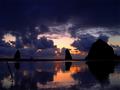
| 06/15/2005 10:57:06 AM |
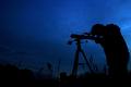
Stargazingby timluComment: I like this solhouette. Unfortunately, I think this is a kind of photograph where digital noise doesn't look good. The big, blue sky would look much nicer if you had run it through NeatImage. 9. |
| Photographer found comment helpful. |
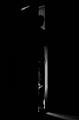
| 06/15/2005 10:55:36 AM |
Imminent... Darknessby ourwebstopComment: The smoke looks great. I don't know whether the empty space to the left helps for your composition, but I do get the idea of darkness. 9. |
| Photographer found comment helpful. |
| 06/15/2005 10:54:06 AM |
Tar and Featherby sherComment: This reminds me of an image I have seen here already. Even though your picture is dark, it doesn't suggest darkness to me. I'm sure it does to you, so that doesn't affect my voting. Technically it's excellent, the lighting is very soft and I like how you narrowed down the areas that reflect it. 8. |
| Photographer found comment helpful. |
| 06/15/2005 08:38:19 AM |
Fighting Daylightby ttibbyComment: This is an interesting approach to the challenge. One of the few pictures that work well even though they're not dark.
I think your border is an over-kill, one or two plain lines would have been enough. Some more contrast for the picture would have improved the quality. 8. |
| Photographer found comment helpful. |
| 06/15/2005 08:36:59 AM |
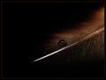
Night Falls by NovaTigerComment: Looks like one of Zoomdak's pictures. I like the cloud formation and the feather in the lower left corner. 8. |
| Photographer found comment helpful. |
| 06/15/2005 08:35:45 AM |
|
| Photographer found comment helpful. |
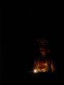
| 06/15/2005 08:34:21 AM |
Be A Light Unto Yourselfby tpocComment: I like the properties of the statue's surface. It's shiny on some parts and has a rusty look in others. Maybe you could have lit the lower part as well? 6. |
| Photographer found comment helpful. |
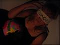
| 06/15/2005 08:32:59 AM |
my own darknessby hayleesComment: I think your picture would have worked better without the word 'darkness' on the bandage. The idea is strong enough, you might even have used a bit more light. Some more contrast would be good here. 7. |
| Photographer found comment helpful. |
Home -
Challenges -
Community -
League -
Photos -
Cameras -
Lenses -
Learn -
Help -
Terms of Use -
Privacy -
Top ^
DPChallenge, and website content and design, Copyright © 2001-2025 Challenging Technologies, LLC.
All digital photo copyrights belong to the photographers and may not be used without permission.
Current Server Time: 04/16/2025 12:31:48 PM EDT.