| Image |
Comment |
| 04/15/2003 07:30:07 AM |
|
 Photographer found comment helpful. Photographer found comment helpful. |
| 04/15/2003 07:28:58 AM |
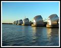
Weather Protectionby Geo_GriffinComment: Excellent colour, light and focus. Good choice of subject too with good framing. Only criticism - seems lightly off-level. 9 - floyd |
| Photographer found comment helpful. |
| 04/15/2003 07:27:19 AM |
|
| Photographer found comment helpful. |
| 04/15/2003 07:25:49 AM |
|
| Photographer found comment helpful. |
| 04/15/2003 07:25:19 AM |
|
| Photographer found comment helpful. |
| 04/15/2003 07:24:24 AM |
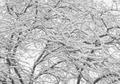
After the stormby vcosmaComment: Very moody and intense. Seems a little off-level though. Could also have used a focal point or some framing. 7- floyd |
| Photographer found comment helpful. |
| 04/15/2003 07:10:38 AM |
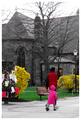
On Locust Walkby JPRComment: Greetings from the Critique Club
First off - this is an interesting picture. I've just spent a good couple of minutes looking at it. I see that you've desaturated some colours and that's left us with a few very strong colours in the foreground. I'm left wondering if there is significance to the fact that the church is almost totally desaturated while the child and her mother are bright and vibrant. I also wish I knew more about Locust Walk - there has to be a story behind that name and I wonder if it's related to the meaning in this picture.
What I also find interesting is that the young lady and her mother have some movement left to right but where most pictures depicting movement would leave open space in front of them to move into you've left space beind them. That gives the feeling that they're leaving the scene - perhaps going to the church which has those interesting orange lights inside.
I really can't get a grip on how much of this is intentional and how much is simply an artifact of what can be achieved within the DPC rules.
Your picture certainly meets the challenge - your use of colour is interesting and is the primary focus of the picture. The cropping I've got mixed feelings about - you seem to have wanted to catch the couple and the church together but did you specifically want that lamp in shot? My own style is to crop in as much as I can so I would probably have taken out the lamp and some of the flyers on the left but that's just me.
Your exposure of the church and the foreground is good but there's some definite bleeding of sky onto the branches at the top. I imagine on the original full colour version we'd see blue fringes there too. I wonder if your use of a 1/30 exposure is the culprit here - it's also resulted in some motion blurring on the walker's feet. If the motion blur was your intention then there's little that could be done about the sky. But the focus in this picture is also a little soft - especially on the church. A smaller aperture than the f/3.2 you used would have increased your depth of field as well as perhaps eliminating the light bleeding and would still have allowed you a long enough exposure to get the motion blur.
Of course if this was an opportunity shot then all that I've just described is far too much to think about before taking the picture. |
| Photographer found comment helpful. |
| 04/14/2003 06:29:34 AM |
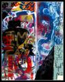
Graffiti in the Sunby greenem2Comment: Greetings from the Critique Club
My very first impression of this is that I really can't imagine a more fitting subject for the Colour challenge. So well done on that score - definitely meets the challenge in my view. There is perhaps some question about whether this is simply a photograph of someone else's artwork but in my view this is both a collage of a number of people's artwork plus it's a real 3D structure as evidenced by the shadows and that makes this OK in my book. This seems to me to be a reflection of something about this neighborhood as well as being a celebration of how grafitti can actully be vibrant and attractive.
The second thing that strikes me about your photo is the very strong importance of light and shadow. Somehow the shadows in the top left and bottom right frame the scene in a very interesting way that lifts the picture. Those shadows combine with the border to turn this shot into what is almost a painted canvas. The very strong sunlight has also really made those colours shine and that's really what this picture is all about.
Your focus seems good and exposure too - which might have been tricky considering the light. Your composition is very face-on but as I mention above it really works for this shot. It's hard to know what your own intentions where with this picture or whether you succeeded with them but you've captured a wonderfully vibrant image with tons and tons of detail. Really something to stare at and keep finding new things. |
| Photographer found comment helpful. |
| 04/14/2003 06:15:30 AM |
Pizza Piby sherComment: Greetings from the Critique Club
My first impression of your picture is that you probably spent longer setting up your props than you did setting up your shot. And this was a really GREAT prop - well done for that, it must have taken a lot of effort.
Your concept for this picture fits the challenge very nicely on two counts - the pi shape and the pizza pie - so well done on meeting the challenge. The arrangement and lighting is a little conventional. I think this could have been made more dramatic by shooting at a lower angle and being bolder with your use of lights. You might also have used a shiny metal tray as a backdrop instead of that brown cloth - a reflective metal surface would have made a nice contrast to the organic looking food.
Your focus looks good and the exposure is fine. More light in the scene would have given your exposure more interest but the biggest culprit isnt the lack of light it's the dark background. Your composition is good and the border lifts the picture a little.
Overall - I think you set out with a very strong idea of what subject you wanted to shoot but you let yourself get distracted into making that before you'd really thought about how you were going to shoot it. |
| Photographer found comment helpful. |
| 04/13/2003 05:54:58 PM |
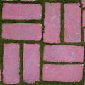
Backyard Symmetryby magnusComment: Greetings from the Critique Club
No question here about whether this fits the Symmetry challenge. It's clear that it does. Compositionally this looks almost Warhol-esque or perhaps even a fabric print. It's a very brash collection of shapes when photographed up close like that, filling the frame. That boldness could have been used more to your advantage, I think, by playing with the colours more and perhaps making them equally brash. It is, I think, the colours that let this image down a little. You've taken an everyday household object and photographed it in a way that we wouldn't normally see. You've managed to disassociate your image quite strongly from the original scene very successfully and I'd have liked to have seen you sever the link entirely by not attempting to keep the original colours. The bricks have come out a little purple-looking and the light is very flat. That really brings down this otherwise in your face image.
Technically your image is just fine. The focus seems OK if bordering a little on the soft side - I dont think that's a problem. The exposure is OK but the whole scene could have used a lot more light. I've already covered composition and that's your strongest element here.
I think your concept was good - you went out with an idea in mind and you captured it well. I just think you needed to develop that idea a little more to turn it into something that really stands out. |
| Photographer found comment helpful. |
Home -
Challenges -
Community -
League -
Photos -
Cameras -
Lenses -
Learn -
Help -
Terms of Use -
Privacy -
Top ^
DPChallenge, and website content and design, Copyright © 2001-2025 Challenging Technologies, LLC.
All digital photo copyrights belong to the photographers and may not be used without permission.
Current Server Time: 04/19/2025 08:39:39 AM EDT.