| Image |
Comment |
| 10/27/2004 04:49:56 PM |
A World Upside Down¿by mrwaffles989Comment: I dunno.. flipping the picture upside down may just confuse the issue. Now it's just sureal. I think it would have worked better rightside up, even with the title... |
 Photographer found comment helpful. Photographer found comment helpful. |
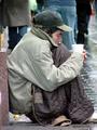
| 10/27/2004 04:48:42 PM |
The Invisible Manby TallblokeComment: I'll feel realy bad if I'm wrong.. but this shot looks posed.. It really does, it may really be a homeless person on the street, but my first instinct says it is not. Still a fairly well composed shot. And gives the idea of poverty |
| Photographer found comment helpful. |
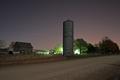
| 10/27/2004 04:46:07 PM |
Tired Farmby billmortonComment: A nice image, a great picture of a farm..Tho I have no reason to suspect these farmers a poverty stricken. I t looks like so many other farms around me, that have some old buildings they don't bother getting rid of, but that they are not using anymore for various reasons.
So a great picture of a farm.. not a good image to depict poverty. |
| Photographer found comment helpful. |
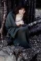
| 10/27/2004 04:38:17 PM |
The girl with the matchesby siggiComment: um.. Poverty? I'm sorry but I get magic elf long before I get poverty from this. It's a good picture and a very nice image. But it doesn't read as poverty to me. |
| Photographer found comment helpful. |
| 10/27/2004 04:36:33 PM |
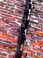
Rust to rustby jcolosiComment: A nice image, with good exposure.. I had to look at it for a while to see the rusted away pipe.. The composition doesn't present it self very clearly, it actually looks like a pretty picture, carrying some beauty. The negative sense I would get from this is.. disrepair or decay.. not poverty. |
| Photographer found comment helpful. |
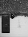
| 10/27/2004 12:29:05 PM |
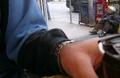
empty cupby clictacameraComment: I had to look twice to find the subject of this shot. I'm guessing you were trying to not draw attention shooting over your arm and thu a window.. And that's what it looks like, like a picture a PI would take while tailing someone. The arm in the foreground just takes up so much space, the blue on the part of the sleave in focus draws the eye and it falls one of the axises of the 'thirds' . While the subject is up in the corner leaving the frame. I think it would have been improved a lot by some cropping. |
| Photographer found comment helpful. |
| 10/27/2004 12:23:55 PM |
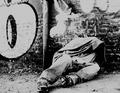
Up Against A Wallby charmayneComment: This.. this lookes posed, to me anyway. I looke like a shot for an album cover of some sort. Yes it's a person laying in an alley way, but it looks like nice new shoes and jeans. With a jacket tossed over his head. Seems like a clean subject trying to look down and out.
I like the image, I just don't think it captures the word poverty as well for me as some of the more gritty shots out there. |
| Photographer found comment helpful. |
| 10/27/2004 12:20:58 PM |
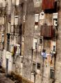
housesby carlosmfernandesComment: Well formated, good shot of the image of urban poverty. I don't think there is anything I would change about this picture.. Maybe play around with less saturation, but I don't know if that would help or hinder. |
| Photographer found comment helpful. |
Home -
Challenges -
Community -
League -
Photos -
Cameras -
Lenses -
Learn -
Help -
Terms of Use -
Privacy -
Top ^
DPChallenge, and website content and design, Copyright © 2001-2025 Challenging Technologies, LLC.
All digital photo copyrights belong to the photographers and may not be used without permission.
Current Server Time: 03/13/2025 06:12:52 PM EDT.