|
|
|
Showing 321 - 330 of ~828 |
| Image |
Comment |
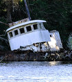
| 02/09/2006 11:24:10 PM | s broken dream.jpgby jorrComment: Great shot - too bad you didn't get to submit it. One thing I would recommend is to crop the bottom 50ish pixels, to eliminate those blown highlights on the water surface. |  Photographer found comment helpful. Photographer found comment helpful. |
| 02/09/2006 01:12:17 AM | Shadowby VanBergenComment: Hmm, curious as to why did you leave that cord and the power outlet in the photo? Adds nothing... and actually spoils the image. Also, is that motion blur in her hands intentional? It does not come across as too artistic, so that too subtracts from the image appeal. 5. | | Photographer found comment helpful. |
| 02/08/2006 11:45:51 PM | Linesby res0m50rComment: I do not find this one as interesting as the other one. Your focal point is too far from the wood, and your leading lines lead nowhere. Even if you left more negative space, it seems like that would have been better than to lead to the ceiling of the photo. I would try the following things (not necessarily all at one time):
- focusing farther down , to get the edge of the guitar in focus
- adding more negative space on top
- changing the perspective only slightly, either to have the strings lead from bottom left to top left, or to lead diagonally towards top-right.
This one just did not have the impact as the other one did. IMO only of course. | | Photographer found comment helpful. |
| 02/08/2006 11:40:36 PM | G Shadowsby res0m50rComment: You have one steady hand (not as much as in another shot though). Love the texture in the veneer. The crop seems just right, and so is the DOF. Strings seem to be a bit blown, but that could be a personal preference. | | Photographer found comment helpful. |
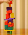
| 02/06/2006 01:05:36 PM | Steady Does Itby talmyComment: Here is my honest take on this one:
OK, this shot did not receive any comments during the challenge. If you look at the Gaussian distribution of votes here at DPC, there is another curve, inverse to the votes curve, that describes comments. The closer your photo is to the ribbon (either blue or brown) the more comments you get. This one is in the dead peak of the votes curve. Hence 0 comments.
Now that you understand the statistics behind the 0 comments, here is my take on it.
- saturation of the voting body (only 6 comments per entry, see here: challenge stats, while some recent challenges managed to get 15-16-17 comments on the average.
- uninteresting and unappealing photo. You have wooden blocks that would have been fine if:
* there was no blurred hand on the top. If you wanted to include the hand, then you should have changed your title to something else than "steady"
* the blocks were sharper (there is this aura around the blocks caused either by overzealous post processing or by shaky exposure during those loong 250ms)
* the background - those vertical lines/shadows that stretch even across the table, only represent a distraction, they do not enhance the photo at all.
* the colors of the background do not help bringing out the foreground.
All that said, I saw this image, there was an off-center object, did not appeal, did not have that many imperfections, clicked on 5 and moved on.
| | Photographer found comment helpful. |
| 02/06/2006 03:06:09 AM | Crisp Point Lighthouseby hi131Comment: ::: Critique Club :::
Hi
I am Serge from the Critique Club. The following is a critique for "Crisp Point Lighthouse".
First Impression - the most important one: Wonderful photo but - what's that with the horizon? Could it be the perspective - will check later...
Composition: Very good. Rule of 3rds applied on both the horizon line and the seashore line. The lighthouse is occupying the middle 3rd of vertical space - everything is pleasing to the eye.
Subject: As this is the best of (free study) it is hard to measure how much does this one meet the challenge. From your perspective (as per your comments) it means a lot to you, so this is your most remarkable (if not the best) photo of 2005.
Technical (Colour, focus, and light): This is another place (other than the horizon that could have been straightened a bit, while leaving the lighthouse perfectly straight) where this photo did not draw all the top scores (although 5.7x is pretty good result). The lighting conditions were not perfect. What is lacking is some contrast between the sea and the sky, and the gray color of the lighthouse against the similarly gray color of the sky behind it. The lighting was very diffused, (sometimes a good thing that eliminates harsh shadows) that in this case subtracted from the photo a little bit. What could have worked is if you dodged the lighthouse to bring out more white in it.
To grow its vote? a big pet peeve at DPC is the crooked horizon. Although it is not a written requirement anywhere to have straight horizons, you WILL lose point(s) on it. That's one thing guaranteed to bring your score up.
Summary: Overall nice and appealing photo. Among 800+ entries in the best of 2005 (and I voted on all of them) I actually remembered this one. And that is something to take with you - it is a memorable photo after all.
if you have any questions on the critique feel free to PM me.
Best regards,
-Serge | | Photographer found comment helpful. |
| 02/05/2006 11:26:00 PM | 120by ajschelComment: Nice choice of putting the focal point of the image off center. | | Photographer found comment helpful. |
| 02/05/2006 11:22:33 PM | Hello, anyone in?by p2jvrComment: I like what you tried to do with the frame, but I hate the color of the frame. Yuck! (just my opinion).Otherwise, perfect photo for the challenge. | | Photographer found comment helpful. |
| 02/05/2006 12:42:12 PM | Guardian Angelsby SilviComment: Greetings from the Critique Club!
I liked this photo a lot when going through the best of voting. I'd like to emphasize what IMO would have made this photo stand out more. (In addition to existing comments you've received).
- yellowish color cast is odd. You could have adjusted the color balance somewhat to make the girls' faces more natural looking.
- the farthest girl was apparently moving faster than your shutter speed. You haven't indicated your exif settings for the photo, but I assume that since it was taken in the low light it must have been on a slower side, 1/10-1/30 or so, which is then very subject to blurs due to subject motions. You could have re-taken this shot (when shooting Candids sometimes it pays off to shoot in a burst mode, and then pick the best out of a couple you make of one scene).
- someone suggested to use black & white for this photo, and that could have worked fine - it would have eliminated the bad color cast, and would have let you enhance contrast in places and dull the other uninteresting areas, e.g. highlighting the poster by enhancing its contrast with dodge&burn, and dulling the surrounding distractions.
Good things:
you have what is the basic premise for making a good photography: an eye for the scene. Great find - your everyday scenery from metro turned into the story about lives of these women waiting for the train.
Keep up the good work, pay attention to camera settings (balance the DOF more carefully to achieve desired effects) and I'm sure that we will see high placed images from you in the future.
PS. it is a good idea to specify the ISO, aperture, flash used/not used and shutter speed with your photo, as suggestions for improvement sometimes could benefit from that information.
Good luck in your future submissions.
-Serge | | Photographer found comment helpful. |
| 02/05/2006 03:00:54 AM | | | Photographer found comment helpful. |
|
Showing 321 - 330 of ~828 |
Home -
Challenges -
Community -
League -
Photos -
Cameras -
Lenses -
Learn -
Help -
Terms of Use -
Privacy -
Top ^
DPChallenge, and website content and design, Copyright © 2001-2025 Challenging Technologies, LLC.
All digital photo copyrights belong to the photographers and may not be used without permission.
Current Server Time: 04/21/2025 06:36:59 AM EDT.
|