| Image |
Comment |
| 01/02/2005 05:02:02 AM |
|
 Photographer found comment helpful. Photographer found comment helpful. |
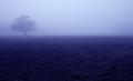
| 01/02/2005 04:58:26 AM |
...To be more seriousby xtabintunComment: umm...you're not getting off to a very good start...but then, your resolution is really tongue-in-cheek, right?
I like the zaniness off the photo. The head being slightly off center kind of adds to the effect. |
| Photographer found comment helpful. |
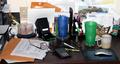
| 01/02/2005 04:53:47 AM |
Got to get organizedby eaglebeckComment: True dat. I hear ya. The only problem is that you need to redefine for yourself what "organized" means. That IS organized--or nearly so by my definition.
My dad's got that same mousepad.
Despite being about "disorder," the array of objects in the photo maintain a balance of color--except perhaps the green glass. |
| Photographer found comment helpful. |
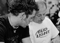
| 01/02/2005 04:48:14 AM |
More Time With Dadby cbellerComment: I like the contrast between the t-shirts and hair.
Between the necklace and Bud Light logo, the photo kind of reminds me of a Yin Yang.
Well done. |
| Photographer found comment helpful. |
| 01/02/2005 04:45:44 AM |
|
| Photographer found comment helpful. |
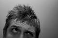
| 01/02/2005 04:42:35 AM |
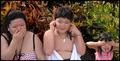
Learn to be nice, not nasty by steinarComment: sweet shot! Looks like you might need to work on smiling though ;)
What is that, a Russian naval officer's coat? I like it.
My only beef with the shot, and it's a pretty minor one, is that the upper right corner is a little distracting for me. For some reason my mind keeps wanting there to be a little more symetry between the two sides, but that's only minor.
Nice Job! |
| Photographer found comment helpful. |
| 01/02/2005 04:37:23 AM |
Trim the peach treeby dr rickComment: I like this shot a lot because it has both elements of simplicity (there's black and light gray, but not a lot of intermediate gray) and complexity (all the little branches).
It uses pretty much the whole area of the shot (ie, the corners or a side are not bare in comparison to the rest of the photo), too.
Good Job. |
| Photographer found comment helpful. |
| 01/02/2005 04:32:28 AM |
Read to My Daughter Moreby spydrComment: I like the dimmer lighting in the shot. I think it adds a sort of intimacy to the shot that is present when a parent reads to their child.
I'm curious to know why it's cropped so close on the left side. This is not necessarily a criticism, but it seems like that side is a little cramped compared to the right side of the photo. |
| Photographer found comment helpful. |
| 01/02/2005 04:20:55 AM |
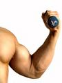
I will not be afraid to use bigger weightsby nico_blueComment: Nice muscles--they are yours, right?
I am not sure, but I think using black and white on this shot might have been a better choice. I can't explain why I feel that way (too inexperienced to communicate the reason), but when I imagine this shot in black and white, I am drawn to that imaginary version more.
|
| Photographer found comment helpful. |
| 01/02/2005 04:16:47 AM |
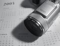
Daily Pursuitby ZoomdakComment: Nice Camera--no no: I mean the one that took this picture. It's JUST like the one I use*...come to think of it, that calender looks familiar, too...
On the serious side:
I noticed that you took the color out of the shot. That was a good choice considering, one, there wasn't that much color there in the first place, and, two, adding color to the elements in the shot wouldn't do anything to make them more interesting.
*For those unaware: he used my camera to take the shot, but not my person. I'm just teasing him and not trying to say the shot's illegal, because it's not. |
| Photographer found comment helpful. |
Home -
Challenges -
Community -
League -
Photos -
Cameras -
Lenses -
Learn -
Help -
Terms of Use -
Privacy -
Top ^
DPChallenge, and website content and design, Copyright © 2001-2025 Challenging Technologies, LLC.
All digital photo copyrights belong to the photographers and may not be used without permission.
Current Server Time: 04/07/2025 08:59:22 AM EDT.