| Image |
Comment |
| 01/23/2005 08:10:06 PM |
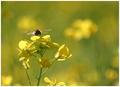
A bee in my bouquet!by arpitaComment: Excellent shot. Even the background elements are nicely placed in the composition. The only distraction for me is the blossom at the bottom of the image, but I think cropping it out would destroy the balance of the piece.
Guess we can't have everything *grin*
Nice job. |
 Photographer found comment helpful. Photographer found comment helpful. |
| 01/23/2005 08:06:51 PM |
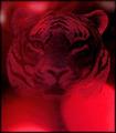
Shadows of Redby ace flymanComment: The tiger has insufficient sharpness and contrast to pull it away from the background. It looks too much like it is the background, and there's a key element of the composition missing. Then, the bright lights pull the viewer's eye away from the tiger, further alienating the viewer from the composition.
Just my thoughts. |
| Photographer found comment helpful. |
| 01/23/2005 07:40:56 PM |
A Piece of the Frozen Forestby KekiinaniComment: While a good example of bokeh, and the pine needles stand out nicely agains the background (the water drops are a bit out of focus), the main subject as you have composed it is the snow, which is slightly over-exposed and lacking any detail that would make it interesting.
The viewer's eye is drawn straight to that clump of snow and stays there. |
| Photographer found comment helpful. |
| 01/23/2005 02:27:21 PM |
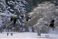
Concertoby ellamayComment: Lynn
A lovely example of bokeh. Enough clarity in the background for the detail to engage the viewer, while still making the midground subjects leap off the image.
I think the only thing I would ask is a little more space between the third bird and the edge of the image: rather than being part of the triad, he seems left behind, as the edge pulls at him.
Beautiful work. |
| Photographer found comment helpful. |
| 01/23/2005 02:23:05 PM |
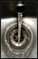
Mid Flowby ManicComment: Hey Manic
I'm not sure this was the best subject for 'Bokeh', as a lot of the interesting detail is in the bottom of the sink, as a result, there isn't much to hold the viewer's attention. I'd like to see a little more on the bottom of the frame, also, to trap the eye and keep it from following the lines off the botttom of the image.
Just my thoughts. |
| Photographer found comment helpful. |
| 01/23/2005 11:35:31 AM |
advancementby coldaComment: A nice shot. I agree with the comment about fore ground space, but I like the amount of negative space; its seems commentary on the corporate world. Effective use of lighting and focus, though you may want to comsider burning in that bit of glare at the bottom of the prominent pawn.
|
| Photographer found comment helpful. |
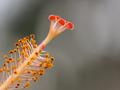
| 01/22/2005 04:19:22 PM |
Pistil and Stamenby umbrisComment: I have problems with the point of focus. For me, the red tips should be the focus of the image - yet they're not on the depth of field. The field of focus begins past them, evidenced by the yellow 'buds' that are in sharp focus.
We used to use a photographer's loupe for focusing on ground glass; it would be a help in macro focusing also, if you're using the LCD. Inexpensive one can be found and are great for critical focusing.
This seems a weak splash of color against a blurred background, to me. Nothing grabs my eye. Sorry I can't be more positive. |
| Photographer found comment helpful. |
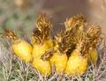
| 01/21/2005 09:04:04 PM |
Saguaro Fruitby ClubJuggleComment: CJ
My eye keeps getting pulled to the brightest 'stalk (?)' in back (unfocussed). Perhaps burn it in and darken it. I would like to have seen the back fruit in focus, and the colors saturated a bit more, but that's just personal taste.
Maybe crop out some of the background? It may just be my middle-aged eyes can't handle it, anymore. *grin* |
| Photographer found comment helpful. |
| 01/21/2005 10:23:52 AM |
Through the Bridgeby fotodudeComment: Brando
Nice composition, but the attention remains on the mason work, and I'd like to see it drawn down the road. This might not have been the best subject for 'bokeh', per se. If the road were in focus, the lines would pull the viewer's eye down th road, so they'd wonder what it led to.
As is, the mason work needs to be sharper and burn in the corners so they're not as distracting. |
| Photographer found comment helpful. |
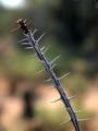
| 01/21/2005 10:18:58 AM |
Desert Thornsby BAMartinComment: Barbara
I can't find any technical nits: nice use of backlighting and aperature size to make the limb stand out from the background. Compositionally, the image doesn't do much for me. The tones of the branch blend with the tones in the background. Nothing really pulls my eye away from the specular lights on the thorns. The red tip is nicely placed, but again, not saturated enough to demand attention. The black blur in the background, angainst the highlighted tan, pulls the eye more.
Just my opinions, of course.
|
| Photographer found comment helpful. |
Home -
Challenges -
Community -
League -
Photos -
Cameras -
Lenses -
Learn -
Help -
Terms of Use -
Privacy -
Top ^
DPChallenge, and website content and design, Copyright © 2001-2025 Challenging Technologies, LLC.
All digital photo copyrights belong to the photographers and may not be used without permission.
Current Server Time: 03/12/2025 07:35:57 AM EDT.