| Image |
Comment |
| 04/17/2005 10:56:31 PM |
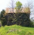
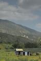
Plank Houseby eaemthomasComment: the trees make it hard to see the subject, maybe next time shoot the house on a side where the trees don't obstruct as much.
the sky needs more color, i would suggest a polarizing filter.
also, the subject is in the dead center of the picture. try the rule of thirds next time. |
 Photographer found comment helpful. Photographer found comment helpful. |
| 04/17/2005 10:49:53 PM |
|
| Photographer found comment helpful. |
| 04/17/2005 10:48:52 PM |
|
| Photographer found comment helpful. |
| 04/17/2005 10:45:05 PM |
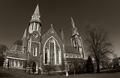
St. Joseph's Churchby hopperComment: i really like everything about this picture except the fact that it was taken with a fisheye/wideangle lens. the fisheye effect doesn't seem fitting to me for this type of picture. |
| Photographer found comment helpful. |
| 04/17/2005 10:42:04 PM |
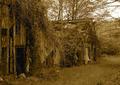
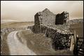
Forgottenby shadowangelComment: the background needs more contrast i think, especially with the sky and clouds. maybe next time a polarizing filter will help.
good composition maybe not so much sky though. |
| Photographer found comment helpful. |
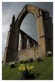
| 04/17/2005 10:39:27 PM |
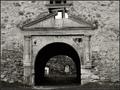
ancient castleby frumoazniculComment: i like the black and white of the picture, i think it goes well with the good contrast level you have.
as far as composition, i would have put the doorway exactly in the middle along the horizontal axis because it is slightly to the left or i would have put it farther to the left to be in accordance with the rule of thirds. |
| Photographer found comment helpful. |
| 04/17/2005 10:35:17 PM |
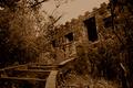
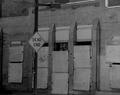
Dead Endby TobyFComment: more contrast perhaps? it seems to have an excess of gray and midtones.
also, the abandoned building isn't easily seen since the sign is the subject. |
| Photographer found comment helpful. |
| 04/17/2005 10:33:36 PM |
|
| Photographer found comment helpful. |
| 04/17/2005 10:32:32 PM |
|
| Photographer found comment helpful. |
| 01/19/2005 05:51:37 PM |
|
| Photographer found comment helpful. |
Home -
Challenges -
Community -
League -
Photos -
Cameras -
Lenses -
Learn -
Help -
Terms of Use -
Privacy -
Top ^
DPChallenge, and website content and design, Copyright © 2001-2025 Challenging Technologies, LLC.
All digital photo copyrights belong to the photographers and may not be used without permission.
Current Server Time: 04/26/2025 08:11:27 PM EDT.