| Image |
Comment |
| 02/01/2004 07:57:25 AM |
Virgoby bormicComment: I like the idea behind this a lot. Personally I like this shot except for the framing. I would've tried to make it portait oriented. I think I'd have cut off almost all the black on the left side and a little on the right. about enough to make her pretty centered. Its a good shot. One of my top 5 for the challenge. |
 Photographer found comment helpful. Photographer found comment helpful. |
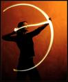
| 02/01/2004 07:55:31 AM |
Setting A Heart On Fire by ndsComment: This isn't the best taken photo of the challenge. It may however be the coolest. Your idea is incredible. Very well thought out. If only the arrow could've been straighter. Well framed and the lighting is pretty good too. Excellent creative idea. good luck 8 |
| Photographer found comment helpful. |
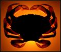
| 02/01/2004 07:52:01 AM |
Cancer, The Zodiac Sign by HRoxasComment: I thought this was the best photo of the challenge. NIce warm backlit with a good subject, excellent symmetry, well framed and well shot. Nice work 9 |
| Photographer found comment helpful. |
| 01/29/2004 10:12:45 PM |
"V-Dub"by tfarrell23Comment: Don't really like the angle this was taken at. Picture is just a little soft. I do like the framing but I think it would've been better from a lower angle than a higher one. |
| Photographer found comment helpful. |
| 01/29/2004 10:11:51 PM |
Painting With Lightby CatherineComment: Good idea. Not terribly well executed. The curve is awesome at the bottom. A shot worth reshooting to try to get the brush crystal clear. |
| Photographer found comment helpful. |
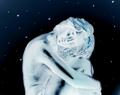
| 01/29/2004 10:10:21 PM |
viridisby MJENNIComment: This is okay. what happened to the top of this mate's head? THe highlights are too bright. The green light is a good touch. |
| Photographer found comment helpful. |
| 01/29/2004 10:08:34 PM |
Decorative Tulipsby banmornComment: This reminds me of another photo for some reason. Pretty good for a flower photo. Good exposure in the right places, good underexposure in the right places. |
| Photographer found comment helpful. |
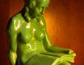
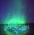
| 01/29/2004 10:07:20 PM |
Chess, Mate?by kayceeComment: This has the feel of a real high tech illustration. That's a good thing methinks. I like the way the white piece look. The clear pieces are always more of a challenge. You did pretty well with this one. The blue tint is a good illusion as it makes them look clearer. |
| Photographer found comment helpful. |
| 01/29/2004 10:05:35 PM |
Evocationby smittyComment: I love the light streaks. Don't like the background a whole lot. The light streak abstract on its own would do more for me. I don't like the vertical line in the middle of the piece. |
| Photographer found comment helpful. |
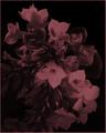
| 01/29/2004 10:03:40 PM |
Flower Paintingby jrs915Comment: Unique photo, I'l give you that. Dark and artsy in a trendy kind of way. Looks purposely underexposed. Honestly, I get the Moriticia Addams vibe from this photo all the way. |
| Photographer found comment helpful. |
Home -
Challenges -
Community -
League -
Photos -
Cameras -
Lenses -
Learn -
Help -
Terms of Use -
Privacy -
Top ^
DPChallenge, and website content and design, Copyright © 2001-2025 Challenging Technologies, LLC.
All digital photo copyrights belong to the photographers and may not be used without permission.
Current Server Time: 04/19/2025 07:31:45 AM EDT.