| Image |
Comment |
| 06/22/2003 08:40:21 AM |
Bright SUnny Dayby CreativeFlyPhotoComment: Great sky color. Hate the sunflares. Nothing personal, just never liked them. I don't like the way the trees have the little highlight sparkles on them. Makes them look plastic. I do however think the framing is very good with the trees on the corners and the clouds on one side. I like the asymmetry to this pic. Good work |
 Photographer found comment helpful. Photographer found comment helpful. |
| 06/22/2003 08:38:19 AM |
Cloud fanby ewebComment: Interesting illusion. I think the framing could've been better to not have so much dead area at the top of the frame. Not a lot either... I think trimming this to 1.5:1 aspect would've done the job. The focus could've been just a little better. The greyscale is interesting. Great idea. |
| Photographer found comment helpful. |
| 06/22/2003 08:35:23 AM |
DOCutivityby TarbiniComment: Greetings from the Critique Club
By Inspzil
Looks like a Savin
Composition - Nice and colorful. I think there are a few dead spots though where there are no buttons. I was thinking maybe taking this from the number side would've worked out a little better. What do I know though? You do have a better array of colors from this end, and they are brighter.
Technical - With only a very small area of this actually in focus, and part of that area not having anything there, it might've given the illusion that more of it was in focus if some of the number buttons were in focus. Good use of shallow DOF, but maybe just a little too shallow. I think at f5.6 or so you could've put the whole green button in focus, considering you had the light to do this, and/or a tripod because handholding at 1/30 sec or 1/15 sec is definitely tough to pull off.
Overall - For what it is, I think you pulled off a pretty good pic. A little greater DOF to show more of the "start" button in focus I think is the only thing that would've made much of a difference to this pic. Nice work. Good luck in future challenges - Bob |
| Photographer found comment helpful. |
| 06/22/2003 08:10:27 AM |
Village Council meeting room, in the early morning sun.by jjbeguinComment: Greetings from the Critique Club
By Inspzil
Greetings M. Beguin. Before I start this, I was looking at your comments and I must say I'm glad you didn't win because if you did, then I would've blown my best shot at winning anything on DPC. You have plenty of ribbons, you can spare this one.
Composition - Nice array of chairs with some good shadow patterns. I think you did an outstanding job conveying the warmth of the wood to the voters. This is a surprisingly simple scene, but with all the shadows and the angle you took this picture from, it sure looks like a lot is going on. The angle and the way you framed this is very good.
Technical - Besides the hot spot in the center of the picture, it is almost perfectly exposed. Everything is very nicely focused. I think the hot spot in the middle of the picture is the only thing really wrong with this picture.
Overall - I've been thinking about this picture for 24h. Honestly, its a quality pic, but I have a hard time telling you that I don't really like it. If it was someone else, it would be easier. But it doesn't really do anything for me. There... I said it. It can be difficult to say something like that from someone like me to a more experienced, obviously better photographer like you, on a week where I won the challenge I'm critiquing a photo for, and not sound condescending. This has been awkward and I'm glad its done. Hopefully you can understand what I'm trying to say. Good luck in future challenges. - Bob |
| Photographer found comment helpful. |
| 06/20/2003 05:31:26 AM |
Beachedby indigo997Comment: Very interesting use of colors and a dynamic composition of some different elements. Very creative and well done. I like the blue a lot. Good choice of tone. |
| Photographer found comment helpful. |
| 06/20/2003 05:30:19 AM |
"Yummy"by ladpupmoeComment: Don't particularly like the focus on this. Looks just like my black cat to be honest. The flash in his eye on the left is just a killer for me perosnally. |
| Photographer found comment helpful. |
| 06/20/2003 05:24:05 AM |
Flyingby FranziskaLangComment: Great motion shot. Like the way you framed him with the ground so much lower. A really nice shot -9 |
| Photographer found comment helpful. |
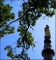
| 06/20/2003 05:16:48 AM |
Monumentby rickhd13Comment: I'd have shot this portrait. The tree on the left is totally extraneous. The tree in the right is good. |
| Photographer found comment helpful. |
| 06/20/2003 05:06:12 AM |
MERGEby photogooComment: Nice contrasting colors, especially the clouds and the sign. Sky is very cool in this picture. Good work |
| Photographer found comment helpful. |
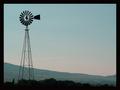
| 06/20/2003 04:51:01 AM |
Misty Mtn. Windmillby sagestudioComment: Good use of negative space on this one. I think this one might have worked really well in portrait too. Landscape it might have just a little too much negative space. |
| Photographer found comment helpful. |
Home -
Challenges -
Community -
League -
Photos -
Cameras -
Lenses -
Learn -
Help -
Terms of Use -
Privacy -
Top ^
DPChallenge, and website content and design, Copyright © 2001-2025 Challenging Technologies, LLC.
All digital photo copyrights belong to the photographers and may not be used without permission.
Current Server Time: 04/24/2025 07:28:31 AM EDT.