| Image |
Comment |
| 05/25/2003 07:22:54 AM |
Waiting For The Sunby cpanaiotiComment: Greetings from the Critique Club
By Inspzil
Composition - I gotta tell you this looks like a combination of my last 2 flower shots (my ONLY 2 flower shots). The water is always great on flowers to show sharpness in my opinion. I'm going to guess this is a tulip too because of the textures on the petals, which is what my last challenge subject was, showing the same textures. The crease in the flower is a good idea, but I might not have taken this quite so close. Its a very nice combination of colors. I got ripped for not showing all 3 primary colors for my tulips photo, so I bet some of the people probably felt the same away about your entry too. I don't feel that way though. Its a quality composition.
Technical - I like the shallow DOF on this macro. The focus seems just a touch soft, but is pretty good for the most part. I think a little more contrast would help to provide a little separation between the flower and the background. The exposure is pretty good, if anything it might be just a touch dark. I can really appreciate you putting all the things you did to the photo in your comments section.
Overall - A pretty nice picture overall. It needs a little sharpening, a little more separation between the flower and the background and maybe not taken quite so close. Its a good photo, but doesn't have a real compelling element to push it up the next level (and if I could do this, I'd tell you how in a heartbeat). Good job and good luck in the future. - Bob |
 Photographer found comment helpful. Photographer found comment helpful. |
| 05/22/2003 12:58:32 PM |
Beach Hutsby hughletherenComment: Greetings from the Critique Club
By Inspzil
Composition - Good find for this challenge. I think the lines and regularity of the pattern work well for this not to mention the way the shadows go too. One thing with having this many lines, you wan't to keep this photo as vertical as possible. The top is definitely leaning to the left a bit. It's easy enough to check when you have a reference line very close to the edge of the frame. Generally speaking I think the composition is pretty good.
Technical - The photo is not as focused as it could be. I would've set the aperture as high as it would go. Judging by the shutter speed, you should be able to easily and still have enough light to effectively shoot this. As it is, I personally would've sped up the shutter a bit. Less exposure gives more saturation. This isn't necessarily over-exposed, but it would be a little more saturated with a quicker shutter. I'm not sure if you can sharpen this one a little more with no ill-effects or not, but you may want to try that if you haven't already. A little more saturation via Photoshop is always an option too.
Overall - I think its not a real compelling subject, but it is very fitting for this challenge. I think with a few minor changes to the colors via PS or a quicker shutter would be advantageous. Something else in the picture to give it a focal point might have been a good idea. Maybe even a person. Good luck to you in future challenges - Inspzil |
| Photographer found comment helpful. |
| 05/17/2003 10:40:19 PM |
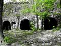
Weird New Jersey... The Caves of Insanity...by WILDBLUEComment: Greetings from the Critique Club
By Inspzil
Composition - I'm going to look at this picture from the more "weird" perspective in lieu of my normal straight up straight laced approach to this. If I didn't read that you desaturated all the colors, I wouldn't know it. There really isn't too much here that is losing its apparent colors. The only thing I can see that MIGHT give it away are the tree trunks that are totally grey and not brown. The stones that make up the "cave" entrances look like they would be perfectly happy grey. I think it's effective for this picture, mostly because its not totally noticeable that it's been applied. The general part of this composition is a little weird maybe, but not that compelling. I see where you're going with this but I don't think you quite made it. I might have tried this shot at dusk or dawn, where there is much less available light. It would've really made this more dark and dreary, like Jeckyll and Hyde or something like that. As for the horizon of this picture, you probably should've made the openings run uphill from corner to corner. The other option is to level them. It makes the photo's mood more morose and serious which of course is a little more BORING. I think it's good to have it tilted, just maybe more tilted.
Technical - This picture is pretty well taken and exposed. But I think this is a picture where its more effective to be a little underexposed. A little out of focus probably is an option to you too. The text is a little thin and not as readable at the bottom of the card as I think it should be. Processing looks pretty good.
Overall - You needed to do something a little more drastic to get the viewers attention, whether it be with exposure, framing or something else. Being slightly out of level was detrimental. Being level with the horizon or drastically tilted is an option too. Good luck with your future shots - Bob |
| Photographer found comment helpful. |
| 05/12/2003 05:00:39 AM |
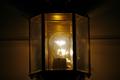
Imprisoned for lightby autumngirl786Comment: I'd have done anything I could to make this picture bigger, but to keep the bulb seem small. Maybe just put a gigantic black border around it to isolate it. |
| Photographer found comment helpful. |
| 05/12/2003 04:57:15 AM |
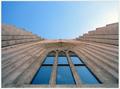
Pool of Glassby finnurComment: Fantastic perspective shot. This is really great. I think this will be in the top 5 if not the top 3. Very well done. I like the illusion that this is laying down vs. being the front of a building (or the side i suppose). Great concept and great shot. - 10 |
| Photographer found comment helpful. |
| 05/12/2003 04:50:31 AM |
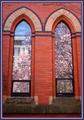
Reflecting Springby RiderGalComment: Great concept and very well executed. I like that the reflections are very contrasting to the color of the window trim and the whole building. Makes the colors of spring seem that much more dramatic. |
| Photographer found comment helpful. |
| 05/12/2003 04:42:09 AM |
illusion in blueby David EyComment: The woodgrain in the background was not the best choice of backdrops for this picture. I think you might've had some nice blue casts on a lighter colored backdrop. Idea is solid though |
| Photographer found comment helpful. |
| 05/12/2003 04:33:57 AM |
High-Beam Heavenby dan_pendletonComment: I like the way this was framed. I never would've thought to put the light that high up in the frame, but I guess I don't have a car that I could do that with either. Good shot. Black and white was also a sound choice |
| Photographer found comment helpful. |
| 05/12/2003 04:15:10 AM |
Washed Up Leafs (out of the playoffs)by rogerspaulComment: Great glass block shot. Harboring some ill feelings? They played their ass off though and came real close. Hopefully they can pick up a veteran forward or two during the offseason. My regrets. Oh yea, good idea for this pic too eh. |
| Photographer found comment helpful. |
| 05/12/2003 04:09:19 AM |
Boy in a Sphereby orussellComment: This is a great idea that suffers from underexposure. He also doesn't look terribly happy about getting his picture taken either. I love the concept, but I think it needs some refining before reshooting. |
| Photographer found comment helpful. |
Home -
Challenges -
Community -
League -
Photos -
Cameras -
Lenses -
Learn -
Help -
Terms of Use -
Privacy -
Top ^
DPChallenge, and website content and design, Copyright © 2001-2025 Challenging Technologies, LLC.
All digital photo copyrights belong to the photographers and may not be used without permission.
Current Server Time: 04/24/2025 05:59:21 PM EDT.