| Image |
Comment |
| 06/07/2006 04:22:43 PM |
Little Explorerby SeanachaiComment: this would have been cuter if his shorts were green too, since his behind draws the eye. Good dof. |
 Photographer found comment helpful. Photographer found comment helpful. |
| 06/07/2006 04:21:31 PM |
|
| Photographer found comment helpful. |
| 06/07/2006 04:18:16 PM |
limeby Prime_TimeComment: This looks a little too green to be natural. |
| Photographer found comment helpful. |
| 06/07/2006 04:17:22 PM |
Irish Eyesby L1Comment: wierd shadow on the right nostril. Otherwise this is a nice portrait. |
| Photographer found comment helpful. |
| 06/07/2006 11:59:51 AM |
|
| Photographer found comment helpful. |
| 06/05/2006 11:01:47 PM |
Texas State Capitol Buildingby yankoComment: Hi from ctp2:
Another personal best!! WTG! This is a nice, clean image. The spiralling lines work really well, and I like the contrast. Nice detail. I don't have any suggestions for improvement. Nice job! |
| Photographer found comment helpful. |
| 06/05/2006 10:59:22 PM |
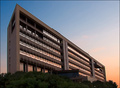
Dawnby alexgarciaComment: Hi from ctp2:
The lighting on this shot is beautiful. It is crips and clean. The composition is interesting, leading the eye down to the sunset. I like the reflection in the windows. The only minus on this, I think, is that the building is a little bland. All in all a great shot. |
| Photographer found comment helpful. |
| 06/05/2006 10:55:10 PM |
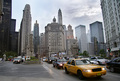
City Architectureby DigiFotoBuddyComment: Hi from ctp2:
My first impression of this is that it shows busy city life more than the architecture. My eye is drawn to the traffic before the buildings. The ligthing and composition are really nice, though, and it's a great picture. |
| Photographer found comment helpful. |
| 06/05/2006 10:53:23 PM |
Selfby DigiFotoBuddyComment: hi from ctp2:
I thought this might be you during the voting. This is a nice, well lit portrait. I like the pose you've chosen, and it definately shows how you are. I'm not sure the red background works real well for me, though. It's a little over powering.
Nice job! |
| Photographer found comment helpful. |
| 06/05/2006 10:50:41 PM |
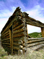
Humble Homesteadby RebeccaComment: hi from ctp2:
I really liked this. The angle is nice. Maybe stepping out a bit so that the edge isn't cut off would improve it a little? I like the texture of the wood. And I really like the way the empty window frames the mountains. The sky looks a little purple, but that may just be my monitor.
Nice job! |
| Photographer found comment helpful. |
Home -
Challenges -
Community -
League -
Photos -
Cameras -
Lenses -
Learn -
Help -
Terms of Use -
Privacy -
Top ^
DPChallenge, and website content and design, Copyright © 2001-2025 Challenging Technologies, LLC.
All digital photo copyrights belong to the photographers and may not be used without permission.
Current Server Time: 04/23/2025 02:35:23 AM EDT.