|
|
|
Showing 3791 - 3800 of ~4217 |
| Image |
Comment |
| 09/23/2005 09:50:13 PM | Overachiever by scalvertComment: 8 - Very good and funny. Criticism; tablecloth/colors dominate, or rather, compete with the ant and his load. Technically, whilst no 'expert', looks like you have achieved good focus on 'a third(s)'. 'Line(s)' are nice and straight, as I said, just the colors detract from this in my opinion. (2nd review); colors are growing on me, but I still think they compete too much, but I realize now 'picnic tablecloth', so apologies there. Can't quite take it to 8 though, re the 'strict application' for the Challenge, I would just like to have seen it 'stricter' somehow, though the originality is great. But yes on further 'review' I can see you have used more than one rule here. No clue why this needed validation either, who knows. Great shot. Ok, ok, 8, especially because of your efforts, and that of the ant. |  Photographer found comment helpful. Photographer found comment helpful. |
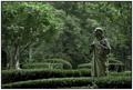
| 09/23/2005 09:37:01 PM | In The Gardenby sibelingComment: 7 - Very nice scene. Criticism; would like to have seen the "point of interest" more defined, contrasted possible. Perhaps a slightly tighter crop down the bottom to avoid that 'thing' bottom left of the statue. Technically, while no 'expert', seems to me like you have gone for two rules here, 'bottom third row' and top right intersection, difficult, but especially for the Challenge, I would like to have seen an even stricter 'adherence' or 'emphasis' using either or both of these rules. | | Photographer found comment helpful. |
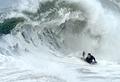
| 09/23/2005 09:28:21 PM | Don't Look Back!by qmdiComment: 7 - Good shot. Criticism; seeing as the "point of interest" is the surfer/board rider, I would like to have seen the same clarity you have top left with the lip of that wave. Technically, and while no 'expert', in addition to that, I would like to have seen the 'rider' even more strictly placed, with more 'fore' at the bottom, but I realize you were likely trying to not crop the wave out, so difficult. | | Photographer found comment helpful. |
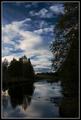
| 09/23/2005 09:24:47 PM | End of summerby IncarlightComment: 7 - Nice. Crticism; not sure, perhaps a little dark. Technically, while no 'expert, seems to me you have used at least three 'rules' here, horizontally, vertically and bottom left intersection, so well done. It is a nice scene, and while the sky coloring is nice, would just like to see more color in the greenery and water/pebbles. Not sure on the frame. | | Photographer found comment helpful. |
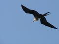
| 09/23/2005 09:18:25 PM | Frigateby hcuevaComment: 7 - Nice shot. Criticism; would like to see it sharper and 'pop out' more, especially colors. Technically, while no 'expert' in the rule(s), seems like pretty well spot on to me with the entire bird being the "point of interest". Nice and simple shot, just like to see it a little more 'vivid'. | | Photographer found comment helpful. |
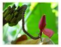
| 09/23/2005 09:14:19 PM | Banana Flowerby bil99Comment: 7 - Nice colors, this plant seems to have many good photo opportunities. Criticism; while no expert in the rule(s), it seems to me you have gone more for the 'rows/columns of thirds', rather than placing the "point of interest" (which to me is the flower), strictly at an intersection. Especially for the Challenge, I would like to have seen it placed more strictly, but the 'composition' you have here works well for this shot in my opinion, difficult without cropping any out at this angle. Not sure on the frame, especially the width, but minor. | | Photographer found comment helpful. |
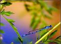
| 09/23/2005 09:11:11 PM | Born to be Blueby elsapoComment: 7 - Nice shot, nice colors. Criticism; perhaps a slightly different angle with this focal point, ie mainly the head and legs, or else the whole body in focus. Technically, while no expert in the rule(s), I would like to have seen, as mentioned above, the 'focal point' more strictly placed, perhaps even a tighter cropping (left side), if possible, not sure. | | Photographer found comment helpful. |
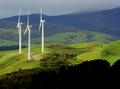
| 09/23/2005 09:05:11 PM | 3 to the power of Thirdsby KiwiShotzComment: 8 - Good shot. Almost looks surreal. Criticism; maybe 'something' done about the 'darkness' bottom/fore right, not sure, as that does add an 'element' here. The colors overall are very good, especially considering the difficulties you may have had with the white windmills/turbines. I like the 'dots', which I assume are sheep - add character and a good sense of perspective here. Technically, while no 'expert', I think you have applied the rule(s) well here vertically and horizontally. Maybe just a touch more 'contrast' or 'sharpness', not sure. Nice shot. | | Photographer found comment helpful. |
| 09/23/2005 07:36:54 AM | Breathby LevTComment: 7 - Wow, good idea. Shame about the crop, also if a different angle would have made this better in my opinion. Nice colors. | | Photographer found comment helpful. |
| 09/23/2005 07:30:57 AM | | | Photographer found comment helpful. |
|
Showing 3791 - 3800 of ~4217 |
Home -
Challenges -
Community -
League -
Photos -
Cameras -
Lenses -
Learn -
Help -
Terms of Use -
Privacy -
Top ^
DPChallenge, and website content and design, Copyright © 2001-2025 Challenging Technologies, LLC.
All digital photo copyrights belong to the photographers and may not be used without permission.
Current Server Time: 04/22/2025 07:19:44 PM EDT.
|