| Image |
Comment |
| 05/16/2006 09:47:06 PM |
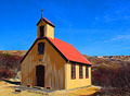
Hallgrímskirkjaby marvinComment: Hvar er þessi?
Mjög flottir litir, gott perspective og góð staðsetning kirkjunnar á myndinni.
Breytt - Gleymdi alveg að kommenta! Message edited by author 2006-05-31 11:23:00. |
 Photographer found comment helpful. Photographer found comment helpful. |
| 05/15/2006 05:31:39 AM |
|
| Photographer found comment helpful. |
| 05/11/2006 06:57:48 PM |
|
| Photographer found comment helpful. |
| 05/11/2006 11:03:54 AM |
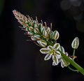
Onion Bloomby AzCKellyComment: This great shot would also have fitted the Rithm challenge.
The only thing IMO could be better is that either the things in the top right corner should disappear or be stronger.
|
| Photographer found comment helpful. |
| 05/11/2006 07:25:18 AM |
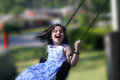
Odyssey swingby Elvis_LComment: Is this done in PS, i.e. the blurryng?
Nice job, weither it is in the taking or in ps. |
| Photographer found comment helpful. |
| 05/10/2006 08:52:08 PM |
A Stitch in Time Saves Nineby xianartComment: Comment from a member of your own commenting club :-)
First impression
1. Good selection of a Cliché
2. The stitch is irregular
3. Good focus and contrast
4. Cropping is good using rule of thirds.
What could be better
1. I find the picture to dark and therefore added lighting would help.
2. IMO the stich could have been better looking but this is just IMO.
3. A frame to close the picture.
|
| Photographer found comment helpful. |
| 05/10/2006 08:39:58 PM |
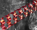
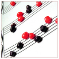
Rhythmic Curvesby DigiFotoBuddyComment: Comment from a member of your own commenting club :-)
First impression
1. What is this?
2. Beautiful thing but what is it?
3. On a mirror but what is it?
4. Good focus
5. Nice setup.
6. Is this plastic behind the thing that I do not know what is?
What could be better
1. Looks a bit grainy in the left side above the ......
2. Put a frame on it to stop the Viewer from going out of the picture
Nothing more to say. Hope my wonderings help. |
| Photographer found comment helpful. |
| 05/10/2006 08:16:43 PM |
R*E*T*I*C*E*N*Tby RoosterComment: Comment from a member of your own commenting club :-)
First impression
1. Beautiful model and you captured it well
2. Good use of colours and lighting
3. Don't know what R*E*T*I*C*E*N*T means and therefore have to look it up. Finding out that it can be many things so it takes away thinking of the picture. There are so many "Non US" on DPC like me and only understand simple English.
4. Good border pick.
What could you do better
1. This is a good example of perfect rule of thirds, i.e. eyes are in the top third, person in the right third but in my opinion you should have zoomed a bit more in on the girl or add something to the picture. There is to much of empty space.
2. There is nothing else that I know of!
Hope this helps Message edited by author 2006-05-10 20:30:36. |
| Photographer found comment helpful. |
| 05/10/2006 08:00:50 PM |
The Gift of Loveby OddfrogComment: Comment from a member of your own commenting club :-)
First impression
1. The picture is to dark. If you were trying to get romantic feeling in it I think that adding a bit of red tone would have done better or just blurr it a bit. (if that is allowed in Basic Editing)
2. I was looking for a hint on what was inside the boxes. Is it chocolate? Is it a jewelry? Are the names on boxes? What is it?
3. Setup is good.
What could be better
1. Applying of rule of thirds is almost ok but the cropping imo should have been to take more of the bottom away and show more of the top.
2. Lighten the picture and correct the colours.
3. The ribbon on the gift is badly done and therefore distracts.
Hope this helps. Message edited by author 2006-05-10 20:30:09. |
| Photographer found comment helpful. |
| 05/10/2006 07:50:50 PM |
Band Nerdsby RebeccaComment: Comment from a member of your own commenting club :-)
First impression
1. I didn't understand the Cliché but I pretended too :-)
Wild guess was that "nerds" is also a word for sweetees.
There are a lot of foreigners on this site. From a small place like Iceland there are 293 people (1 for each 1000) on DPC.
Therefore in choosing title it is better to use simplified text.
2. Good focus on near things
3. Nice idea
What could you do better
1. Upper left corner is dirty
2. Rotate the picture few degrees clockwise to use rule of thirds and make the sweetees inside the picture. In the way you have it the eyes tend to go out of the picture.
3. As you say, purple rather than almost black.
4. I would have liked to see all of the sweets in focus. Message edited by author 2006-05-10 20:29:45. |
| Photographer found comment helpful. |
Home -
Challenges -
Community -
League -
Photos -
Cameras -
Lenses -
Learn -
Help -
Terms of Use -
Privacy -
Top ^
DPChallenge, and website content and design, Copyright © 2001-2025 Challenging Technologies, LLC.
All digital photo copyrights belong to the photographers and may not be used without permission.
Current Server Time: 04/22/2025 12:36:11 PM EDT.