| Image |
Comment |
| 08/31/2006 11:13:15 PM |
|
 Photographer found comment helpful. Photographer found comment helpful. |
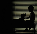
| 08/31/2006 11:12:50 PM |
my palby lynnmarieComment: The shadow on the left is quite distracting from the image. I'm a bit on the fence about the blinds. The parallel lines lend something to the image, but compete with the subject. If you keep them in, you should reposition your subjects and zoom in to eliminate the cord-tracks that hold the blinds up, leaving only the parallel lines. |
| Photographer found comment helpful. |
| 08/31/2006 11:07:57 PM |
Solitudeby sherpetComment: Your subject is getting lost in the background. I think getting more of a profile him would improve the lines of the silhouette as well. |
| Photographer found comment helpful. |
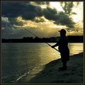
| 08/31/2006 11:04:04 PM |
Sea + Mate = Perfectionby LeooComment: The sea and sun look spectacular, but your subject seems a bit out of focus -- did you end up focusing on the ocean, perhaps? |
| Photographer found comment helpful. |
| 08/31/2006 11:03:00 PM |
Hoodlumsby russiComment: I think this scene would be much stronger with the hooded figure and the dog, but cropping out the guy on the right. I just don't like his pose, and his profile doesn't really sell the "hoodlum" look to me. I like the bright background, and it fits the them very well. |
| Photographer found comment helpful. |
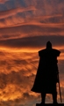
| 08/31/2006 11:00:10 PM |
Zeus' Comingby MeGoobieComment: Something about the sky is not helping you. With so much of the picture being featureless black, it needs a little more punch. You've blown out the lower part of the sky, as well. Maybe darkening the scene as a whole or upping the contrast? That being said, the silhouette itself is striking and growing on me the more I look at it. |
| Photographer found comment helpful. |
| 08/31/2006 10:44:47 PM |
Steadfastby KarenNfldComment: Beautiful and a strong image. My only complaint is that his head gets lost in the dark region in the middle of the picture. |
| Photographer found comment helpful. |
| 08/31/2006 10:40:28 PM |
Bull-headedby dx_powerComment: I think your subjects look more underexposed than silhouetted. They are in a bit of a grey zone where you've lost some detail, but not enough to really let the outline of the subject dominate the composition. |
| Photographer found comment helpful. |
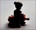
| 08/31/2006 10:34:32 PM |
silhouette dancerby sorayaComment: I think the figurine makes a poor choice for a silhouette as it tends to reflect the light from odd angles. Furthermore, this particular piece doesn't have a strong outline that is necessary to make a good sihouette, IMO. |
| Photographer found comment helpful. |
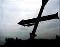
| 08/31/2006 10:28:56 PM |
roadsideby cheleComment: Nice gloomy feel to this. You've cropped it a bit too much on top, losing part of the sign, and on the right, crowding the tail of the arrow. You've also lost the point of the downward-pointing arrow in the horizon. |
| Photographer found comment helpful. |
Home -
Challenges -
Community -
League -
Photos -
Cameras -
Lenses -
Learn -
Help -
Terms of Use -
Privacy -
Top ^
DPChallenge, and website content and design, Copyright © 2001-2025 Challenging Technologies, LLC.
All digital photo copyrights belong to the photographers and may not be used without permission.
Current Server Time: 03/12/2025 01:28:30 AM EDT.