| Image |
Comment |
| 06/23/2006 06:08:45 PM |
New Growth...by littlegettComment: This one's composition is a bit cluttered. Needed to isolate those cone buds a bit more. The two vertical branches on either side are distracting.
Also, more saturation would have made the colour more vivid, which would add impact.
Great focus and DOF though. |
 Photographer found comment helpful. Photographer found comment helpful. |
| 06/23/2006 06:06:22 PM |
Successful Breedingby littlegettComment: Not a bad pic. The composition is decent - strong subject. A level shoreline might have made a stronger impact though (parallel bands of colour behind a subject usually emphasise the subject well). And there is good focus (although you could probably sharpen it up a bit more in pp).
Two things probably hurt your votes - firstly the lack of a more solid connection between your image and the theme. Most people tend to overlook the title...
And secondly, the overall tone is a bit flat. Needed to pump up the contrast and the colours a bit. On this site, photographers usually talk of getting their images to 'pop'. That's a good description of what I mean - if it was more vivid it would burst out at your eyes more.
Cute chick though... ;-) |
| Photographer found comment helpful. |
| 06/21/2006 03:30:10 PM |
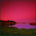
Tributeby PanoComment: This is such a good photo. I love the way that sweeping curve leads your eye up to that bold, dark image of the man. Incredible.
And I was lead to your portfolio after your post to that thread about tilted horizons. The horizon you have here is great. Not tilted - curved! In the context of the colouring and subject, the curved horizon almost makes it look like it's on a small asteroid or alien planet. Really eye-catching. |
| Photographer found comment helpful. |
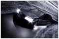
| 06/21/2006 11:22:30 AM |
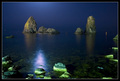
Moonlight...by gipomontesantoComment: It's a great shot. Has had me looking at it for ages.
The way the colours of the water and the sky blend into one another make it look like it's taken in a huge indoor tank - kinda like the one they used to film "Titanic" in - as if the water just drops off in front of a solid backdrop. It also has to do with the quality of the light - the moon seems more like a studio spot light. |
| Photographer found comment helpful. |
| 06/21/2006 11:09:49 AM |
|
| Photographer found comment helpful. |
| 06/21/2006 11:04:53 AM |
|
| Photographer found comment helpful. |
| 06/21/2006 11:03:41 AM |
Time Interrupedby accadyComment: There were quite a few people who entered clock faces - yours was the best. Mainly because of the simplicity of the composition, bold colours, and sharp lines. |
| Photographer found comment helpful. |
| 06/21/2006 09:17:00 AM |
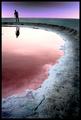
Remeber that walk ...by vikasComment: I gave this photo a high score during voting, but never made a comment. I really like this picture. I love the way the colour blooms as it approaches the subjects. It's a great use of framing. This would be an awesome set up for a wedding portfolio (bride and groom walking down the path). Has a really romantic feel. In fact, you probably could have added impact to the current photo if the pair had been holding hands. (Not sure if they were your models or not though). |
| Photographer found comment helpful. |
| 06/21/2006 05:18:33 AM |
Back to the Futureby glodaComment: Awesome shot. Love the "blurred walls of hyperspace" effect... And the exposure is perfect. |
| Photographer found comment helpful. |
| 06/21/2006 05:12:49 AM |
|
| Photographer found comment helpful. |
Home -
Challenges -
Community -
League -
Photos -
Cameras -
Lenses -
Learn -
Help -
Terms of Use -
Privacy -
Top ^
DPChallenge, and website content and design, Copyright © 2001-2025 Challenging Technologies, LLC.
All digital photo copyrights belong to the photographers and may not be used without permission.
Current Server Time: 04/12/2025 06:16:18 AM EDT.