| Image |
Comment |
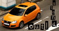
| 05/28/2009 12:46:08 AM |
Stand Out!by witt34Comment: I think this is a great idea, but I really don't like the font. It's very difficult to read the way you placed it. I want to read "Out!" before I read "stand," especially since the "O" looks capitalized due to the box around it while the "s" does not. Ads should be very clean and very very easy to read, especially since most ads are glanced at for a split second (flipping the page, turning the channel, driving by, and such). I really don't mean to be harsh, but ads are about conveying something, usually through text, so you should make sure that there is nothing that may hinder someone trying to understand your message. Changing the font is very simple to do, so I thought I should point it out. I hope you find it helpful. |
 Photographer found comment helpful. Photographer found comment helpful. |
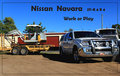
| 05/28/2009 12:34:43 AM |
Nissian Navaraby CraftyComment: I wish the car was a bit more of a focal point of the shot. It gets a little lost with the two other vehicles in the frame. Maybe get closer and use a wide angle? |
| Photographer found comment helpful. |
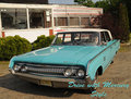
| 05/28/2009 12:32:09 AM |
Mercury's Rideby TomsPhotosComment: I LOVE the guy driving! I wish you had used a polarizer to remove the reflection on the window so he would have stood out more! A bit shallower depth of field, just enough to put a slight blur on the background, would have made him stand out more too. |
| Photographer found comment helpful. |
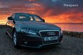
| 05/28/2009 12:27:37 AM |
Respect. by prperoldComment: Because of the tilted wall, I almost feel like the car is about the fall into the water : )
The background is beautiful, but I think that since it is so much brighter than the car, it pulls for more attention. Maybe a little more light on the front of the car?
Well done of the text. I'm glad you went with something simple and clean as opposed to something more attention grabbing. Simple fits very well. |
| Photographer found comment helpful. |
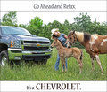
| 05/28/2009 12:23:23 AM |
Go ahead. Relax. by LydiaComment: I think this shot is overall very well done. The only thing I don't like is the font of the word "Chevrolet." Test that has even the tiniest bit of stylizing gives a fun, relaxed, un-serious feel. That works exactly as it should for the top line (the feel of the text conveys *exactly* what the text says), but the only reason why you can relax is because the Chevy is strong, tough, serious, etc, which is why I think it would have been much more powerful if the "Chevrolet" was in a heavy bold text. The way the name brand is portrayed is almost more important than how the item being sold is portrayed : ) But like I said, I really like the rest of the shot! |
| Photographer found comment helpful. |
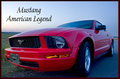
| 05/28/2009 12:18:13 AM |
American Legendby sfmorrisComment: I love the blue on the right side of the photo, but I'm not liking the font at all. It looks much too girly and frilly for a *Mustang*! : ) |
| Photographer found comment helpful. |
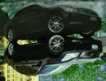
| 05/28/2009 12:16:18 AM |
My Baby - Infiniti G35xSby MisterMarcusComment: When I first looked at this, I thought, "Eek, watercolor PS effects!" Then I realized that the "effect" is just the texture of the pavement under the puddle in an inverted reflection shot. I think this idea can work well in some cases, but I can't really see any benefit of doing it in an auto ad like this, except to distract from the crazy things you did with the sky : ) |
| Photographer found comment helpful. |
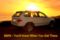
| 05/28/2009 12:11:02 AM |
BMW - You'll Know When You Get Thereby k9logicComment: I bet you're getting a lot of comments about that noise! Some fill flash (on-camera would have even been something) might have made it so you wouldn't have needed to bring up the blacks so much (I assume that's what you did, anyway).
I also think the flare is a bit distracting since it's on the car. If it was just in the sky, I'd say go with it, but not when it's covering what you're selling.
I might have also cleaned the dirt off the back since there's not a lot there : )
I do love the location though. The yellows are the oranges are great--very summery. Fits with the "go anywhere," summer road trip, driving in mud puddles thing : )
As I look at this longer, I think I also might have put the car a bit further to the left to leave some room in front of it. |
| Photographer found comment helpful. |
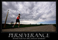
| 05/23/2009 08:44:26 PM |
PERSEVERANCEby LVicariComment: (I can't believe no one's quoted Toy Story yet...)
To infinity...and beyond!
(: |
| Photographer found comment helpful. |
| 05/15/2009 01:20:54 AM |
Lone Treeby dsa157Comment: I love the simplicity in this one. It should have scored so much higher! |
| Photographer found comment helpful. |
Home -
Challenges -
Community -
League -
Photos -
Cameras -
Lenses -
Learn -
Help -
Terms of Use -
Privacy -
Top ^
DPChallenge, and website content and design, Copyright © 2001-2025 Challenging Technologies, LLC.
All digital photo copyrights belong to the photographers and may not be used without permission.
Current Server Time: 04/16/2025 01:26:06 AM EDT.