| Author | Thread |
|
|
06/07/2009 03:44:04 PM |
Greetings from the Critique Club
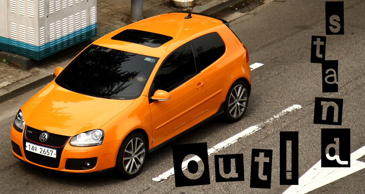
I read your photographers notes and noted that you did not shoot this specifically for this challenge. It is a pity that you had not taken the shot just a couple of seconds sooner, so that the car is entering the frame rather than leaving it. This would have given you more space to the left to add your text. The car would also not have been competing as much with the background.
The background is a bit distracting and I do believe it cost you a few points. I notice you are in South Korea, so it is probably not unusual to see the text as written over to the right. Again, I think this probably cost you a few points in the scoring, even though some of your commenters liked it that way.
|
|
 Photographer found comment helpful. Photographer found comment helpful. |
Comments Made During the Challenge  |
|
|
05/31/2009 06:05:48 PM |
| Love the text and colours on this. |
|
| Photographer found comment helpful. |
|
|
05/29/2009 12:49:29 PM |
|
| Photographer found comment helpful. |
|
|
05/28/2009 12:46:08 AM |
| I think this is a great idea, but I really don't like the font. It's very difficult to read the way you placed it. I want to read "Out!" before I read "stand," especially since the "O" looks capitalized due to the box around it while the "s" does not. Ads should be very clean and very very easy to read, especially since most ads are glanced at for a split second (flipping the page, turning the channel, driving by, and such). I really don't mean to be harsh, but ads are about conveying something, usually through text, so you should make sure that there is nothing that may hinder someone trying to understand your message. Changing the font is very simple to do, so I thought I should point it out. I hope you find it helpful. |
|
| Photographer found comment helpful. |
|
|
05/27/2009 10:37:20 PM |
| The roadside elements, the large white and blue box etc are distracting elements that draw attention. I am not a fan of the writing, as it is hard to read, and goes against the standard left to right. Reflections of the tree on the car is also an element that would have been best avoided. |
|
| Photographer found comment helpful. |
|
|
05/27/2009 06:43:07 AM |
This is VERY car add like! The text works very well in this shot, and feels completely appropriate. The only thing letting this one down is the big white thing (no idea what it is) in the top left corner.
The colours and the overall design are great, I would expect to see this on a large billboard by the side of the road.
9 from me, took 1 off a perfect 10 for the weird white object. |
|
| Photographer found comment helpful. |
|
|
05/27/2009 02:56:35 AM |
|
| Photographer found comment helpful. |
|
|
05/26/2009 09:48:35 PM |
| pretty car, nicely photographed, cool graphics - nice work |
|
| Photographer found comment helpful. |
|
|
05/26/2009 06:51:33 PM |
| Striking Colors on the VW! Bummer about the distractions in the background! I probably would have tried to re-crop. Mixed Emotions. Sorry... :} |
|
| Photographer found comment helpful. |
Home -
Challenges -
Community -
League -
Photos -
Cameras -
Lenses -
Learn -
Help -
Terms of Use -
Privacy -
Top ^
DPChallenge, and website content and design, Copyright © 2001-2025 Challenging Technologies, LLC.
All digital photo copyrights belong to the photographers and may not be used without permission.
Current Server Time: 03/12/2025 03:25:40 PM EDT.