| Author | Thread |
|
|
06/07/2009 02:28:54 PM |
Greetings from the Critique Club
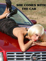
Conceptually a good car ad, composition is good, the graphics are good although not particularly sharp (don't know how to overcome that), but I believe what is letting you down is the post processing from the HDR image.
One of the problems I have experienced when using photomatix, is that the tonemapped image loses something along the way. Getting the tonemapping just right is I think very difficult. The car in your image has that weird very flat grey look often found in tonemapped images. There is a sort of halo effect around both the car and the mountains, which although only quite feint is there nonetheless. The image lacks contrast especially on the car. This is one of those cases I think where the HDR has not really improved the image.
Apart from the tonemapping problem, I think this was a well executed shot that met the challenge well. |
|
 Photographer found comment helpful. Photographer found comment helpful. |
Comments Made During the Challenge  |
|
|
05/31/2009 11:09:28 PM |
| Great overall composition hear. Maybe shooting from slightly higher, just so we can see a little more of the mountains would have been better, but I love the slogan and all the overall word positions used here |
|
| Photographer found comment helpful. |
|
|
05/31/2009 04:30:58 PM |
| Hmmm, Neo, do I get to choose it in RED or GREEN? :} Nice mirror symmetry between the roof of the car and the mountain top, BTW! |
|
| Photographer found comment helpful. |
|
|
05/30/2009 11:12:17 AM |
| good idea for the theme. just an extension of your thought: wouldn't it been better to show the car moving? rather than standing still? You're implying that you get get to places at this consumtion. But you're showing a car stinding still with no implied action, like doing something at the lake in be background (fishing, relaxing,...) |
|
| Photographer found comment helpful. |
|
|
05/29/2009 06:53:28 AM |
| Excellent ad, ok photo. It lacks pop and contrast. |
|
| Photographer found comment helpful. |
|
|
05/28/2009 11:14:03 PM |
|
| Photographer found comment helpful. |
|
|
05/28/2009 09:57:57 PM |
| picture in the darker ereas seem to be grainy, wich is distracting to me. hope this kinda helps in some way. |
|
| Photographer found comment helpful. |
|
|
05/27/2009 07:41:52 AM |
Good exposure and location, like the message you're putting across as well.
The shot seems a little flat though, it could be there there's a lot of grey in it and it all seems to blend together, but it just doesn't jump out the way you expect a car ad to do. 7 from me. |
|
| Photographer found comment helpful. |
|
|
05/26/2009 10:05:26 PM |
| i like the theme and text - very good ad for this type of ad. you picked a great place to get the shot - a beautiful vista. i just wish the light and angle of the shot would have brought more shine from the paint |
|
| Photographer found comment helpful. |
|
|
05/25/2009 12:41:42 PM |
| How it looks to me - I could be wrong of course. Shadows aren't dark enough and bright paintwork looks murky. Maybe the result of HDR being used where a single exposure might have been better . good luck |
|
| Photographer found comment helpful. |
Home -
Challenges -
Community -
League -
Photos -
Cameras -
Lenses -
Learn -
Help -
Terms of Use -
Privacy -
Top ^
DPChallenge, and website content and design, Copyright © 2001-2025 Challenging Technologies, LLC.
All digital photo copyrights belong to the photographers and may not be used without permission.
Current Server Time: 03/12/2025 10:50:40 PM EDT.