| Author | Thread |
|
|
06/07/2009 11:14:01 AM |
Greetings from the Critique Club.
Sorry you did not score higher with this image, I thought it was a fun entry.
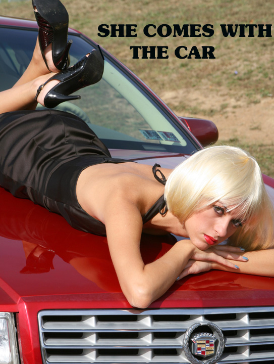
This is sort of reminiscent of the 1970's style car shows, where beautiful women would be draped all over the cars on the stands.
I think the font also has a very 1970's feel to it, which may very well have cost you a few points as far as DPC is concerned. The car feels as though it is framed a bit too tightly. I would really like to see a little bit more of the car itself. Somebody else commented about the badge of the Cadillac being cut off, this likely cost you a few points. I have come to realise over the years on DPC, it is these really small details that typically make the difference between a lowish/average score and a higher score.
Well done though, for even though it didn't score so well, I think it was a very well conceived idea.
|
|
Comments Made During the Challenge  |
|
|
05/31/2009 11:14:34 PM |
| That would be nice.........Very different image that is well executed. Classical car ad rather than the more modern ones we have seen in the rest of the challenge. |
|
|
|
05/28/2009 11:32:25 PM |
| great concept - font choice hurts this one |
|
|
|
05/28/2009 01:50:15 PM |
|
|
|
05/28/2009 11:05:36 AM |
|
|
|
05/27/2009 04:38:51 PM |
Yeohhhhhh!
I can hear the conversation now, "No, Officer! I'm not drunk! I just can't keep my eyes on the road!" X} |
|
|
|
05/27/2009 04:16:13 PM |
|
|
|
05/27/2009 02:00:02 PM |
|
|
|
05/27/2009 01:35:25 PM |
| In the long haul, I'll bet she costs more! |
|
|
|
05/27/2009 03:01:10 AM |
|
|
|
05/26/2009 10:14:17 PM |
| funny take- that is not my father's Cadillac! |
|
|
|
05/26/2009 07:30:00 PM |
|
|
|
05/25/2009 04:51:00 PM |
Well, let me qualify my comments with this. If you were submitting this just for fun/laughs, I got a kick out of this. Too funny. Another high maintenance accessory with a high maintenance car. :)
On the serious side (if this was a serious submission), you probably should have picked a font matching the Cadillac style. Probably shouldn't have cut off the bottom of the Caddy emblem. Maybe tried a head on shot of the Caddy with the model centered above the emblem. And finally, the model's lipstick matches the car, maybe had the model paint her nails red too.... |
|
|
|
05/25/2009 11:42:32 AM |
| I wish the background were a little more exciting or colorful, as opposed to simply a grassy hill. Great angles, and I really like the model's look, though! Phenomenal title, as well! |
|
|
|
05/25/2009 12:16:35 AM |
|
Home -
Challenges -
Community -
League -
Photos -
Cameras -
Lenses -
Learn -
Help -
Terms of Use -
Privacy -
Top ^
DPChallenge, and website content and design, Copyright © 2001-2025 Challenging Technologies, LLC.
All digital photo copyrights belong to the photographers and may not be used without permission.
Current Server Time: 03/14/2025 01:39:25 AM EDT.