| Author | Thread |
Comments Made During the Challenge  |
|
|
05/31/2009 11:22:21 PM |
| Not really sure about the text fonts etc used here. A nice image, but the angle/colours and composition of the image don't help it stand out fromt eh crowd |
|
 Photographer found comment helpful. Photographer found comment helpful. |
|
|
05/29/2009 07:50:53 PM |
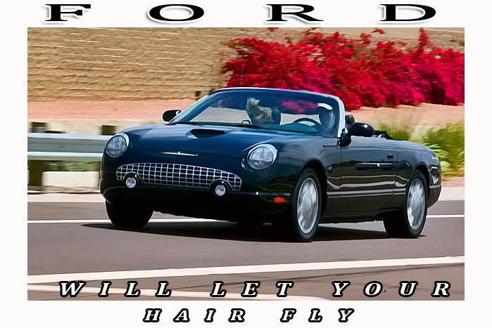
Nice enough shot, but it doesn't "feel" like an auto ad. I'm not entirely sure why, I think it might be a combination of things.
Firstly I don't particularly like the text, this feels more like a postcard than an ad. Next is the very slight motion blur. You've done a great job of capturing the car but because the motion blur on the background is only very slight, it feels more like you did something wrong than it being something you were going for.
Lastly is the red bush thing in the background, it draws too much attention and doesn't leave the shiny black car to stand out on its own. Giving this a 5. |
|
| Photographer found comment helpful. |
|
|
05/27/2009 01:50:25 PM |
| not wild about your text; image makes the car look fun! |
|
| Photographer found comment helpful. |
|
|
05/26/2009 04:19:21 PM |
i love the look of these cars - nice capture to get one going - too bad the passenger's hair is getting thrown around so - it seems to distract more than aid to the ad. good photo overall
i am not fond of the font choice - it seems a bit heavy and overwhelms the car a bit |
|
| Photographer found comment helpful. |
Home -
Challenges -
Community -
League -
Photos -
Cameras -
Lenses -
Learn -
Help -
Terms of Use -
Privacy -
Top ^
DPChallenge, and website content and design, Copyright © 2001-2025 Challenging Technologies, LLC.
All digital photo copyrights belong to the photographers and may not be used without permission.
Current Server Time: 03/12/2025 09:40:47 AM EDT.