| Author | Thread |
Comments Made During the Challenge  |
|
|
05/31/2009 03:08:33 PM |
| it looks as if you're advertising the backhoe rather then the truck . |
|
 Photographer found comment helpful. Photographer found comment helpful. |
|
|
05/28/2009 12:34:43 AM |
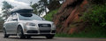
| I wish the car was a bit more of a focal point of the shot. It gets a little lost with the two other vehicles in the frame. Maybe get closer and use a wide angle? |
|
| Photographer found comment helpful. |
|
|
05/27/2009 04:33:00 PM |
| Nice Layout, but sadly a tad busy... |
|
| Photographer found comment helpful. |
|
|
05/27/2009 06:51:09 AM |
This is very good for an add, and a very well targeted one too as opposed to all the generic stuff I've been seeing so far.
The environment, the trailer, the positioning of this all scream "HEAVY DUTY OFF ROADER", which I think would do a great job appealing to a particular market segment.
My only complaints with this one are that the car feels a little bit crammed into the right side, and your border is actually cutting into it. Other than that, great shot. 9 from me. |
|
| Photographer found comment helpful. |
|
|
05/26/2009 10:20:41 PM |
| the colors are nice and bright and the theme is a good one for this type of vehicle - but I am not crazy about the border, the choice of font, or the angle of the truck crowed by the big rig behind it |
|
| Photographer found comment helpful. |
|
|
05/25/2009 03:47:01 PM |
| I don't think the thin border was needed or adds to the image. Being that you did add the border, you probably should have adjusted the framing of the Nissan so that the border didn't cut through the right side of the bumper. Also, if you were able to compose the shot, it might have been better to move the position of the Nissan so that the dump truck wasn't in the background. Just an honest critique. |
|
| Photographer found comment helpful. |
|
|
05/25/2009 04:14:03 AM |
Like the idea. Love the blue sky. Hitching the trailor is good.
However, the crop is too tight. You are on the edge of losing the front bumper, and the border goes through it. Also, the trailor is partially cropped off. The car needed to be more towards the centre, on the line of third, as the main subject, with the trailor behind as a secondary element
Also, there are too many distracting elements in this. The truck is a major problem, it doesn't add to the message, neither does the garage either, but both just grab the attention. |
|
| Photographer found comment helpful. |
Home -
Challenges -
Community -
League -
Photos -
Cameras -
Lenses -
Learn -
Help -
Terms of Use -
Privacy -
Top ^
DPChallenge, and website content and design, Copyright © 2001-2025 Challenging Technologies, LLC.
All digital photo copyrights belong to the photographers and may not be used without permission.
Current Server Time: 03/16/2025 12:30:36 AM EDT.