| Author | Thread |
|
|
06/07/2009 04:07:35 PM |
Greetings from the Critique Club
Looking at the comments below, I see that you have not marked some as helpful. That is very interesting because instead of the normal one or two words, at least two of those comments are extremely helpful as they are explaining to you why you like only scored a 5.00. I am likely to repeat most of what they said in my critique.
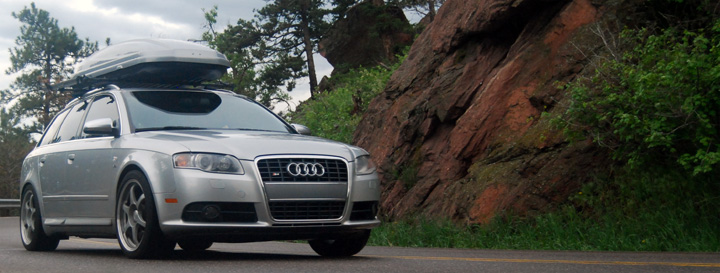
The composition is good, you have the car driving into the frame which works well. The choice to use a sort of letterbox crop is interesting and I'm not 100% sure that this works that well. I think I would prefer to see a little more vertical height above the roof of the car.
The focus seems a bit off, the rocks to the right of the frame are sharp but the car is not that sharp (it doesn't really look like motion blur). Also, the image feels a bit flat with regard to the lighting. A boost in levels would likely have helped a bit here, as it seems a bit underexposed.
As this was an advanced editing challenge, you could have selected the car and adjusted the levels (midtones) specifically for the car and then inverted the selection and boosted the rest of the image (highlights). I feel sure this would have helped.
As this was a automobile ad, I think you would have really helped your score by adding some text/graphics to the image. Most of the higher scoring images had texts added.
I was surprised this didn't score higher. It is a good image that could benefit from a bit more advanced editing. Hopefully you understand a bit better now why it only scored a 5.00.
|
|
Comments Made During the Challenge  |
|
|
05/30/2009 10:45:11 AM |
| If you're looking at Auto Ads, you can always see the driver through the windshield - thanks to polarizers :) I would have like to see some more surrounding of the car. |
|
|
|
05/29/2009 10:11:37 PM |
Nice enough shot, the composition and location are nice but there are a couple of things which detract from it.
The car looks a bit out of focus or perhaps it's motion blur, can't really tell. Also, the overall shot is lacking definition and the colours look a little flat, perhaps a saturation increase and or sharpening would have helped. 5 from me. |
|
 Photographer found comment helpful. Photographer found comment helpful. |
|
|
05/28/2009 11:00:16 AM |
| the color of the car doent seem to make fit in with the scenery. |
|
|
|
05/26/2009 10:40:29 PM |
| A great composition on this image. Yopu have given great space on the right which has lead to a balanced photo. The panoramic crop works for me with this. Maybe some words in it to make it the true Ad for the car. A good image that works well for the challenge. |
|
| Photographer found comment helpful. |
|
|
05/26/2009 09:46:27 PM |
| pretty car and great scenery - i just wish the light were a bit better to show the gloss on the paint and that crop were not quite as tight in the vertical direction |
|
|
|
05/26/2009 11:46:38 AM |
| "Getting Audi in Nature!" :) |
|
Home -
Challenges -
Community -
League -
Photos -
Cameras -
Lenses -
Learn -
Help -
Terms of Use -
Privacy -
Top ^
DPChallenge, and website content and design, Copyright © 2001-2025 Challenging Technologies, LLC.
All digital photo copyrights belong to the photographers and may not be used without permission.
Current Server Time: 03/15/2025 06:38:10 PM EDT.