| Image |
Comment |
| 02/03/2010 12:46:27 PM |
He will be a bright skater one day...by sarampoComment: Greetings from the Critique Club.
First impressions are that this is fantastic. The colours pop and the little light man is great.
Technically this is almost spot on. The light man is right in the centre which is probably the best place for him in this composition. The bridge forms a nice line that merges well with the slope covered in graffiti. Great star shapes in the lights
Artistically this rocks. The combination of the graffiti with the whimsical nature of the light man makes us think about the shot. I enjoy looking at this.
In summary this is fun and while not really about the graffiti does meet the challenge. Congrats on your top 5.
Feel free to PM me if you have any queries.
Gerry |
 Photographer found comment helpful. Photographer found comment helpful. |
| 02/02/2010 08:22:22 PM |
|
| Photographer found comment helpful. |
| 02/02/2010 12:06:58 AM |
|
| Photographer found comment helpful. |
| 02/01/2010 03:49:27 PM |
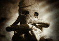
Yes, I Love You Mr Scaryby artistChanComment: Greetings from the Critique Club.
First impressions are that this is a great macro shot with a very interesting subject.
Technically this is very good but there are a couple of major issues. Frist that blade of grass in front of him. I'd have looked to clone that out but it would have been tough to reconstruct his face. Second, in order to expose his face properly it has blown out the background and overall the lighting looks harsh. Other than that this is good.
Artistically there is not much to say. The centred composition works well for dramatic effect.
In summary it's a good shot but the technical elements held it back a little. Good work for challenge #3 though.
Feel free to PM me if you have any queries.
Gerry |
| Photographer found comment helpful. |
| 02/01/2010 02:07:58 PM |
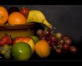
Still Fruit of Lifeby TerComment: Greetings from the Critique Club.
First impressions are that the shot is good as it is nicely balanced and the fruit is arranged so as to help the flow of our eye.
Technically the lighting seems a bit harsh (see the hotspots on the fruit) and it is concentrated in an area that is a little too small as it drops off on some of the fruit too soon for my liking. The DOF is large enough but that banana seems a little soft to me.
Artistically I like the choice of background but the widescreen style framing is not a good look here. Often it helps a crop like this but there I think it is too much of a contrast with the shot itself and with a fruit still life, a dramatic contrast is not what is needed.
In summary this is a good shot that has a couple of areas for improvement that held it back.
Feel free to PM
me if you have any queries.
Gerry |
| Photographer found comment helpful. |
| 02/01/2010 02:03:09 PM |
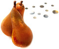
Kissing pearsby docjonnyComment: Greetings from the Critique Club.
First impressions are that the shot is nice and crisp with some intrigue. Once I view for longer I start to see the issues.
Technically the composition is good but it's those dot things that balance the shot. The pears are a little too close to the left edge. The lighting is good in that is has the pears against a crisp white background but this is a double-edged sword in that it also makes the shot seem a bit sterile.
Artistically those dot things confuse us viewers. How do they relate to the fruit? Is this an "artistic" element?
In summary this has some really good points but I think the average voters was confused by those dots and the sterile feel.
Feel free to PM
me if you have any queries.
Gerry |
| Photographer found comment helpful. |
| 02/01/2010 01:59:15 PM |
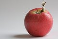
CottonAppleby MArteSiComment: Greetings from the Critique Club.
First impressions are that this has a nice minimalist feel to it and that is good.
Technically the composition is good and the lighting is fine, if not just a little bit flat.
Artistically there are two things I think let this shot down. First, what are those things on the apple stalk? They don't add value and take away from the uncomplicated feel this shot has. Also, the grey background seems to be too bland, a different colour (not too colourful) or a slight pattern perhaps?
In summary this shot is ok and has great potential but just doesn't pull it off.
PS: Get out there and cast some votes ;)
Feel free to PM
me if you have any queries.
Gerry |
| Photographer found comment helpful. |
| 02/01/2010 01:56:11 PM |
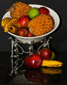
Refelctionby tinkie2010Comment: Greetings from the Critique Club.
First impressions are that there is far too much going on in this shot.
Technically the lighting is too harsh - that will be the flash. Did you bounce it or diffuse it? Composition needs work too - the platter thing is too cramped against the edge of the frame.
Artistically the choice of platter may not have been best but I don't think that's the biggest issue here. The surface you have used is too reflective and that complicates the image rather than allowing us to focus on the fruit and the bowl.
In summary this is a good idea but it just hasn't come off. Try to reduce the harshness of the lighting and make the composition less complex.
Feel free to PM
me if you have any queries.
Gerry |
| Photographer found comment helpful. |
| 02/01/2010 01:48:38 PM |
First Still Lifeby MinsoPhotoComment: Greetings from the Critique Club.
First impressions are that processing is what this shot is about, rather than the shot itself.
Technically the processing is poor. Some may like the cartoon style photomatix can produce and in some cases it works but for a still life with fruit, I don't think so. If it weren't for this processing you would have a much higher score as the composition is good and the lighting seems fine.
Artistically placement of the fruit is good and the candles are a really nice addition. The background could be blurred some more to enhance the separation. The border is too much I feel, it's always best to go for less when adding borders for DPC shots.
In summary this could have been a great shot but the use of your processing technique cost you a full point. Even so, a new PB can't be bad can it? ;)
Feel free to PM me if you have any queries.
Gerry Message edited by author 2010-02-01 13:51:01. |
| Photographer found comment helpful. |
| 02/01/2010 01:44:03 PM |
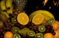
Seven Fruitsby BJokerudComment: Greetings from the Critique Club.
First impressions are that the lighting is too harsh and the subject very complicated.
Technically the lighting seems to be the biggest issue. Is it flash lighting? There is nice separation from the background but it is very harsh indeed. The colours are also a little muted.
Artistically the fruit is arranged in an awkward manner that means we struggle to focus on anything in particular.
In summary this has great potential but comes across as more of a snapshot, something DPC voters tend to frown upon.
Feel free to PM me if you have any queries.
Gerry Message edited by author 2010-02-01 13:51:23. |
| Photographer found comment helpful. |