| Image |
Comment |
| 01/06/2006 02:42:38 PM |
|
 Photographer found comment helpful. Photographer found comment helpful. |
| 01/06/2006 01:49:38 PM |
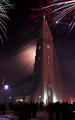
At the stroke of midnight.by sissiComment: I was getting so sick of fireworks shots but this one is exceptional. Contrasts, hues and composition all work for me. Love the dark figures in the foreground, the crispness and spareness of the fireworks and particularly, the juxtaposition of the white center of the red firework and the glow of the cross (despite not being religious, haha). Also like how flat and painted the church looks, beautiful building too. Nice work. |
| Photographer found comment helpful. |
| 01/06/2006 01:43:53 PM |
|
| Photographer found comment helpful. |
| 01/06/2006 01:35:39 PM |
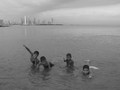
innocenceby valenzuelamauricioComment: Nice amount of contrast - makes it misty, like a memory. Great use of space and flawless focus. Cute kids don't hurt neither! Good answer to challenge. Well done. Thanks. |
| Photographer found comment helpful. |
| 01/06/2006 01:29:49 PM |
|
| Photographer found comment helpful. |
| 01/06/2006 01:27:52 PM |
|
| Photographer found comment helpful. |
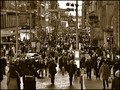
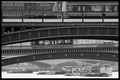
| 01/06/2006 01:25:33 PM |
Crossingsby ImagineerComment: Complicated! Wonderful! Contrast is at perfect level, I think if it were any more, my eyeballs would revolt. I like the ambiguity of the era depicted. There is a seriousness to this photo, but all the different patterns give it a whimsy too. Excellent. Thanks. |
| Photographer found comment helpful. |
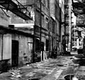
| 01/06/2006 01:20:29 PM |
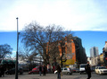
Urban Reality by Patents4uComment: The realism of this shot is what gets me. Good choice of scenes. Flat, stark and dank. My eye likes those horizontals in the foreground leading to the verticals in the background. You made a busy shot work well. Apt title. Nice going! |
| Photographer found comment helpful. |
| 01/06/2006 01:00:33 PM |
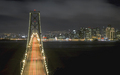
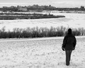
Pushed to the City Limitby dw_photoComment: Hi. Reminds me of NJ's Meadowlands. Perfect level of sharpness and great contrasts throughout. Swirling crop-circle shapes in the center with verticals in foreground and background. I love the composition and the loneliness of this photo. Thanks. |
| Photographer found comment helpful. |
| 01/06/2006 12:50:57 PM |
Not looking up?by QuickeyeComment: Hi. My guess is that the title is hooked into why you used this perspective and left the sky uncropped, but for me, the scene is too subtle to illustrate it. I feel a little frustrated by the lack of focal points and mesh of heights on the ground. Will be interested to read what you'd set out to do. Thanks. |
| Photographer found comment helpful. |
Home -
Challenges -
Community -
League -
Photos -
Cameras -
Lenses -
Learn -
Help -
Terms of Use -
Privacy -
Top ^
DPChallenge, and website content and design, Copyright © 2001-2025 Challenging Technologies, LLC.
All digital photo copyrights belong to the photographers and may not be used without permission.
Current Server Time: 04/02/2025 04:09:34 AM EDT.