|
|
|
Showing 1391 - 1400 of ~1705 |
| Image |
Comment |
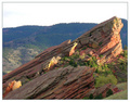
| 05/08/2006 02:06:10 PM | Backlit Under Cloudsby RebeccaComment: hiya from the ctp2!
First Impression:
nice. a good starting point of an image, but... it could be much much more.
Composition:
very good composition. the angle of the rock formations works well, as wel as the slightly anthropomorphic face at the peak.
Technical:
all fine, but, again, i want more! ;-) if the saturation were up, the rocks would pop - the reds and yellows would glow. the atmospheric perspectve works quite well, but more contrast and darker for the background hills would really bring the rocks out.
the sky is very bright, and brings the viewers focus away from the rocks to...white. i can see a tiny bit of detail in the sky, again, more showing would be great. either really bumping it and turning it into a threatening sky, or just enough to focus on the rocks.
if the foreground grass were burned a bit, this would draw the viewer's gaze in more. again, the whole thing should be more saturated. redder reds, greener greens.
Summary:
a nice image with the potential to be much, much more. Message edited by author 2006-05-10 19:01:04. |  Photographer found comment helpful. Photographer found comment helpful. |
| 05/08/2006 01:53:34 PM | Palistinians go to Work in West Bank and Gaza againby GunnsiComment: Hi Gunssi, from christian, ctp2
First Impression
A very striking image, clean and simple, yet powerful for all that.
Composition:
very good. the crane in the background is very effective, with the atmospheric perspective. the small lights in the distance help to create a feeling of isolation and loneliness. the way the horizon line extends in the background hill works very well.
Technical:
i'm not sure about the purple. i think i'd have liked a slightly more realistic sky colour. also, there seem to be some jpeg artifacts happening around the edges of objects, that i'm sure can be corrected (but i don't know how - change how you save???)
My opinion:
a very strong image indeed. i gave it a 7 in voting. well done.
cheers, gunnsi,
c. Message edited by author 2006-05-10 19:01:37. | | Photographer found comment helpful. |
| 05/07/2006 02:26:07 PM | From outer spaceby facesastheycomeComment: Hello, this is christian here, and i'm a new member of the critique club. this is my first critique with the c.c., so at the moment i'm using a format borrowed from others. i hope this is helpful to you, and if you have any questions about what i've said, please p.m. me.
First Impression:
a good strong shot, well composed and nice tonal range.
Composition:
quite good, but with further looking, some weak areas appear. i find the pattern of the roof in the upper left corner rather distracting. it may have worked in positive, but it's not helpful in the negative version. i think if you had cropped the left side to just beyond the start of the poky-out bit (octopus' head?)(i'm pointing at the screen here, just pretend you can see me...)it would be stronger. the large area of blur, again isn't effective in this shot.
i think a crop would focus the viewers gaze, and make it a better image.
the intertwining of the tentacles is very nice indeed
Technical:
the focus is good, crisp and clear. i like the simplicity of the straight inversion - you have a good contrasty shot and that works very well with the negative. one thing, i think it would help the image if the large tentacle on the bottom centre right was darkened just a little where it meets the body of the octopus. it's just a little flat and plain, and detracts from the suckers in front of it. so, if you're in negative, that means you should...dodge the shadow on your positive. had to think for a second there...
i like the rich blacks and bright whites.
My Opinion:
a very strong image, stiking and pleasing to the eye. i didn't vote on this one, i ran out of time, but i probably would have given it a 6. it works well, and immediately catches the eye. the texture and exposure are very nice, and do well together.
well done, and keep shooting. you live in a place of perfect light, lucky you! again, if you have any questions, please do contact me.
cheers,
c. Message edited by author 2006-05-07 14:29:14. | | Photographer found comment helpful. |
| 05/06/2006 07:16:58 PM | | | Photographer found comment helpful. |
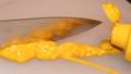
| 05/06/2006 06:00:13 PM | Cut the Mustardby RMyers1314Comment: a great idae, but the poor focus really lets you down. nice exposure, but the dark top right corner is distracting. | | Photographer found comment helpful. |
| 05/06/2006 05:58:12 PM | On the Lambby lawreeComment: cute idea, but the lack of focus really lets you down. also, the light is very harsh. | | Photographer found comment helpful. |
| 05/06/2006 05:57:09 PM | let sleeping dogs layby MadukesComment: a nice idea, but the poor focus and eposure really let you down. more contrast might help, as well shooting from a more dramatic angle - perhaps from the muzzle or foot. | | Photographer found comment helpful. |
| 05/06/2006 05:24:18 PM | It'll only hurt for a minute!by NowaytotellComment: it took me awhile, but then i remembered. gah. it bloody well does hurt for a ling time!
too bad about the focus here. if it was just a little bit sharper...
this is very interesting shot, very dsconcerting,. | | Photographer found comment helpful. |
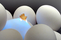
| 05/04/2006 01:10:38 PM | Genesisby BeeCeeComment: a super idea, ma dear. i do like the fact that whole isn't blue, as it does look like the blue is 'emmanating' from the egg, as it were. and, yes, so nice not to see a flower or a baby...
interesting, and funny too. a great combo.
thanks for the thoughful comment on my windows one. i must say, you've imbued it with much more deep thought than i did! | | Photographer found comment helpful. |
| 05/04/2006 12:44:35 PM | wispby RikkiComment: this is stunning rikki. i gave it a 10, which is rare for me. simple, clean, and beautiful. if you ever make this available as a print, i'm there, man... | | Photographer found comment helpful. |
|
Showing 1391 - 1400 of ~1705 |
Home -
Challenges -
Community -
League -
Photos -
Cameras -
Lenses -
Learn -
Help -
Terms of Use -
Privacy -
Top ^
DPChallenge, and website content and design, Copyright © 2001-2025 Challenging Technologies, LLC.
All digital photo copyrights belong to the photographers and may not be used without permission.
Current Server Time: 04/18/2025 07:13:29 AM EDT.
|