the empty combinationby
gocComment: Critique Club Comment
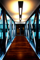
Initial thoughts: wow, nice colors and great symmetry
Visual appeal: yes, the colors of the wood are dark and rich, and the lighting seems to give a nice moody feeling,
Subject & background: I think that you must have been one of the people who didn't read close enough to see that you were supposed to have a "thing" in the room, of course, your thing could have been the door or something, but I'm guessing DPC probably wouldn't have gone for that either. I also noticed some comments about it being a hallway, and not a room, but personally I think that it works fine for the challenge, how many people have a big empty photogenic room? but yes, you would have done much better with something in the room to focus on for this challenge specifically, for your other photography interests, I would leave it as is; it would also be very hard to find a subject to put in here that wouldn't detract from its surroundings.
Angle, framing & composition: I think the perspective is just awesome, I love how you managed to get the symmetry just about spot on. The only thing I notice is that the left side is a little distracting, I would try cropping it a bit, I tried cropping it and liked it cropped just barely outside the little black "bar" you see between the edge and the beam (so that you can still see the "bar"). This seemed to be the most pleasing.
Focus, clarity & DOF: Seems pretty good to me, I would try to get your camera to focus on the beams as well as the door and see what you get. You also might try just a little more sharpening, probably selectively to the beams so as not to hurt the rest of the picture. Also, I think that the wood floor looks fine how it is.
Lighting & exposure: I think the lighting is just right. You might try getting rid of the lighting spot on the floor since this is advanced editing and the reflection to the right side on the floor. I tried using the burn tool and it seemed to work, also try messing with the exposure on the burn tool.
Post processing: I like what you've done, no obvious editing mistakes or anything that I can see. I did take your photo into PS and messed with the colors a bit. I changed the hue of your cyan to more of a blue and darkened it and played around with the saturation level. I think that it gives it more of a dramatic feel than the bright cyan. It also gave the beams more of a steel color.
Overall, my opinion: I think this is an excellent photo, maybe not for this particular challenge, but a really great execution nontheless. Great work, and I look forward to seeing more of your stuff in future challenges!
If you have any questions regarding this critique, feel free to PM me
Amanda