| Image |
Comment |
| 03/12/2007 12:44:40 PM |
Tempus Fugitby jackal9Comment: A lot of interesting timepieces in this challenge. Yours is one of them. The use of motion blur is particularly nice. The eye is drawn to the paperclip securing the clock's hands. Unfortunenately it and a few other places in the composition suffer from digital "jaggies" that act as a distraction in this fine composition. |
 Photographer found comment helpful. Photographer found comment helpful. |
| 03/12/2007 12:39:30 PM |
Already lunch time!by imagine74Comment: Very much lke the attention to detail with the chained link fence arrangement. Ironically, in order to achieve that nice fence framing you had to tilt the true horizon - as revealed by building and water background, and the curb where your subject is sitting - clockwise. :( The out-of-focus yellow flowers in the foreground act as a distraction. |
| Photographer found comment helpful. |
| 03/09/2007 11:46:27 AM |
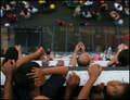
Victory Hugby pmichaudComment: Positive:
Overall this is a fine photojournalistic capture worthy of publication. This image has strong emotion. The BG provides perspective and context to the image far, far better than most. Exposure is good and general photographic technical quality is fine. It gives the viewer much to think about. Is this the wrestler's father happy at a victory? Is it a coach happy over his first ever state champion? It preserves a touching moment in time that can never be captured again which is a fundamental purpose of photography itself.
Technicals:
The BG is a strength. It clearly shows the context generating the reaction we see. Inclusion of the referee is very nice and it clearly shows the gym atmosphere of a wrestling competition. You are perfectly placed for the capture of the moment. That makes this a very fine image.
Though exposure is good the overall lighting is nothing special. The capture of the moment is great, but the overall perspective has more in common with a snapshot than it does with fine art.
The challenge:
Right or wrong, voters in free study challenges are looking more for fine art images of exceptional technical quality than anything else. The 'snapshot' perspective and lack of funk and flash post processing hurt this image in voting. When there are over 600 entries in a challenge with many being exceptional technical achievements it is easy for an image like this to be overlooked. It was.
If you had surrounded it with a gradient like the three ribbon winners and applied some serious dodge and burn to hit the voter over the head with the embrace then it would have been more 'artistic' and scored a lot higher. |
| Photographer found comment helpful. |
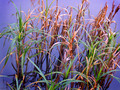
| 03/08/2007 07:07:18 PM |
Sunset Reedsby Shadowi6Comment: Positives:
Focus is good which works well for the amount of detail contained within the image.
Technicals:
As far as focus and detail are concerned this image is good.
Color is problematic, it does not look 'natural'. At least on my monitor the blue is to purple and the dried grasses are to red.
Perspective is also problematic. A different angle from a 'snapshot' perspective would be a lot better for this image. It depends more on technicals, including perspective, than it does on content for its impact on viewers.
A weak subject matter hurts this image.
The challenge:
Free study submissions depend more on technical quality than anything else for their score. The quality in this image, specifically related to color, is weak and combined with a difficult subject and pedestrian perspective you got a low score.
Bummer! |
| Photographer found comment helpful. |
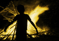
| 03/08/2007 01:49:49 PM |
Attracted by Fireby dreamyComment: Positives:
There are emotional aspects of this image that are appealing. The boy in front of the fire begs the viewer to speculate what the child is experiencing and thinking. Placing the subject between the brightest flame and photographer works well.
Technicals:
Sharpness is not bad, but could be better.
A problem with low light situations is that the image tends to be overly yellow(as is likely in your case) or red(as common with people images) because of white balance issues under those conditions. If you have to overcome those issue then you may already have lost the battle for a great photograph regardless of content.
You did the best you could under those conditions but really stood no change to overcome that.
In its own way the use of yellow is fine, but the lack of other color detail gives it a superficial, overprocessed appearance.
The challenge:
Again, the assumption of voters for a free study is images of the highest technical quality. When disappointed they punish the images with a low score. That is not to say the image deserves the lower score, it is just the way DPC voters think. |
| Photographer found comment helpful. |
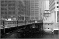
| 03/08/2007 01:28:32 PM |
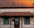
Bridge Towerby meyersComment: Positives:
A nice wintery cityscape capture. I cannot describe why, but this captures the feeling of a big city(Chicago) in winter and that is its strength. Nicely done in BW to capture that feeling.
Perhaps it is because I have been through Chicago a couple times and have an appreciation for the city.
Technicals:
The technicals are good and exposure fine across the full range of luminosity. Composition wise there is nothing compelling about it, according to the 'rules', but I really like it anyway. It has lighting balance that works well an it has a technical feel to it, including sharpening, that cannot be denied as being good.
The challenge:
As a free study entry in challenges that have a lot of high quality entries this one suffers from 'subtlety'. It is to subtle to be appreciated in the time that most DPC voters have to devote to making a judgement.
This is a fine image!
I find it interesting that, like routerguy666's cityscape before, that this image has a statistical overabundance of 2s. Might be for a similar reason. It requires viewers to spend more time evaluating it to appreciate it's traits and typically the DPC voting process does not lend itself well to that. Message edited by author 2007-03-08 19:06:44. |
| Photographer found comment helpful. |
| 03/08/2007 01:05:46 PM |
Bridge Towerby meyersComment: Positives:
A nice wintery cityscape capture. I cannot describe why, but this captures the feeling of a big city(Chicago) in winter and that is its strength. Nicely done in BW to capture that feeling.
Perhaps it is because I have been through Chicago a couple times and have an appreciation for the city.
Technicals:
The technicals are good and exposure fine across the full range of luminosity. Composition wise there is nothing compelling about it, according to the 'rules', but I really like it anyway. It has lighting balance that works well an it has a technical feel to it, including sharpening, that cannot be denied as being good.
The challenge:
As a free study entry in challenges that have a lot of high quality entries this one suffers from 'subtlety'. It is to subtle to be appreciated in the time that most DPC voters have to devote to making a judgement.
This is a fine image! |
| Photographer found comment helpful. |
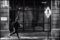
| 03/08/2007 12:38:22 PM |
Synchronicityby violinist123Comment: Positives:
Framing, image balance and composition are incredibly well done. Technical quality is right on! The use of the background building brickwork for natural framing is a wonderful touch. The juxtaposition of the runner with the sign adds considerable interest and nice balance to this imagery. A thought provoking image well thought out by the photographer. Worthy of a "best of" challenge. Kudos to you!
Technicals:
Composition, framing and balance in this image are its strengths. Nice BW and good choice for this image. Just the right amount of grain for the composition. The crop is EXCEPTIONAL. It is absolutely level and using the buiding brickwork for natural framing is a wonderful added touch. Your attention to detail is to be commended, that is the hallmark of a great photographer.
After post processing a thing that can be done is to apply a quick "Autolevels" adjustment to the image to see if you have not screwed it up. If it does NOT change it normaly means post processing is 'good'. There are exceptions to this. Your image, of course, is rock solid! No surprise.
The challenge:
Scorewise, this image was affected primarily by two things. One, it is submitted to a free study challenge with over 600 hundred images and free study challenges tend to have very high quality images. Two, DPC voters are affected by funk and flash and vote them higher, particularly in a challenge with lots of entries. Yours requires more attention to detail to be appreciated. It did not get it.
I see there is a statistical overabundance of 2s given. This probably comes from voters who noticed the motion blur of the runner, assumed it meant the image was out of focus, and did not look beyond that.
I would not change a thing. Personally, I'd be proud to have this image in my portfolio. |
| Photographer found comment helpful. |
| 03/08/2007 12:23:26 AM |
familyby boysetsfireComment: Positives:
Nice perspective and an interesting angle of capture. Its different. The DOF nicely draws attention to the girl looking up. The variety of people provides a lot of stories within this capture for the viewer to speculate on. Nice wide variety of colors.
Technicals:
Technical quality is generally good. Use of DOF to draw attention to the girl is achieved. Sharpness is well done. The horizontal lines in this image are off a little, it looks like you might need to rotate it slightly clockwise.
Generally speaking the distribution of people works well except for the left foreground. The boy's left arm looks like it is sticking out of his head and that is a distraction. You might consider cloning out the forehead of the adult behind him. The left foreground looks cluttered.
The challenge:
The concept of love is hard to immediately recognize within the context of the composition and that probably affected this image in voting. |
| Photographer found comment helpful. |
| 03/07/2007 11:34:39 PM |
101by gg3rdComment: Positives:
There is a lot to like about this image. The care you've taken with the symmentry in this composition is exceptional, as is its sharpness. The technicals are well above average and color is good. It is one of those images that are interesting but the viewer has trouble saying why. Only a true photographer would take a picture like this.
Technicals:
As I said, overall the technicals on this image are exceptional and well above average. You have to get nit picky to find faults. Some faults you have control of, others you do not. You've done so well that the slight tilt of the building somewhere between .1 and .4 degrees actually becomes noticeable.
The lighting on the roof, though a nice golden color detracts from the overall symmetry of the rest of the image. The blue specks along the edges of the roof are distractions I'd recommend cloning out. The tubular vent on the right is to close to the edge of the frame. Cloning it out might have been a good idea but I'd ask about that first.
The challenge:
Free study images tend to be above average submissions at DPC. The unbalanced lighting on the roof is the killer here. You were probably hurt by that and the fact that static 'photographer eye' images like this tend to score lower than others. Yours is very much an above average image but got a below average score. |
| Photographer found comment helpful. |
Home -
Challenges -
Community -
League -
Photos -
Cameras -
Lenses -
Learn -
Help -
Terms of Use -
Privacy -
Top ^
DPChallenge, and website content and design, Copyright © 2001-2025 Challenging Technologies, LLC.
All digital photo copyrights belong to the photographers and may not be used without permission.
Current Server Time: 04/21/2025 06:12:37 AM EDT.