| Image |
Comment |
| 06/19/2003 08:29:38 PM |
Avuxeniby albright1Comment: What a lovely woman! I do however, think that the lighting is too bright here and that it's washed out your beautiful creamy white skin. It appears it was your intention to have your skin contrasted with the background and your lips and I think that was a good strategy, just not carried out effectively.
Also, I think the photo effectively displays your essence in that the choice of a chartruse background and your stare into the camera tells me you are bold and spirited. If this was your intention, then you have accomplished that goal.
That said, this is one of my favorite photos of the challenge and I am rooting for you to finish highly. Good luck to you. |
 Photographer found comment helpful. Photographer found comment helpful. |
| 06/19/2003 07:49:40 PM |
|
| Photographer found comment helpful. |
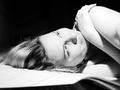
| 06/19/2003 01:30:46 PM |
Little Old Me.by iconsueComment: Very creative pose reminiscent from the 30's and 40's. I think the lighting may be a bit too strong though. Would prefer to see more detail and texture of your skin. |
| Photographer found comment helpful. |
| 06/19/2003 01:00:48 PM |
last minute meby christeyComment: Engaging photo...I like your smile and pose. Red hair is very attractive. I also like the narrow DOF that you've chosen so that your body is slightly blurry. What I would have liked to have seen is more color cooridination with what you were wearing. I don't like the blue blouse and would have preferred something less loud as it takes attention away from you and doesn't match anything in the picture, not even your eyes. Something in the warm color scheme I think would have been better. Also, bare bottomed would have been even nicer :) Nice work for a last minute shot. |
| Photographer found comment helpful. |
| 06/19/2003 12:49:27 PM |
|
| Photographer found comment helpful. |
| 06/19/2003 12:47:29 PM |
|
| Photographer found comment helpful. |
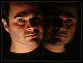
| 06/19/2003 12:41:44 PM |
Me!by jodiecostonComment: Very nice portrait and I like the way your hair falls over your shoulder. Pose is also good and I like the way your hair on top merges with the background. Only thing I would have liked to have seen is you bring out the color of your beautiful blue eyes more. Maybe more saturation. Well done. |
| Photographer found comment helpful. |
| 06/19/2003 12:33:30 PM |
self portraitby mrhburComment: Nice concept and I like the format. However, I wish the bare light bulb at the top of the picture was hidden or cropped out completely and I wish the entire door was evenly lit throughtout. In addition, I find the sides not to add anything to the photo, so would have liked them cropped out too, unless light shed on them would have revealed something interesting to look at. Colors are too drab and would have liked some other kind of effect, even a small spot light on the face from the side or behind to add a more personal touch. |
| Photographer found comment helpful. |
| 06/19/2003 03:16:03 AM |
Oh no... I have HOW LONG to finish planning my wedding!?by lemmingComment: Lighting is a bit too strong here and I'm not sure I like your expression either. I think dramatic lighting would have worked better here especially if you had brought attention to your hand covering your face and your eye instead of a wash of very bright light illuminating everything in the picture. |
| Photographer found comment helpful. |
| 06/19/2003 02:59:12 AM |
Nice to Meet Youby K-RobComment: Focus is lacking and I don't like the "in your face" shot. Also, your expression, or lack of one, is not warm and does not match your photo's title. |
| Photographer found comment helpful. |
Home -
Challenges -
Community -
League -
Photos -
Cameras -
Lenses -
Learn -
Help -
Terms of Use -
Privacy -
Top ^
DPChallenge, and website content and design, Copyright © 2001-2025 Challenging Technologies, LLC.
All digital photo copyrights belong to the photographers and may not be used without permission.
Current Server Time: 04/07/2025 04:13:27 AM EDT.