| Image |
Comment |
| 09/13/2006 10:52:00 AM |
|
 Photographer found comment helpful. Photographer found comment helpful. |
| 09/13/2006 10:51:26 AM |
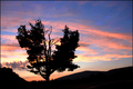
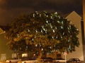
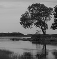
Single tree in carparkby bogusComment: composition: unfortunately, it's just a tree in a carpar with some buildings in the background. it's boring to look at. everything around the tree takes away from the picture.
Lighting: the sky isn't adding to the photo and it's hard to tell what the lights in the tree are. |
| Photographer found comment helpful. |
| 09/13/2006 10:48:55 AM |
The Death of a Kingby HeatherJComment: I think a different time of day might have given you more helpful light. the bark and dying leaves don't look great with the bright light. I'd alos like to see this whole scene in focus. the outside of the picture looks OOF at points. |
| Photographer found comment helpful. |
| 09/13/2006 10:45:42 AM |
Fallenby sadiebirdComment: the leading branch looks oversharpened. I see jagged edges on my LCD. This looks more like a jumbled pile of branches than a tree that's fallen. I like your score and OOF background. |
| Photographer found comment helpful. |
| 09/13/2006 10:44:10 AM |
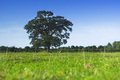
Single but Lookingby tjbel05Comment: two things detract from a very high score...the tree on the right and the 'muddy' or 'flat' b&w...6 |
| Photographer found comment helpful. |
| 09/13/2006 10:42:44 AM |
Big Wall Flowerby michael_pComment: for me the DOF, POV, green and blue colors work well. I like the bits of tall grass standing out. great picture for a mediocre scene. 7 |
| Photographer found comment helpful. |
| 09/13/2006 10:40:50 AM |
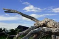
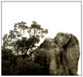
...by TiberiusComment: I see 3 dominant features: tree, rock and white space. To me, the white dominates and its not appealing to look at. The composition of the rock and tree don't seem to work togehter. |
| Photographer found comment helpful. |
| 09/12/2006 04:38:28 PM |
Corn Fieldby p3wizComment: I like this a lot - clean and simple. the 3 elements just seem to work together here. good exposure (not too hard I'd imagine). |
| Photographer found comment helpful. |
| 09/12/2006 04:36:07 PM |
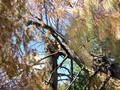
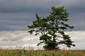
dead ...... and aliveby gocComment: I like your DOF and colors. maybe...exposure up a little to bring out the darker background at right adn some of the branch detail. - wouldn't matter cause you lost the highlights in top left already. |
| Photographer found comment helpful. |
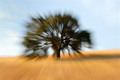
| 09/12/2006 04:34:13 PM |
Zoom Zoomby tmhallingComment: I wish it were a little more subtle. as is, it's distracting and not easy on the eyes. |
| Photographer found comment helpful. |
Home -
Challenges -
Community -
League -
Photos -
Cameras -
Lenses -
Learn -
Help -
Terms of Use -
Privacy -
Top ^
DPChallenge, and website content and design, Copyright © 2001-2025 Challenging Technologies, LLC.
All digital photo copyrights belong to the photographers and may not be used without permission.
Current Server Time: 04/25/2025 05:36:32 PM EDT.