| Image |
Comment |
| 06/09/2003 09:01:24 AM |
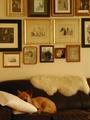
"My HoMe"by KIKIComment: *Critique Club*
This definately says home to me I see a little dog every day too on the sofa when I come in the door. The concept and composition are very good for this challenge.
Your focus appears to be soft on the entire image and a unsharping mask may have helped with that. Also as mentioned in the other comments the white balance may be an issue here, if you can set your white balance set if for soft lighting indoors if not when you edit your photo set your color balance towards the blue to help pull the yellow tones out.
Overall the image is interesting and does meet the challenge.
Anna |
 Photographer found comment helpful. Photographer found comment helpful. |
| 06/09/2003 08:51:33 AM |
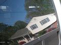
Mirrored homeby mattComment: *Critique Club*
This could be a very interesting take on home sweet home if not for a few distractions. First is the glare on the left handside near the top, then there is the issue of another glare or something like that just off center and to the right, also the right corner and the right edge of the photo where you can see the van are very distracting. Take your time when doing a reflection and get rid of as many distracting issues before taking the photo then crop out as much as you can and it will improve greating on mirrored images like this.
You are however well within the challenge with this definately says home. The focus is also very good. The concept is very good and has potential just take your time and take into consideration the distracting elements and this will work for you.
Anna |
| Photographer found comment helpful. |
| 06/09/2003 02:50:17 AM |
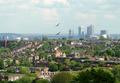
Where The Heart Isby ImagineerComment: *Critique Club*
Nice image with a lot to look at. The birds add a bit of feeling to the overall image. The focus is very good and the dof you used appears to be infinity cause everything seems to be in reasonably good focus. The trees add a lot of texture and feel to the photo, the composition is really good fits the challenge well.
Only thing I might change is something that really you have little control over. The taller buildings and the ones in the distance seem to be in a fog, but they also take from the image as you look at it. Maybe a different time of day might help.
Overall this is a wonderful image, keep up the good work.
Anna
|
| Photographer found comment helpful. |
| 06/09/2003 02:37:22 AM |
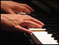
Universal Languageby karmatComment: *Critique Club*
This photo has lots of feeling. Well done and can almost hear the notes being played.
The focus is wonderful on just the one hand with the depth of field used giving the other hand a feeling of the distance across the keyboard. The composition is very nice and appealling it definately fits the challenge.
Only thing I don't like is there is a C shaped distraction near the bottom of the image in the center that seems to pull your eye down from the hands. I'm actually sitting here trying to figure out what it, if its lighting and shadows or a mark on the wood of the panio.
Overall this is a fantastic photo makes you feel like you are sitting in the same room listening to the music. Well done.
Anna |
| Photographer found comment helpful. |
| 06/07/2003 06:35:42 PM |
A Very Unusual Portraitby smellyfish1002Comment: *Critique Club*
Definately a different look, obviously meets the challenge. Good use of macro settings which created a wonderful dof for you.
The upper lip was definately your center of focus in as much as the intensity of the texture and grains within the lip. However at the same time the amout of distortion use probably hurt you in this case cause the photo just isn't eye appealing to most. Text books call this kind of distortion "dog nosing" and warn about the use, although in this case you weren't trying for beauty you were trying for effect.
This photo was well thought out and executed equally well. Keep up with the interesting angles if nothing else it makes you think when you see them and thats what its all about making people stop and take notice =o)
Anna |
| Photographer found comment helpful. |
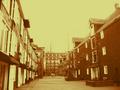
| 06/07/2003 12:55:58 PM |
Down by the Waterfrontby KimInNBComment: *Critique Club*
The image itself is not bad, the buildings appear to be in very sharp focus. The composition is also very good and nicely balanced out.
My problem with the photo is the harshness of the yellow. When doing sepia tones you need to try for more of a amber color to it and less yellow. The sky is so yellow as are the shutters on the building to the left they're extremes and needed to be softened up. Changing your settings slighting when doing sepia tones will add a lot to the image.
In all the photo is in good focus and the composition is really good. Keep trying with the sepia tones and you will loose the harshness this one had and will get the real beauty of sepia tones.
~Anna~ |
| Photographer found comment helpful. |
| 06/06/2003 11:10:22 AM |
Lancing collageby marboComment: *Critique Club*
Reminds me of Harry Potter, even has that effect of the mystical powers which was created with the softness in the image.
The composition is wonderful there is so much to look at. The structures make you think of a kindom in a fairytale and with the dreaminess it does have that effect about it. However at the same time that dreaminess seems a bit overdone on the structures and yet the tree is overly sharp compared to the rest of the image and becomes a distracting element to the rest of the composition.
Also you have a black spot up at the top that would be easily cropped out, possibly something simply overlooked.
It does have a wonderful dreamy feel to it overall. Keep up the good work.
Anna |
| Photographer found comment helpful. |
| 06/05/2003 10:05:13 PM |
Behind the Screenby PaigeComment: *Critique club*
I have liked this image from the moment I first saw it. It is definately something different and has a very unique charm about it.
The kids seem to be in good focus and the screen adds to it to give it the feel of canvas like a painting. The only thing I don't like about it is the white specks which probably are part of the screen, but they are a bit distracting and draw attention away from the two children.
Overall the image is good and very orginal, I really appreciate the ogrinality of something like this makes it stand out. Keep up the good work the orginality is unique. =o)
~Anna~ |
| Photographer found comment helpful. |
| 06/05/2003 07:18:46 AM |
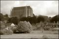
The Memory of Stoneby jjbeguinComment: *Critique Club*
The composition of this photo is very good. The structures do not have a case of falling over but the way you cropped may have helped with that. The sepia tones work well with this photo almost transporting the viewer back in time. It is very crisp and clean the focus so sharp. The texture is very good as you look you see that the dof used allows still see the bricks into the center of the photo.
The one improvement that might be able to be made on this is the time of day the photo was taken. Taking it between 11am and 1pm might still give you a little of the shadowing created by the building on the right but shouldn't cause as much or as dark of a shadow . The shadow even though it tends to add feeling to the photo also seems to distract. You need some of that shadowing just not as much as there is there.
In all it is a very well done photo, keep up the good work
~Anna~ |
| Photographer found comment helpful. |
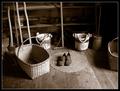
| 06/05/2003 01:50:25 AM |
Days Gone Byby sherComment: *Critique Club*
The feel of this photo is fantastic. At first glance it makes me think of my Grandmother's basement.
The sepia tones really work well here for this photo, and your compositiion of the baskets and tools being spread out make this photo well balanced. There really isn't anything I would change about this photo other than maybe adding dried flowers to a basket or a few canning jars to the image to add a little more of an effect of the past to it. The lighting on the left bottom let you wonder what is in the shadows and distracts slightly from the overall appearance. The focus here is really good the baskets are in such sharp focus you can see the texture in them and the floor you can see the grains of the wood as well as some dirt or small pebbles on the floor.
It really does portray the title. Keep up the wonderful work.
~Anna~ |
| Photographer found comment helpful. |
Home -
Challenges -
Community -
League -
Photos -
Cameras -
Lenses -
Learn -
Help -
Terms of Use -
Privacy -
Top ^
DPChallenge, and website content and design, Copyright © 2001-2025 Challenging Technologies, LLC.
All digital photo copyrights belong to the photographers and may not be used without permission.
Current Server Time: 04/18/2025 01:08:25 PM EDT.