| Image |
Comment |
| 11/25/2006 01:28:00 AM |
|
 Photographer found comment helpful. Photographer found comment helpful. |
| 11/25/2006 01:27:33 AM |
|
| Photographer found comment helpful. |
| 11/25/2006 01:26:57 AM |
Vegas Post Cardby RockBruiseComment: Meets Challenge - 2 of 2
Lighting/Processing - 2 of 2
Composition - 1 of 2
Overall Impression - 0 of 2
"WOW" factor -0 |
| Photographer found comment helpful. |
| 11/25/2006 01:25:45 AM |
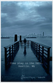
I ONLY HAVE EYES FOR YOUby krglComment: Meets Challenge - 1 of 2
Lighting/Processing - 1 of 2 (too much processing)
Composition - 2 of 2
Overall Impression - 1 of 2
"WOW" factor -0 |
| Photographer found comment helpful. |
| 11/25/2006 01:24:14 AM |
Bring your Umbrellaby Sunshine86Comment: This doesn't seem very inviting for a postcard, but its a good photo. I would have placed the lettering differently. I think it is distracting. |
| Photographer found comment helpful. |
| 11/25/2006 01:22:50 AM |
Ostseebad Sellinby GuGiComment: Even with this building centered in the picture, it works! The lighting is beautiful. Good timing! |
| Photographer found comment helpful. |
| 11/25/2006 01:21:14 AM |
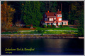
Autumn Sunsetby Bear_MusicComment: This is a beautiful sunset, but there is not enough contrast between the sky, water, and ground, and the little house almost disappears. In my opinion a little difference would make this awesome. |
| Photographer found comment helpful. |
| 11/25/2006 01:16:02 AM |
Greetings from Californiaby PhotologistComment: This would have been great if the sun hadn't been too bright on the top. I love the perspective. Maybe you could do it again some time at a different time of day. |
| Photographer found comment helpful. |
| 11/25/2006 01:11:31 AM |
Basingstoke Canalby dippydazComment: I like the bright colors, but your highlights are a bit blown, and focus could be a little clearer. It looks like some selections problems in the post processing in the sky area where you tried to add some of the blue back to the sky. I hope you get advice on how to overcome this as I often have the same problem. |
| Photographer found comment helpful. |
| 11/25/2006 01:05:38 AM |
Lindisfarne Bayby wisieComment: This has great potential, but would have been better if the horizon were either higher or lower rather than cutting through the center of the picture. |
| Photographer found comment helpful. |
Home -
Challenges -
Community -
League -
Photos -
Cameras -
Lenses -
Learn -
Help -
Terms of Use -
Privacy -
Top ^
DPChallenge, and website content and design, Copyright © 2001-2025 Challenging Technologies, LLC.
All digital photo copyrights belong to the photographers and may not be used without permission.
Current Server Time: 04/23/2025 04:50:42 PM EDT.