| Image |
Comment |
| 09/26/2002 12:17:00 AM |
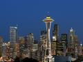
Postcards 101: Assignment Seattle by chrisabComment: great night shot. Feels like it is tilting a few degrees to the left though. I like it more with the bottom 1cm or so cropped off to hide the blue/ grey block/ building |
 Photographer found comment helpful. Photographer found comment helpful. |
| 09/25/2002 11:03:00 PM |
Bristol Housesby KonadorComment: I recognise the English skies! I think this would suit from a tigher crop, on the foreground buildings perhaps- yes it would look 'jumbled and cramped' but that is the way the houses seem to be so it would be well reflected in the image. I'd try to avoid the sky in shots when it is dull and grey like this. |
| Photographer found comment helpful. |
| 09/24/2002 09:32:00 PM |
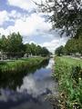
Water Streetby CreativeFlyPhotoComment: nicely balanced, with the plants and trees on the upper and lower right, and the trees balancing side to side. |
| Photographer found comment helpful. |
| 09/26/2002 12:30:00 AM |
butterflyby pookey83Comment: focus is quite soft - I think I'd prefer it sharper on the butterfly |
| Photographer found comment helpful. |
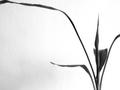
| 09/21/2002 11:58:00 AM |
Tranquilby labryntheComment: needs a bit more space to avoid cropping the ends I think - or you could have cropped it a whole lot more closely - seems stuck inbetween those two options in this case. |
| Photographer found comment helpful. |
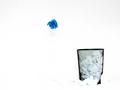
| 09/21/2002 11:07:00 AM |
Blew itby FrooberComment: funky and stark - I'd like to see a bit more detail in the crumpled paper around the bin but other than that - very clean |
| Photographer found comment helpful. |
| 09/21/2002 11:51:00 AM |
Hannahby ZeissmanComment: Fantastic - great contrast with the background - excellent expression and framing. Only issue is it seems a bit soft focused on the eyes - maybe worth experiementing with setting the focus on the eyes and reframing, if you don't already do that, or maybe different sharpening settings 10 - Gordon |
| Photographer found comment helpful. |
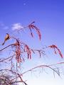
| 09/21/2002 11:47:00 AM |
Moon Birdby lisaeComment: the moon seems lost in the picture - too small to make much of an impact I think,. I like this better without it up there. |
| Photographer found comment helpful. |
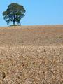
| 09/21/2002 11:04:00 AM |
Oasisby floydComment: think I'd prefer to see the horizon line flat - even though it probably wasn't in reality |
| Photographer found comment helpful. |
| 09/21/2002 10:21:00 AM |
|
| Photographer found comment helpful. |
Home -
Challenges -
Community -
League -
Photos -
Cameras -
Lenses -
Learn -
Help -
Terms of Use -
Privacy -
Top ^
DPChallenge, and website content and design, Copyright © 2001-2025 Challenging Technologies, LLC.
All digital photo copyrights belong to the photographers and may not be used without permission.
Current Server Time: 04/21/2025 06:04:47 AM EDT.