| Image |
Comment |
| 05/27/2003 01:26:53 AM |
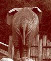
The source of all of the colour BROWNby MorganComment: haha. I did one similar to this for the fauna challenge. Nice DOF, but the focus looks a touch soft. I am still able to see good detail. Maybe it is just the colors, especially how the shady background appears hazy |
 Photographer found comment helpful. Photographer found comment helpful. |
| 05/27/2003 01:07:57 AM |
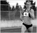
For The Lineby jimmythefishComment: I hate this...no wait...I hate running. (C: Very nice catch, stopped the action, spot on. great tones and light definitely brings out musculature in the legs and the definition. |
| Photographer found comment helpful. |
| 05/27/2003 01:06:24 AM |
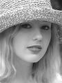
Whitneyby draney4Comment: she is stunning!! I really like the lighting, very well done. the hat seems to have great detail, but the face is a touch soft. confuses the eye a bit, but the soft focus/diffusion works well |
| Photographer found comment helpful. |
| 05/27/2003 01:02:58 AM |
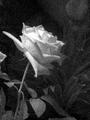
Rose an artistic interpretationby EJComment: Interesting. The top area of the rose is a bit blown, which would not help with me prefering to see a bit more light on the rest of the shot, to bring out more lines and depth to the shot |
| Photographer found comment helpful. |
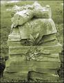
| 05/27/2003 01:00:58 AM |
R I Pby rickhd13Comment: Interesting subject. good choice on DOF. not quite sure of the focus. appears a bit soft, but I am able to make out details very well. Maybe a darker hue would look better? |
| Photographer found comment helpful. |
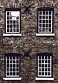
| 05/27/2003 12:55:28 AM |
Gregg Mill Windowsby PaulkComment: Great subject with the contrasting b&W's. The brick areas appear a touch dark...like to see it brought out more to give more texture. the top left window has that blown out area that is a bit distracting |
| Photographer found comment helpful. |
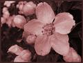
| 05/26/2003 03:53:51 PM |
Rain in the Apple Orchardby PatztComment: Great compostion. I would like to see the focus on the stamen area (middle) to bring those to more attention. the DOF is pretty good that you can see the other closed buds and then the others make a good background. th hue you selected is great |
| Photographer found comment helpful. |
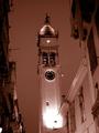
| 05/26/2003 03:50:16 PM |
St Spyridon glowsby hughletherenComment: Great subject. Of course, the blown out area draws my eye away from looking at the tower, and then have to work may way up. My monitor registers this with a slight rose colored hue to it. I would like a more sepia brownish tone (but I like those older photos that look that way) |
| Photographer found comment helpful. |
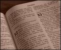
| 05/26/2003 03:48:09 PM |
32nd Psalmsby StevePaxComment: I like the lighting that ended up on the left page, seems to bring out the type a bit better. Not sure what color the pages are, but a tad brighter may add more pop to the text |
| Photographer found comment helpful. |
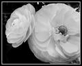
| 05/26/2003 03:46:45 PM |
Queen of the gardenby pitsamanComment: Great DOF. For most flowers I like to see the focus around the (stamens) middle of the flower. Ususally the most interesting part. Great tone and detailon the petals. I think maybe using the rule of thirds on the larger flowers middle area instead of the smaller one would command it more attention. But that is one opinion |
| Photographer found comment helpful. |
Home -
Challenges -
Community -
League -
Photos -
Cameras -
Lenses -
Learn -
Help -
Terms of Use -
Privacy -
Top ^
DPChallenge, and website content and design, Copyright © 2001-2025 Challenging Technologies, LLC.
All digital photo copyrights belong to the photographers and may not be used without permission.
Current Server Time: 12/14/2025 11:01:46 AM EST.