| Image |
Comment |
| 01/09/2005 08:16:47 AM |
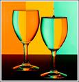
More.....by loz1Comment: 17 comments, 5.6? that's not bad!
The only thing I can see now that I would have changed is to crop this in portrait orientation to enhance the length of your leg, instead of cropping horizontal and emphasizing the width. :)
M |
 Photographer found comment helpful. Photographer found comment helpful. |
| 12/20/2004 12:33:49 AM |
|
| Photographer found comment helpful. |
| 12/20/2004 12:23:06 AM |
|
| Photographer found comment helpful. |
| 12/20/2004 12:19:21 AM |
|
| Photographer found comment helpful. |
| 12/20/2004 12:12:43 AM |
|
| Photographer found comment helpful. |
| 12/20/2004 12:11:27 AM |
My Point of Viewby soupComment: One of my favorite images of all time and you nailed it minus the paper sticking up around the edges. Good work! |
| Photographer found comment helpful. |
| 12/11/2004 10:05:37 PM |
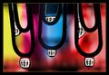
Makes them wacko!!.....Have a Schmacko!!by suemackComment: I think the most important issue in an advertisement is to get the product in. Clearly you have a good idea here, but I don't think there's enough product here. I see "pet food only" but I still don't know what a Schmacko is.
The light looks a little flash-y to me. I don't like on camera flash, so I use available light whenever possible - putting the dog by a window or something. :)
M |
| Photographer found comment helpful. |
| 12/11/2004 08:33:11 PM |
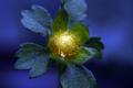
Genesisby SkipComment: The processing on this shot ROCKS. I was commenting on people's entries with the least comments, but I really wanted to make an exception for your shot here.
The yellow BOOMS and just flies out of the picture at me. I love the glow effect it has. Leaving a little bit green on the inside really adds to the look this has - like the yellow is adding glow to the blue to create the greens. VERY cool. Compositionally, I'm glad there is nothing to distract my eye in the background.
I have a hard time believing this didn't do better, but I think:
//www.dpchallenge.com/image.php?IMAGE_ID=18680
That shot was the first one I remember with blue flower backgrounds. I think subconsciously people may have associated the two and thought it was a re-do of a challenge winning technique. (redo's NEVER do well around here.)
Thanks also for the thoughtful comment - I appreciate your time.
M |
| Photographer found comment helpful. |
| 12/11/2004 08:27:26 PM |
Ship at Restby dpdaveComment: I can see the lines as well and they do distract.
However, the angles and lines give my eyes lots to do and it makes me interested in the subject. I like the little tad of background image we have - the other boats, water, shoreline - which add to the overall feel of the picture.
I like contrasty black and white shots, so I would bump it +7 or so contrast, just to get that feel to it, but overall I like the image a lot.
M |
| Photographer found comment helpful. |
| 12/11/2004 08:24:19 PM |
Rising Above It Allby OlyuziComment: This image is of something very fantastic. I love the subject. The crop and composition don't appeal to my eye. The topic and meaning are very nice, but maybe if you had something in the background (a different side, different angle?) it would have given some context.
That all being said, I definitely like what I'm looking at in this. The little stubble of trees in the LLC is funny.
M |
| Photographer found comment helpful. |
Home -
Challenges -
Community -
League -
Photos -
Cameras -
Lenses -
Learn -
Help -
Terms of Use -
Privacy -
Top ^
DPChallenge, and website content and design, Copyright © 2001-2025 Challenging Technologies, LLC.
All digital photo copyrights belong to the photographers and may not be used without permission.
Current Server Time: 04/02/2025 03:57:45 AM EDT.